The Dr's Evil Creation Lab!
 TheDR
03 Mar 2007
TheDR
03 Mar 2007
For people who want to request a Sig.
I need some details for the Sig:
Picture/Topic
Favorite Colours
Any size limits
Ect..
Don't be afraid to ask for a sig, I like making them as it gives me practice with Photoshop.
You can post your request in this topic or send a PM to me, if you don't like the sig i made for you, Ill change it or Ill start again.
For people who want to request Other Art.
If you want any 2D arty things doing i will have a go, i don't know how to skin models but if someone wants to teach me i'm up for it.
You can request Wallpapers, Logo's Ect.
You can post your request in this topic or send a PM to me.
Remember, If you give me a bad quality image, i will try my best to make something good out of it, but don't expect me to make the image better quality.
My Wins:
------------------------------
Edited by TheDR, 04 February 2011 - 19:42.
TheDR
03 Mar 2007
i will make it smaller then
is that better?
Edited by The Dr, 03 March 2007 - 10:44.
is that better?
Edited by The Dr, 03 March 2007 - 10:44.
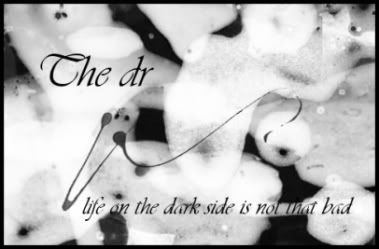
 . It's got an old inky feeling. Keep on working your way to the top.
TheDR
03 Mar 2007
thanks sic. i used blood brushes in black
and then white on the black and so on
untill it looked good.
and then white on the black and so on
untill it looked good.
TheDR
03 Mar 2007
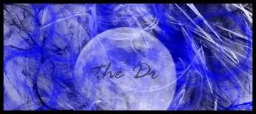
my latest work , i felt like some colour and i made it a bit smaler.
will add name if anyone wants it.
Sgt. Nuker
03 Mar 2007
IMHO, both look best in black and white, given the nature of the render you used. Your first sig has a touch of old school and I really like it. Very nice work mate, very nice. Keep at it, and I'm sure people will want your sigs.
My best,
Nuker
My best,
Nuker

Sic
03 Mar 2007
Very nice, it looks like a whole world, wrapped in smokes and cosmic mist. Very good for a begginner, too good infact. Just add a border, and your sig is in the center of roxxor.

TheDR
03 Mar 2007
ok i will try that thanks sic
how do u set it to overlay mode?
ps:what dose IMHO mean?
Edited by The Dr, 03 March 2007 - 20:27.
how do u set it to overlay mode?
ps:what dose IMHO mean?
Edited by The Dr, 03 March 2007 - 20:27.

Sgt. Nuker
04 Mar 2007
The black print sort of ruins the rest of the sig. Personally I'd have made it a thin, whispy font and set the opacity to aroud 40 or 50%. That way the font blends into the rest of the sig better, and looks like a part of it, instead of another layer.
My best,
Nuker
My best,
Nuker
TheDR
04 Mar 2007
I will try that then, thanks nuker
I could not get the border to overlap because
i am only a beginer on gimp but i will keep trying.

now it has a border that has two colours
Edited by The Dr, 04 March 2007 - 09:06.
I could not get the border to overlap because
i am only a beginer on gimp but i will keep trying.
now it has a border that has two colours
Edited by The Dr, 04 March 2007 - 09:06.
Sgt. Nuker
04 Mar 2007
Much, much better. Sometimes a complimenting color is better for a border, but not in this case. The blue border looks top notch.
My best,
Nuker
My best,
Nuker
TheDR
04 Mar 2007
Thanks nuker
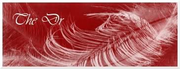
Here is one more sig for a nod fan

I tryed using some different tools on the gimp.
Edited by The Dr, 04 March 2007 - 20:39.
Here is one more sig for a nod fan
I tryed using some different tools on the gimp.
Edited by The Dr, 04 March 2007 - 20:39.
Athena
05 Mar 2007
That one's quite nice, as well as the blue one you're having in your signature now.
In regards to the Nod one, the font is a tad hard to read, maybe tone down the blur or sharpen it (or add a shadow or border around the text). I quite like the black/red dark background.
@ the blue one
With this blue border and all it looks fine to me. Maybe you can do something more special to the font next time. Very nice background. Did I mention blue is one of my favourite colours .
.
Keep up the work, especially for someone who hasn't been doing this long it is quite good.
In regards to the Nod one, the font is a tad hard to read, maybe tone down the blur or sharpen it (or add a shadow or border around the text). I quite like the black/red dark background.
@ the blue one
With this blue border and all it looks fine to me. Maybe you can do something more special to the font next time. Very nice background. Did I mention blue is one of my favourite colours
.Keep up the work, especially for someone who hasn't been doing this long it is quite good.
TheDR
05 Mar 2007
Quote
In regards to the Nod one, the font is a tad hard to read, maybe tone down the blur or sharpen it (or add a shadow or border around the text). I quite like the black/red dark background.
i was trying to make it hard to read.
Sic
05 Mar 2007
 The Dr, on 4 Mar 2007, 20:59, said:
Thanks nuker
Here is one more sig for a nod fan
I tryed using some different tools on the gimp.
Here is one more sig for a nod fan
I tryed using some different tools on the gimp.
Where's the Nod?
Well, quite nice, but as Blaat said, you need to use a border on the font, and I'd suggest adding a simple one color nod logo and brushing a little above it.
Athena
05 Mar 2007
The Dr, on 5 Mar 2007, 11:43, said:
i was trying to make it hard to read.
.@Sic
Sounds like a good idea.
