Wizard's Signatures
 Wizard
05 Oct 2007
Wizard
05 Oct 2007
This will be my new sig thread, after the last one was moved to the 3d/Game artwork subforum. Only Sigs in here.
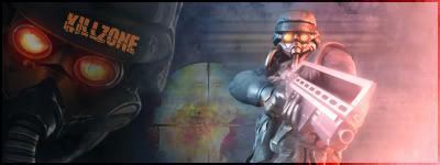
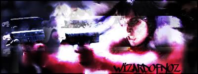
Requests will be taken. But to start off here is my SOTW entry:
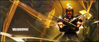
Was going to be this one but I didn't like it at all. Quite poor IMO.
I will put some of my better sigs in here soon enough. If someone wants something post here...
Regards
Wizard
Edited by Wizard, 09 January 2009 - 12:58.
Requests will be taken. But to start off here is my SOTW entry:
Was going to be this one but I didn't like it at all. Quite poor IMO.
I will put some of my better sigs in here soon enough. If someone wants something post here...
Regards
Wizard
Edited by Wizard, 09 January 2009 - 12:58.
Sgt. Nuker
06 Oct 2007
Both of them look good. I think it's because of the atmosphere that's generated by the colors you used and the type of renders .
Anyway, I like the first one more than the second. The first just seems to have a shine and is more fluid than the second.
My best,
Nuker
. Anyway, I like the first one more than the second. The first just seems to have a shine and is more fluid than the second.
My best,
Nuker
Wizard
06 Oct 2007
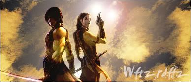
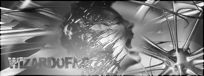
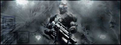
Something new I have been experimenting with.

Just wanted to do something a bit different to my usual style. Thoughts? This style will need to improve with practise.
- Wizard
Just wanted to do something a bit different to my usual style. Thoughts? This style will need to improve with practise.
- Wizard
Hax
06 Oct 2007
I most like first one... thats cool.
GTA sig: in one point too many things and in another nothing... put some lines around it (like your sig), paint over grey some colors and choice 1, 2 or 3 colors as primary and use they mainly
GTA sig: in one point too many things and in another nothing... put some lines around it (like your sig), paint over grey some colors and choice 1, 2 or 3 colors as primary and use they mainly
Wizard
06 Oct 2007
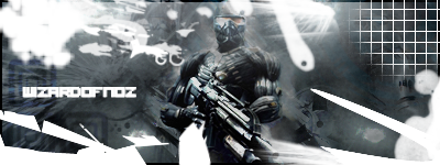
I know what you mean Hax. It's a bit cluttered. As I said this is a new style for me so it's gonna take a whole lotta time to get the composition and colouring right. Plus most of it was done with a hangover like a MOAB! :nurse: The retro look is really gonna burn me but I am gonna nail it if it kills me, or my PS!!!
Thanks for your comments though. All greatly appreciated.
- Wizard
PS Like your new sig/avy combo! Nice!
Edit: Damn typos
Edit: Reworked sig
Edited by Wizardofnoz, 06 October 2007 - 17:30.
Thanks for your comments though. All greatly appreciated.
- Wizard
PS Like your new sig/avy combo! Nice!
Edit: Damn typos
Edit: Reworked sig
Edited by Wizardofnoz, 06 October 2007 - 17:30.
Wizard
07 Oct 2007
Glad you like it Red!
On a seperate note if anyone wants any psd of my sigs let me know. More than happy to share techniques etcs.
- Wizard
On a seperate note if anyone wants any psd of my sigs let me know. More than happy to share techniques etcs.
- Wizard
Wizard
07 Oct 2007
Another one!
-Wizard
Edit:D'oh Double post, sorry!
Edited by Wizardofnoz, 07 October 2007 - 13:48.
-Wizard
Edit:D'oh Double post, sorry!
Edited by Wizardofnoz, 07 October 2007 - 13:48.
Wizard
09 Oct 2007
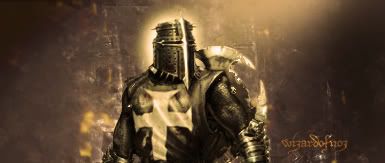
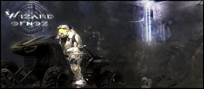
Latest tag, trying to find some inspiration from somewhere right now.
Constructive comments?
Constructive comments?
Wizard
09 Oct 2007
Thanks kid. There are 2 c4ds in there.
Looking at it now I am not happy with the way the c4ds are blurred into the render. Need to work on that a bit harder.
- Wizard
Looking at it now I am not happy with the way the c4ds are blurred into the render. Need to work on that a bit harder.
- Wizard
Wizard
12 Oct 2007
Cheers Capt. *imaginary salute*
Was a pig to work on. I am not that great at these unless I can see something in the render. Sadly this one was slightly shallow on that score. The one Hax did for Areze is also very good!
- W
Edited by Wizardofnoz, 12 October 2007 - 16:41.
Was a pig to work on. I am not that great at these unless I can see something in the render. Sadly this one was slightly shallow on that score. The one Hax did for Areze is also very good!
- W
Edited by Wizardofnoz, 12 October 2007 - 16:41.
Areze
12 Oct 2007
 Wizardofnoz, on 12 Oct 2007, 12:24, said:
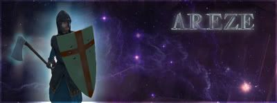
If you like it?
- W
Wondrous. Glorious. Kickass.
Wizard
13 Oct 2007
Glad you like it. Happy to help.
Here's a new one.
Edit: Some minor changes
Edited by Wizardofnoz, 14 October 2007 - 10:26.
Here's a new one.
Edit: Some minor changes
Edited by Wizardofnoz, 14 October 2007 - 10:26.
Wizard
28 Oct 2007
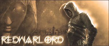
Sorry about the bump chaps/chapesses. Latest work:
Thoughts?
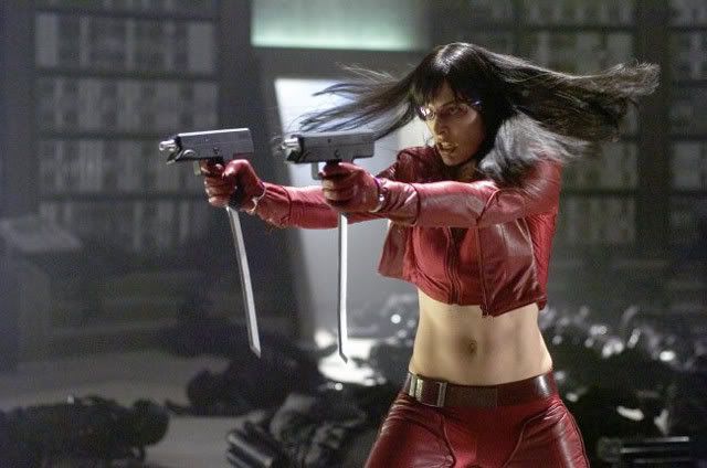
Just for comparison this is the stock used
I wanted to upload the .psd but it's too big
Edited by Wizardofnoz, 28 October 2007 - 11:27.
Thoughts?
Just for comparison this is the stock used
I wanted to upload the .psd but it's too big
Edited by Wizardofnoz, 28 October 2007 - 11:27.
Wizard
28 Oct 2007
Thanks guys :smile:
Here is another one
I am going to to do something a bit different with this in a minute........
Just friggin around with some stuff. Which one peeps prefer? Bear in mind that unless you have latest IE or FF you aren't gonna be able to see the effects.
PS think it looks best in Soviet skin!!
Edited by Wizardofnoz, 28 October 2007 - 14:34.
Ellipsis
28 Oct 2007
Personally I love the second one!
How do you switch the skin to the soviet one?
How do you switch the skin to the soviet one?