Hangar 13 Design
 TheDR
05 Feb 2010
TheDR
05 Feb 2010
Indeed it looks a lot better, the sniper was a bit overkill (not meant as a pun  ).
).
).
Jok3r
05 Feb 2010
In a sniper mood. Light Fitty:

EDIT: it's up for grabs if anyone wants it, I'll put your name on it and whateva, I don't plan on using it.
Edited by Jok3r, 05 February 2010 - 02:37.
EDIT: it's up for grabs if anyone wants it, I'll put your name on it and whateva, I don't plan on using it.
Edited by Jok3r, 05 February 2010 - 02:37.
Jok3r
01 May 2010
Triple Post, wow.
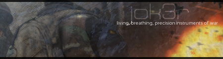
Open for requests again, and inspired to make a change by Doc's new sig. Also, really looking forward to the new MoH, which is were the images and the phrase come from.
Open for requests again, and inspired to make a change by Doc's new sig. Also, really looking forward to the new MoH, which is were the images and the phrase come from.
Jok3r
11 May 2010

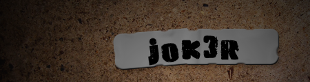
I don't even really know, tbh, but I kinda like it. First try at making a sig in illustrator... perhaps not the best choice.
TheDR
11 May 2010
Yeah, illustrator is for graphic design rather than sigs.
However, i can see what you were going for, it looks quite Mexican for some reason, maybe you should have another go, but using PS instead
However, i can see what you were going for, it looks quite Mexican for some reason, maybe you should have another go, but using PS instead
Wizard
11 May 2010
It doesn't really work as it has no context. We don't see you as either a joker or someone associated with red
Jok3r
11 May 2010
 Wizard, on 11 May 2010, 10:09, said:
It doesn't really work as it has no context. We don't see you as either a joker or someone associated with red
@Doc: I know what it's for, I was just messing around
. @Wiz: fair point on the context, lemme see if I can come up with better text
Sgt. Nuker
19 Apr 2011
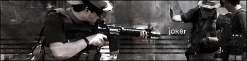
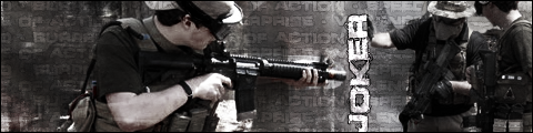
Not bad. Don't worry, I won't leave the post to just those two words. The atmosphere of the signature is all well and good, however, your name placement lacks a bit to be desired. Actually, it's not so much the placement, as it is the font choice. If it were me, I'd have made the text look like graffiti on the wall, to give the signature a bit more depth. The gent wearing the boonie hat seems to have his hand on nothing, or at least that's the way it seems, given the texturing on the wall (I assume that's a wall) his hand is directed towards.
All in all, it isn't bad, but perhaps you've spent a bit too much time away.
All in all, it isn't bad, but perhaps you've spent a bit too much time away.
Sgt. Nuker
20 Apr 2011
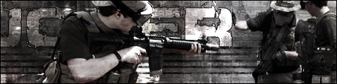
An improvement for the simple fact that the "R" looks like a perch for the guy's hand. The issue I have with the signature now is that the "K" is obscured, so it takes a bit away from the overall.
Wizard
20 Apr 2011
Make he text much smaller and rotate it to vertical, then you use it as the "prop" for the guys hand 
Sgt. Nuker
20 Apr 2011
Perhaps if the letters were stacked vertically, instead of on their respective sides, it would look more feasible.
Alias
20 Apr 2011
You need to get rid of the black border around the type, it isolates it far too much.
