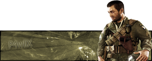
Drag#!'z Artworkz
 Ellipsis
09 Aug 2008
Ellipsis
09 Aug 2008
You have got too much free time. 
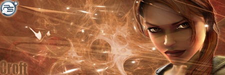
All of them look splendid. Especially the lot that you posted.
Btw, how did I miss this awesome display of Photoshopitism?
All of them look splendid. Especially the lot that you posted.
Btw, how did I miss this awesome display of Photoshopitism?
Kaido
10 Aug 2008
 Ellipsis, on 9 Aug 2008, 5:55, said:
Btw, how did I miss this awesome display of Photoshopitism?
Dont ask me D:

Dauth
20 Aug 2008
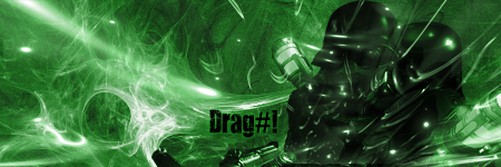
That's a bit swish, nicely done, however it looks like you ran out of room for the text.
Kaido
20 Aug 2008
Dauth, on 20 Aug 2008, 3:10, said:
That's a bit swish, nicely done, however it looks like you ran out of room for the text.
I Just Didnt Found Any Good Font With It >.<


TheDR
31 Aug 2008
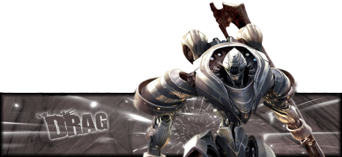
I know its a bit late
My favorite is the 4th one, the colours work well.
To improve your sigs i would say you should add a border and reduce the height of the sigs a bit.
Keep up the good work
My favorite is the 4th one, the colours work well.
To improve your sigs i would say you should add a border and reduce the height of the sigs a bit.
Keep up the good work
Kaido
15 Oct 2008
And this one is totaly The Dr Kind
*Image Deleted*
Edited by Drag#!, 22 October 2008 - 17:43.
*Image Deleted*
Edited by Drag#!, 22 October 2008 - 17:43.
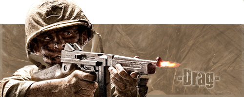
Brad
15 Oct 2008
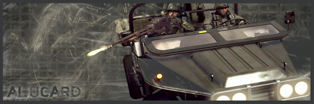
Thats beautiful, does the render cut off there (the gun), or did you do that? Because it would look better if it didnt get cut off.
Edited by Tactical_person, 15 October 2008 - 16:12.
Edited by Tactical_person, 15 October 2008 - 16:12.
Kaido
15 Oct 2008
The render gut off at there
http://planetrenders....php?pos=-23491
Edited by Drag#!, 15 October 2008 - 16:14.
http://planetrenders....php?pos=-23491
Edited by Drag#!, 15 October 2008 - 16:14.
TheDR
15 Oct 2008
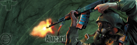
Its a nice sig, the Background and render work well but the pop up doesn't work.
You could delete the top part of the gun (the popping out bit) which would improve the Pop up.
You could delete the top part of the gun (the popping out bit) which would improve the Pop up.
Dauth
15 Oct 2008
Is an improvement, but I can see a fleck of colour just above where the gun was

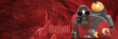
Warbz
22 Oct 2008
It's good but nothing special, I also think the render pops out a bit too far.


 (You in the middle)
Kaido
15 Dec 2008
Were Bored and i made these 3 images o.0

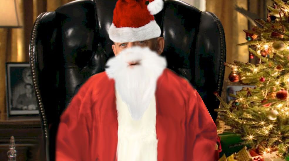
U Will Barrow Before us, Or U Will Not Get Presents At All
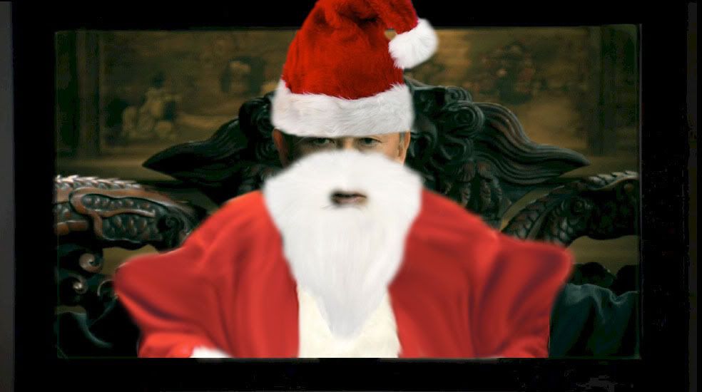
U Will Barrow Before us, Or U Will Not Get Presents At All
