Nid's Art Base
 Jazzie Spurs
26 Jul 2008
Jazzie Spurs
26 Jul 2008
I like the first, very well done my Dirty Friend. 
sencond, needs moar effects though
sencond, needs moar effects though
WarMenace
07 Aug 2008
can you make me one, a halo themed battle sig with master chief standing out. thanks.
Nid
09 Aug 2008
I often screw them up.
The Dr is the one to help you with that.

Scratch that, I'll do it. but this is a one off. Nobody else is getting one
.
Edited by Niddy, 09 August 2008 - 16:23.
TheDR
09 Aug 2008
 Niddy, on 9 Aug 2008, 17:17, said:
I often screw them up.
The Dr is the one to help you with that.
Scratch that, I'll do it. but this is a one off. Nobody else is getting one
.Im getting quite a reputation
I look forward to seeing it Nid

WarMenace
09 Aug 2008
oh well my bad if i knew u werent takin requests then i shouldn't have posted, but since ur gonna do it anyway, thanks.
Nid
09 Aug 2008
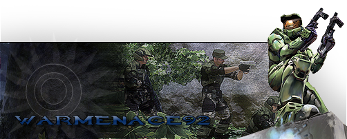
Enjoy
EDIT: Oops, screwed up again there, my bad, I'll get a final version to you soon, I don't have much time now. You can use that as a temp for now if you want.
Edited by Niddy, 09 August 2008 - 18:45.
Nid
19 Aug 2008
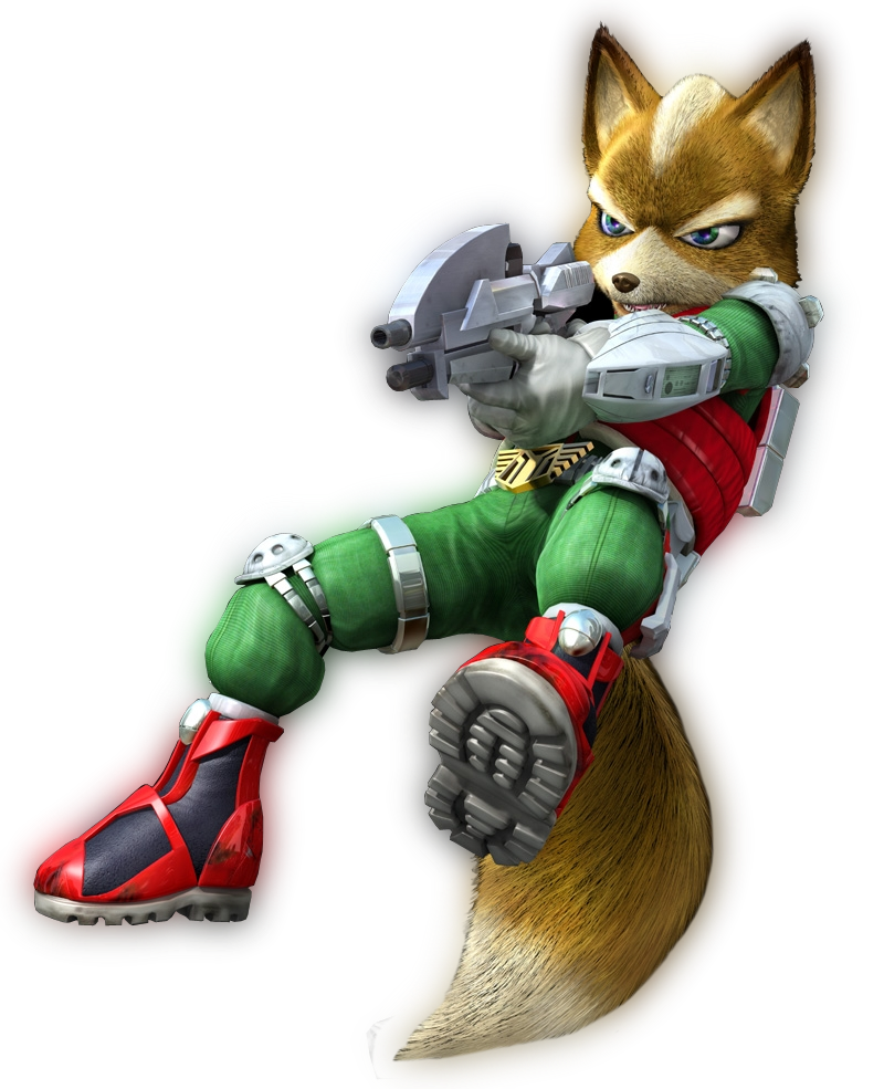
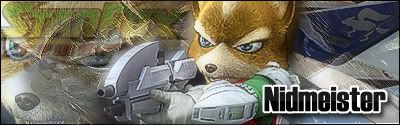
A StarFox cut that I'm planning on using later.
And remember.
ALL MY CUTS ARE AVAILABLE FOR FREE USE.
Edited by Niddy, 19 August 2008 - 18:17.
 I don't use that smiley much, if ever. Accept it graciously.
Nid
19 Aug 2008
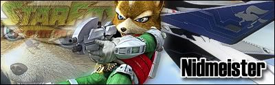
And the sig to go with it. ^_^
Not quite as impressive
Edited by Niddy, 19 August 2008 - 18:52.
Wizard
19 Aug 2008
But it's not bad though. Maybe you could've made the render bigger and focused on the face and gun more than the bigger render image. 
Nid
19 Aug 2008
Wizard, on 19 Aug 2008, 19:54, said:
But it's not bad though. Maybe you could've made the render bigger and focused on the face and gun more than the bigger render image.
That is why I take more pride in my cutting

I look now the colours used for my Name could have been more correspinding to the Starfox logo opposite as well.
Still, there' always time and room for improvement...
Back to work I go.
Edited by Niddy, 19 August 2008 - 19:00.
Wizard
19 Aug 2008
The colour of the text isn't bad. You have two seperate sides there and they each correspond with the text. It's the render I'd change.
Nid
19 Aug 2008
I'll take your word for it then
EDIT:
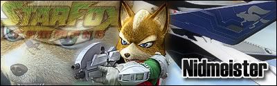
Any good?
Edited by Niddy, 19 August 2008 - 19:16.
EDIT:
Any good?
Edited by Niddy, 19 August 2008 - 19:16.
Nid
19 Aug 2008
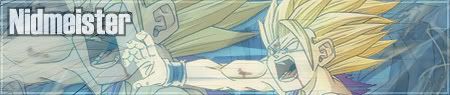
Aside from the fact that his gun came before a spartan laser, so it would be right to say the spartan laser looks like his gun.
Wizard
19 Aug 2008
Did you do anything apart from more the render down? You need to make it bigger.
Nid
20 Aug 2008
Final version.
Not so happy about that extra "shadow" layer I put in though. Might get rid of it.
Edited by Niddy, 20 August 2008 - 22:34.
TheDR
31 Aug 2008
I really like the way that sig turned out.
The only thing i don't like about it is it feels a bit white and it overwhelms the sig.
I suggest using a gradient map of "Blue, orange and purple" and putting the opacity to 20%, i think it could make the sig look better.
Keep up the good work Nid
The only thing i don't like about it is it feels a bit white and it overwhelms the sig.
I suggest using a gradient map of "Blue, orange and purple" and putting the opacity to 20%, i think it could make the sig look better.
Keep up the good work Nid
Nid
01 Sep 2008
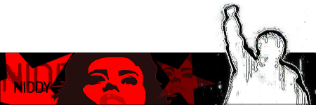
With my latest addition to to collection, I fuel my current addiction to RATM.
TheDR
01 Sep 2008
Nice i love the font choice very simple and the Ds look good. Also i like the colours.
The only thing i can think to improve it is the white splatter, maybe get rid of some parts of it.
Otherwise i really like the sig overall.
The only thing i can think to improve it is the white splatter, maybe get rid of some parts of it.
Otherwise i really like the sig overall.
Nid
01 Sep 2008
I got rid of some of the splatter, kept the more clear and best looking parts of it because I liked it
