Bob's media corner
 Slightly Wonky Robob
18 Oct 2012
Slightly Wonky Robob
18 Oct 2012
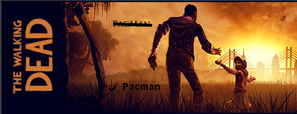
You're probably right, it would best to put my name on the side... Can't find a decent font that gets even close to the other one though. D:
Also, you should play the game anyway. Sure, it doesn't have amazing graphics (they're not horrible though), but you need to play it for the horrible decisions you have to make. I don't think I've ever thought so much about a game after I played. I felt awful for days after one of the decisions I made in episode 2. D;
Also, you should play the game anyway. Sure, it doesn't have amazing graphics (they're not horrible though), but you need to play it for the horrible decisions you have to make. I don't think I've ever thought so much about a game after I played. I felt awful for days after one of the decisions I made in episode 2. D;
TheDR
18 Oct 2012
If you like making awful decisions play some Xcom. Name your soldiers after friends and family to make it extra tense.
The reason I haven't played The Walking Dead games is that I just can't get into adventure games, I wish I could but I have tried multiple times with some of the best (Monkey Island and Grim Fandango) but the game play just doesn't hold my interest (and the puzzles irritate me rather than intrigue). The graphics don't put me off, It's just it would become a must play if it looked like your sig.
The name in the sig doesn't look bad, I was just looking for ways to improve your sig
Wizard
19 Oct 2012
I just think it needs moving to somewhere with less contrast. As a very bad [mocked up] example:
Libains
19 Oct 2012
Agreed, my only slight concern is that it might blend too much into the background if it stays as totally black text. I think the placement will work well, the colouring might need a slight tweak though
(Also, damn good sig either way Pacmon)
(Also, damn good sig either way Pacmon)
