with the first sig i was having trouble cutting the image out of the original picture and so i think it looks blocky at the edges.
with the third one i was trying to get an eery feel to it.
thx for comments i will try to add another element to the third one if i can think of something relevant to add to it.

warbz's visuals
Started By Warbz, Jan 06 2007 21:16
378 replies to this topic
#77
-
- Project Team
-

- 4646 posts
IRC is just a multiplayer notepad.
Posted 02 March 2007 - 22:09

i thought i would get back on ps for a bit today

#78
-
- Global Moderator
-

- 13457 posts
Greenskin Inside
-
Projects: Shoot. Chop. Smash. Stomp.
Posted 03 March 2007 - 04:12
It's not bad, but IMHO, it could use a bit more work.
For starters, I think it would be really cool if the text could have a ghost image of the NOD logo behind it (in the negative space between the lines).
Secondly, and lastly, the NOD logo being blackened out on the right hand corner isn't as flowing as it could be. It would look better if it was burned out of existance gradually, rather than all at once like it is.
My best,
Nuker

#79
-
- Gold Member
-

- 6564 posts
Femme Fatale Of The Army
Posted 03 March 2007 - 04:56
I like the colors, but the Nod Logo should be able to see completely in my Opinon.
- E.V.E.
- E.V.E.

#80
-
- Project Team
-
- 5507 posts
Veteran
-
Projects: NLS 2D Artist, Code 13 Cameo Artist
Posted 03 March 2007 - 08:54
Very nice, but as the above persons, I think you should let the Nod logo be seen, just shoot up some scratch brushes on it  .
.
.


#81
-
- Project Team
-
- 4646 posts
IRC is just a multiplayer notepad.
Posted 15 March 2007 - 20:07
a moment of inspiration:

plain yet classy:

one of my previous ones improved:
plain yet classy:
one of my previous ones improved:
Edited by Warbz, 29 March 2007 - 21:40.
#82
-
- Gold Member
-
- 2672 posts
Embody the Truth
Posted 16 March 2007 - 08:51
Is the last one supposed to be partially transparent? Because here it's blueish, but a slightly different blue than the Estudios skin.
Maybe a bit more could be done with the border. Other than that, I like it .
.
The Crazykenny one is nice. Much too large for a sig, but just as imagine it is nice.
The simplicity in the second one I like.
Maybe a bit more could be done with the border. Other than that, I like it
.The Crazykenny one is nice. Much too large for a sig, but just as imagine it is nice.
The simplicity in the second one I like.
#83
-
- Project Team
-
- 4646 posts
IRC is just a multiplayer notepad.
Posted 16 March 2007 - 19:32
1st isnt so much a sig as just something i made cos i was bored n when i finished, i just though of ken.
the third one the top right isnt actually an image apart from the few pixels i forgot to remove, its a PNG file so i dont no why u see it as a diff blue.
the third one the top right isnt actually an image apart from the few pixels i forgot to remove, its a PNG file so i dont no why u see it as a diff blue.
#84
-
- Gold Member
-
- 2672 posts
Embody the Truth
Posted 17 March 2007 - 16:56
I don't see it as different here in Windows 2000, when I used Linux I did see it as different :S. Odd. It looks better here in Windows2000 .
.
#85
-
- Project Team
-
- 4646 posts
IRC is just a multiplayer notepad.
Posted 17 March 2007 - 21:04
joy. i must be so good at this whole sig thing as u r the only who seems to have bothered lookin ¬_¬.
no offence blat.
no offence blat.
#86
-
- Global Moderator
-
- 13457 posts
Greenskin Inside
-
Projects: Shoot. Chop. Smash. Stomp.
Posted 17 March 2007 - 21:55
 Warbz, on 15 Mar 2007, 16:07, said:
a moment of inspiration:
plain yet classy:
one of my previous ones improved:
plain yet classy:
one of my previous ones improved:
To the first one, although I absolutely adore the nuclear theme, it is far too large to be a sig. Maybe if you scaled it down, and gave it some kind of appropriate border it would be as Austin Powers says "dead sexy".
The second one does have a classic and simplistic feel to it, which is sometimes all you need. Something simple can say much more than something fancy. While the font isn't a bad choice, personally I'd use something a bit more elegant, or one that looks like caligraphy.
Last, but not least, your updated NOD sig. The NOD logo, although it belongs to the pruposed "bad guys", does deserve to be seen as a whole. The torn off corner technique is good, but because of its location, sort of detracts from the sig because part of the logo was torn off.
In order of appearance:
8.5/10
9/10
8/10
My best,
Nuker
#87
-
- Project Team
-
- 4646 posts
IRC is just a multiplayer notepad.
Posted 18 March 2007 - 13:52
thx.
but as i said the nuke pic isnt s'possed to be a sig.
i just made it cos i was bored

im well chuffed with this one.
but as i said the nuke pic isnt s'possed to be a sig.
i just made it cos i was bored
im well chuffed with this one.
#88
-
- Member
-

- 3078 posts
The Hated
Posted 18 March 2007 - 14:08
It's kinda simple, did you make the BG?
7/10
7/10

You'll only notice me when it's too late.

#89
-
- Project Team
-
- 4646 posts
IRC is just a multiplayer notepad.
Posted 18 March 2007 - 14:10
background was from a harvester concept pic. the mammoth from another concept pic and the men from the BG of yet another concept pic.
thens i added a bit of blur and lens flare etc.
thens i added a bit of blur and lens flare etc.
#90
-
- Gold Member
-
- 6564 posts
Femme Fatale Of The Army
Posted 18 March 2007 - 14:36
It maybe looks a bit simple, but I sure like it, especially the Mammoth.
- E.V.E.
- E.V.E.
#91
-
- Project Team
-
- 4646 posts
IRC is just a multiplayer notepad.
Posted 18 March 2007 - 14:44
thx.
i was quite surprised how well i managed to blend the images into each other
i was quite surprised how well i managed to blend the images into each other
#92
-
- Global Moderator
-
- 13457 posts
Greenskin Inside
-
Projects: Shoot. Chop. Smash. Stomp.
Posted 19 March 2007 - 15:45
Simple yet very satisfying I should think. Well done. (8/10)
My best,
Nuker
My best,
Nuker
#93
-
- Project Team
-
- 4646 posts
IRC is just a multiplayer notepad.
Posted 20 March 2007 - 22:10
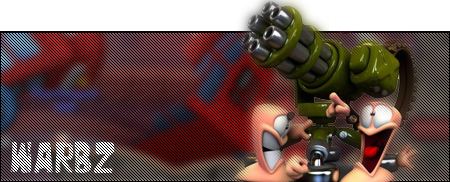
if you watch family guy you'll know wot this is about

#94
-
- Project Team
-
- 4646 posts
IRC is just a multiplayer notepad.
Posted 26 March 2007 - 21:11

a hover tank i made.
my 3rd attempt at 3ds max.
most of u saw my 1st and my 2nd got lost (virus :( )
i see no-one cared about my last post. :(
Edited by Warbz, 26 March 2007 - 21:12.
#95
-
- Project Team
-
- 5507 posts
Veteran
-
Projects: NLS 2D Artist, Code 13 Cameo Artist
Posted 26 March 2007 - 21:14
That's got a little too much polies I think  .
.
Looks nice nonetheless. I suggest making the chassis more realistic though. But, the barrel is awesome.
. Looks nice nonetheless. I suggest making the chassis more realistic though. But, the barrel is awesome.
#96
-
- Project Team
-
- 4646 posts
IRC is just a multiplayer notepad.
Posted 26 March 2007 - 21:21
thx.
current poly's= just over 3000. i think cnc3 units can have over 4000... i think
current poly's= just over 3000. i think cnc3 units can have over 4000... i think
#97
-
- Project Team
-
- 4646 posts
IRC is just a multiplayer notepad.
Posted 27 March 2007 - 17:35

tank render
ever seen the film 300?
well this was like that.
all the units below plus some archers that legged it b4 the the 1st wave of attacks.

the stats:

Edited by Warbz, 27 March 2007 - 17:36.
#98
-
- Member
-
- 2835 posts
Duh!
Posted 27 March 2007 - 18:43
Is That Rome:Total War ?
anyway the tank looks great
anyway the tank looks great

#99
-
- Project Team
-
- 4646 posts
IRC is just a multiplayer notepad.
Posted 28 March 2007 - 21:17
'tis rome:total war
#100
-
- Project Team
-
- 4646 posts
IRC is just a multiplayer notepad.
Posted 29 March 2007 - 20:51
wot have i got to do to get some more ppl to post in here?
anyway

anyway
1 user(s) are reading this topic
0 members, 1 guests, 0 anonymous users

