Jump to content


The Vaughan Shop


146 replies to this topic

#26 Vaughan

    Professional

  • Member
  • 390 posts
  • Projects: Resident Knicker.

Posted 21 May 2007 - 22:25

Yay, my first customer is well-pleased. :D

~V.

Edited by Vaughan, 22 May 2007 - 00:34.

Posted Image

-Tha' rewf iz awn fiyah-

#27 Vaughan

    Professional

  • Member
  • 390 posts
  • Projects: Resident Knicker.

Posted 26 May 2007 - 16:02

Z0mg, Doublepost! :D

New WIP:

Posted Image

I know it needs something else, but I don't know what.. Any suggestions?

~V.
Posted Image

-Tha' rewf iz awn fiyah-

#28 Warbz

    IRC is just a multiplayer notepad.

  • Project Team
  • 4646 posts

Posted 26 May 2007 - 16:08

the BG is very plain.

maybe use some tech brusehes to spuce it up

Posted Image

#29 Nexolate

    The Hated

  • Member
  • 3078 posts

Posted 26 May 2007 - 16:24

And a border. =/
Posted Image
You'll only notice me when it's too late.
Posted Image

#30 Dauth

    <Custom title available>

  • Gold Member
  • 11193 posts

Posted 26 May 2007 - 16:25

Theres a lot of contrast there, but i can appreciate that you dont want to put too much on the sig.

I'd try changing the text, maybe have it slightly bolder.

#31 Vaughan

    Professional

  • Member
  • 390 posts
  • Projects: Resident Knicker.

Posted 26 May 2007 - 18:18

Well of course I'm going to add a border and a background.. But I'm more or less referring to the actual signature itself. :D
Posted Image

-Tha' rewf iz awn fiyah-

#32 Crazykenny

    Eternal Glow

  • Project Team
  • 7683 posts

Posted 26 May 2007 - 19:37

I think it looks kinda nice.
Posted Image

#33 Vaughan

    Professional

  • Member
  • 390 posts
  • Projects: Resident Knicker.

Posted 28 May 2007 - 03:33

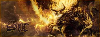
I added my Piano set. :)

And I decided to go a new direction with my WIP:

Posted Image

I'm trying to find some cool text to go with it. C/C?

~V.

Edited by Vaughan, 28 May 2007 - 03:34.

Posted Image

-Tha' rewf iz awn fiyah-

#34 Nexolate

    The Hated

  • Member
  • 3078 posts

Posted 28 May 2007 - 10:43

No ideas on Text, but that is one sweet Sig mate.

8.5/10.
Posted Image
You'll only notice me when it's too late.
Posted Image

#35 Warbz

    IRC is just a multiplayer notepad.

  • Project Team
  • 4646 posts

Posted 28 May 2007 - 10:48

yeh much better

Posted Image

#36 Waris

    Endless Sip

  • Gold Member
  • 7458 posts
  • Projects: The End of Days, DTU Donutin Council Co-Chairman

Posted 28 May 2007 - 10:52

Eye-catching and not over-complicated.

#37 Sic

    Veteran

  • Project Team
  • 5507 posts
  • Projects: NLS 2D Artist, Code 13 Cameo Artist

Posted 28 May 2007 - 15:33

I really like that. It's got simplicity and it looks pleasing.
Posted ImagePosted Image
Posted Image

#38 Dauth

    <Custom title available>

  • Gold Member
  • 11193 posts

Posted 28 May 2007 - 18:13

Love the Piano set, and the WIP looks good too.

#39 Vaughan

    Professional

  • Member
  • 390 posts
  • Projects: Resident Knicker.

Posted 29 May 2007 - 01:45

Thanks, mates. :)

I'm still working on the text. :D

~V.
Posted Image

-Tha' rewf iz awn fiyah-

#40 Whitey

    <Custom title available>

  • Member
  • 8743 posts

Posted 29 May 2007 - 02:39

Nice stuff man, Lovin' the piano. Not lovin the centered-ness of it, never liked the centered sigs, they look off-balance.

#41 Vaughan

    Professional

  • Member
  • 390 posts
  • Projects: Resident Knicker.

Posted 29 May 2007 - 02:57

How can a centered signature be off-balance? :)

Oh well, we all have our opinions. :D

~V.
Posted Image

-Tha' rewf iz awn fiyah-

#42 Whitey

    <Custom title available>

  • Member
  • 8743 posts

Posted 29 May 2007 - 03:13

Measure the distance from the sig to the left side of the page, then measure it to the right. You'll notice a discrepency.

Also, the lil' white line doesn't lead into the centered sigs, so grr argh.

#43 Vaughan

    Professional

  • Member
  • 390 posts
  • Projects: Resident Knicker.

Posted 29 May 2007 - 04:03

Oh!

I thought you mean signatures with a center-piece. :D

Ah, you meant the actual position on the thread, now I see. That's a different story. :D

It's a tough decision, but I prefer them centred, it gives them more of a "solo" feel, if you know what I mean. Even though the white dotted line is to the far left, I usually try to ignore it. :)


EDIT: More work on my WIP.. Tried a font, don't know what I think about it though..

Posted Image

~V.

Edited by Vaughan, 29 May 2007 - 04:44.

Posted Image

-Tha' rewf iz awn fiyah-

#44 Crazykenny

    Eternal Glow

  • Project Team
  • 7683 posts

Posted 29 May 2007 - 08:14

Awesome sig mate :)
Posted Image

#45 Dauth

    <Custom title available>

  • Gold Member
  • 11193 posts

Posted 29 May 2007 - 09:12

I can see why you don't know, i don't either. you could try running blood down the centre of the sword, (the dip was intended for this use).

#46 Vaughan

    Professional

  • Member
  • 390 posts
  • Projects: Resident Knicker.

Posted 29 May 2007 - 15:53

I know, but I think it'd make it look too bloody. :P

~V.
Posted Image

-Tha' rewf iz awn fiyah-

#47 Sgt. Nuker

    Greenskin Inside

  • Global Moderator
  • 13457 posts
  • Projects: Shoot. Chop. Smash. Stomp.

Posted 29 May 2007 - 19:41

The font choice is perfect for its location. Gives the appearance of a "fresh" kill.

@Dauth: Correct me if I'm wrong, but I could have sworn the dip/indentation on a sword was meant to give it strength, not a valley for blood to spill down.


Regards,

Nuker
Posted Image

#48 Vaughan

    Professional

  • Member
  • 390 posts
  • Projects: Resident Knicker.

Posted 29 May 2007 - 20:19

Thanks, Nuker. I'm not sure about the indentation, I've heard that it was also to make the sword more lightweight. :P

And here's a new experimentation.. I'm aiming for it to be a high-quality User-"Bubble", if you know what I mean.

Posted Image

~V.
Posted Image

-Tha' rewf iz awn fiyah-

#49 Dauth

    <Custom title available>

  • Gold Member
  • 11193 posts

Posted 29 May 2007 - 20:30

@Vaughan i like the bubble

@Nuker, imagine what happens when you stick a plain sword in someone, some blood spills out but then a vacuum forms and it can be very hard to remove the sword, from a bloke whos trying to hack your guts out. The dip allows a flow of blood or air in and out of the wound thus allowing the sword to be removed, the curve is a strong shape and is another beneficial effect of the dip.

#50 Vaughan

    Professional

  • Member
  • 390 posts
  • Projects: Resident Knicker.

Posted 29 May 2007 - 20:35

@ Dauth, Yes that makes sense now. :P

Here's a more proffessional version of the "User Bubble"

Posted Image


~V.
Posted Image

-Tha' rewf iz awn fiyah-


1 user(s) are reading this topic

0 members, 1 guests, 0 anonymous users