It looks great, though I'd like the middle text to be a bit larger if possible.
For the second one, I mad an error, please make it say "Capitalism" instead of "Capitalist".

Hangar 13 Design
Started By Jok3r, Jan 05 2008 05:04
266 replies to this topic
#101
-
- Member Test
-

- 2197 posts
Grand Poobah and Lord High Everything Else
-
Projects: Where parallels meet.
Posted 22 April 2008 - 05:38
 19681107
#102
-
- Project Team
-

- 1909 posts
veritas vos liberabit
-
Projects: Hangar 13 Projects
Posted 22 April 2008 - 11:06
ok, sounds good. Also, can you thumbnail those... it takes ages to scroll down now...
~Swimmer
~Swimmer
kinda, sorta alive.
#103
-
- Member Test
-
- 2197 posts
Grand Poobah and Lord High Everything Else
-
Projects: Where parallels meet.
Posted 22 April 2008 - 17:44
How do I thumbnail them?
19681107
#104
-
- Project Team
-
- 1909 posts
veritas vos liberabit
-
Projects: Hangar 13 Projects
Posted 27 April 2008 - 03:39
I dont remember O.o
CnC?
~Swimmer
CnC?
~Swimmer
kinda, sorta alive.
#105
-
- Member Test
-
- 2197 posts
Grand Poobah and Lord High Everything Else
-
Projects: Where parallels meet.
Posted 27 April 2008 - 05:26
 The Swimmer, on 27 Apr 2008, 3:39, said:
I dont remember O.o
CnC?
~Swimmer
CnC?
~Swimmer
Not to be whiney, but are they done yet?
19681107
#106
-
- Project Team
-
- 1909 posts
veritas vos liberabit
-
Projects: Hangar 13 Projects
Posted 03 May 2008 - 06:48
@Dobbs. Is the end of the weekend good (sorry I've been putting this off)
My latest. CnC PLEASE, I'm really just not getting any most of the time
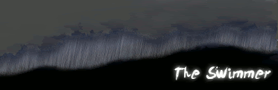
~Swimmer
My latest. CnC PLEASE, I'm really just not getting any most of the time
~Swimmer
kinda, sorta alive.
#107
-
- Member Test
-
- 2197 posts
Grand Poobah and Lord High Everything Else
-
Projects: Where parallels meet.
Posted 03 May 2008 - 07:08
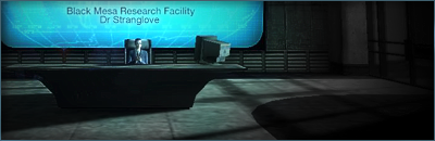
It looks like acid rain! 
19681107
#108
-
- Administrator
-

- 5846 posts
Whispery Wizard
Posted 03 May 2008 - 07:16
I love the effects, shame they don't go to the top as imo it would look much better.
But it still looks cool.
But it still looks cool.

F O R T H E N S

#109
-
- Project Team
-
- 1909 posts
veritas vos liberabit
-
Projects: Hangar 13 Projects
Posted 09 May 2008 - 01:24

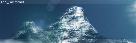
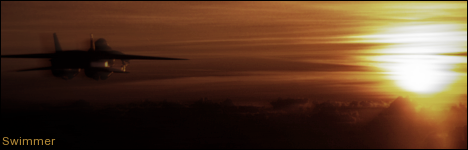
CnC? Not feeling so creative, but I think it turned out OK.
~Swimmer
kinda, sorta alive.
#110
-
- Member
-
- 2591 posts
sniper extrordanare
Posted 09 May 2008 - 01:32
it looks good, however the render looks lost, floating out in the middle of the sig like that, and a border would give it that bit of finish
Sig and avy by yours truly

#111
-
- Project Team
-
- 1909 posts
veritas vos liberabit
-
Projects: Hangar 13 Projects
Posted 18 May 2008 - 22:41
CnC?
Also, @Strangelove- I have a couple questions about your sig. Hit me up on MSN and I can finish those up for you.
~Swimmer
kinda, sorta alive.
#112
-
- Project Team
-
- 1909 posts
veritas vos liberabit
-
Projects: Hangar 13 Projects
Posted 19 May 2008 - 20:14
Edit'd- 2px stroke border, effects intensified a bit, text re-done
Comment, mortals
~Swimmer
Comment, mortals
~Swimmer
kinda, sorta alive.
#113
-
- Project Team
-
- 1909 posts
veritas vos liberabit
-
Projects: Hangar 13 Projects
Posted 21 May 2008 - 02:30
Come on people, comment!
CnC? Please, any ideas for better font placement?
Also- if anyone wants this one, it may be up for grabs...
~Swimmer
CnC? Please, any ideas for better font placement?
Also- if anyone wants this one, it may be up for grabs...
~Swimmer
Edited by The Swimmer, 21 May 2008 - 02:31.
kinda, sorta alive.
#114
-
- Project Team
-
- 523 posts
<Custom title available>
-
Projects: European Conflict
Posted 21 May 2008 - 07:43
I have no Critism it looks awesome.
The font is placed very well, it doesnt distract you from the rest of the Sig but is still noticeable enough to be seen.
The font is placed very well, it doesnt distract you from the rest of the Sig but is still noticeable enough to be seen.
#115
-
- Administrator
-
- 9333 posts
Not a Wonky Gent.
Posted 21 May 2008 - 09:20
The Swimmer, on 19 May 2008, 21:14, said:
Edit'd- 2px stroke border, effects intensified a bit, text re-done
Comment, mortals
~Swimmer
Comment, mortals
~Swimmer
Looks pretty sweet, I think the border needs to be a different colour though, doesn't really reflect the colour of ES blue/Soviet red backgrounds. Other than that, lovin' it
The Swimmer, on 21 May 2008, 3:30, said:
Come on people, comment!
CnC? Please, any ideas for better font placement?
Also- if anyone wants this one, it may be up for grabs...
~Swimmer
CnC? Please, any ideas for better font placement?
Also- if anyone wants this one, it may be up for grabs...
~Swimmer

The font/colour works well with the pic, although I think it could do with a little bit of blending with the rest of the sig
Edited by Bob, 21 May 2008 - 18:11.

F O R T H E N S

#116
-
- Project Team
-
- 523 posts
<Custom title available>
-
Projects: European Conflict
Posted 21 May 2008 - 11:56
Quote
It's ok, but for such a large sig I would expect there to be more going on it, from my point of view all I see is a cropped image with a name slapped on.
I thought that he had made the back ground or edited at least
 still is good though.
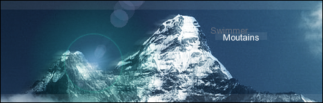
Forgot to comment on the one with the mountains in it earlier, that one is nicely done swimmer.
keep em coming

#117
-
- Administrator
-
- 9333 posts
Not a Wonky Gent.
Posted 21 May 2008 - 13:21

but my comment was aimed at the sig rather than the image, so whether it's a stock photo or a 'shopped image is irrelevant
Edited by Bob, 21 May 2008 - 18:12.
F O R T H E N S
#118
-
- Project Team
-
- 1909 posts
veritas vos liberabit
-
Projects: Hangar 13 Projects
Posted 21 May 2008 - 16:24
The picture is shopped. A lot of colour/focus enchancements, though I didn't touch my brushes, just manipulated what I had. A lot. Anyway- what would you suggest I add? I'm still working with the font. Lately I've been getting into stock sigs like this, though, so expect more of them.
~Swimmer
~Swimmer
kinda, sorta alive.
#119
-
- Project Team
-
- 4073 posts
[Pantsu-Dan]
-
Projects: Commanding the ECA 33rd Ground Assault Team.
Posted 21 May 2008 - 16:26
Maybe the USAF Logo. And some Effects in your ame wouln't hurt much


 Black Lagoon OST
#120
-
- Project Team
-
- 1909 posts
veritas vos liberabit
-
Projects: Hangar 13 Projects
Posted 21 May 2008 - 17:32
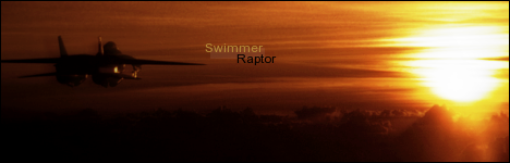
That look a little better?
~Swimmer
kinda, sorta alive.
#121
-
- Project Team
-
- 4073 posts
[Pantsu-Dan]
-
Projects: Commanding the ECA 33rd Ground Assault Team.
Posted 21 May 2008 - 17:50
Asshole, That's a F-15 Eagle. D:
Black Lagoon OST#122
-
- Project Team
-
- 1909 posts
veritas vos liberabit
-
Projects: Hangar 13 Projects
Posted 21 May 2008 - 17:53
Yeah, I know. But the Raptor is in generals, and Eagle (or F-15) looks really bad. Plus, most people aren't going to notice. Any comment on the sig itself?
kinda, sorta alive.
#123
-
- Administrator
-
- 9333 posts
Not a Wonky Gent.
Posted 21 May 2008 - 18:06
Guh apologies, I've done it again... I really need to stop commenting on sigs at work, after seeing the sig on a decent screen (i.e. here), it is indeed very good.
Good work
Good work
F O R T H E N S
#124
-
- Project Team
-
- 1909 posts
veritas vos liberabit
-
Projects: Hangar 13 Projects
Posted 22 May 2008 - 01:32
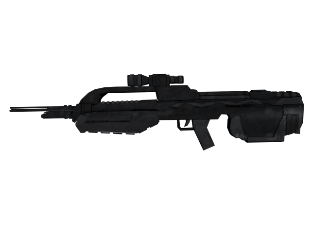
Ok, time for something decidededly different- my first proper skin.
Not completely done yet, (Has to be tweaked some more, and I need to do the glass for the scope) but comment plz (its been applied, the model is by a guy called Iron_Joe, not registered here, though)
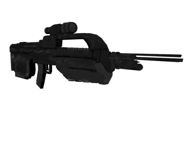
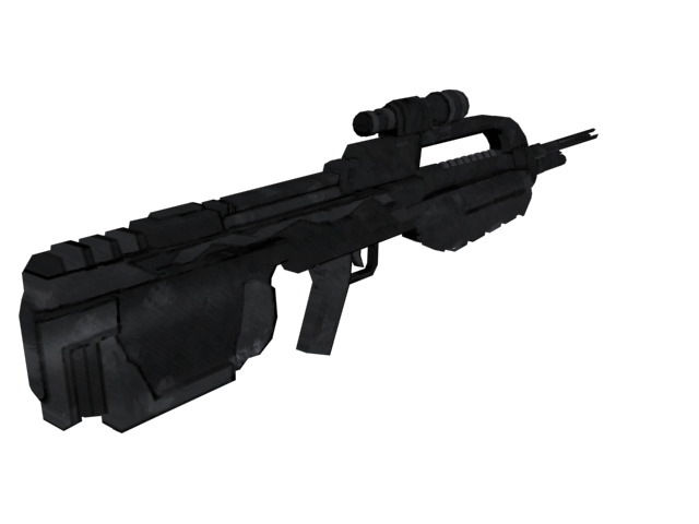
Not completely done yet, (Has to be tweaked some more, and I need to do the glass for the scope) but comment plz (its been applied, the model is by a guy called Iron_Joe, not registered here, though)
kinda, sorta alive.
#125
-
- Member
-
- 924 posts
Usa, I'm Thirsty
Posted 22 May 2008 - 01:41
Like I said on MSN that Bullpup is Fucking Awesome !
 ]
]1 user(s) are reading this topic
0 members, 1 guests, 0 anonymous users

