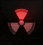
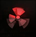
Basicly the top caution symbol is suppose to spin, however I don't have the resources to animate it here. I think it's an interesting logo, with the potential to be
used elseware in the future. :sly :

Edited by Nem, 27 May 2010 - 16:53.

Director
Posted 27 May 2010 - 16:47
Edited by Nem, 27 May 2010 - 16:53.
Director
Posted 27 May 2010 - 17:13
Edited by Nem, 27 May 2010 - 17:15.
Member Title Goes Here
Posted 27 May 2010 - 17:19

Director
Posted 27 May 2010 - 18:23
Edited by Nem, 27 May 2010 - 18:25.
Director
Posted 08 June 2010 - 08:36


Edited by Mr.Dr., 08 June 2010 - 08:45.
Rocket soldier
Posted 08 June 2010 - 08:46
 Chyros, on 11 November 2013 - 18:21, said:
Director
Posted 08 June 2010 - 08:51
ThatDR, on 8 Jun 2010, 4:46, said:

Formerly known as Scopejim
Posted 08 June 2010 - 10:07

Human Being number 80446219302
Posted 08 June 2010 - 11:34
Mr.Dr., on 8 Jun 2010, 9:51, said:

Director
Posted 25 June 2010 - 00:43
TheOtherDR, on 8 Jun 2010, 7:34, said:
Edited by Nem, 25 June 2010 - 00:43.
Whispery Wizard
Posted 25 June 2010 - 09:31
 ).
).


Member Title Goes Here
Posted 25 June 2010 - 10:22
Director
Posted 30 June 2010 - 04:53
Alias, on 25 Jun 2010, 6:22, said:

Edited by Nem, 30 June 2010 - 08:06.
That pro guy.
Posted 30 June 2010 - 07:35
Professional
Posted 30 June 2010 - 14:15


YOUR WORLDS WILL BECOME OUR LABORATORIES
Posted 30 June 2010 - 15:02

Forum Keymist
Posted 30 June 2010 - 18:01
partyzanpaulzy, on 30 Jun 2010, 16:15, said:
 .
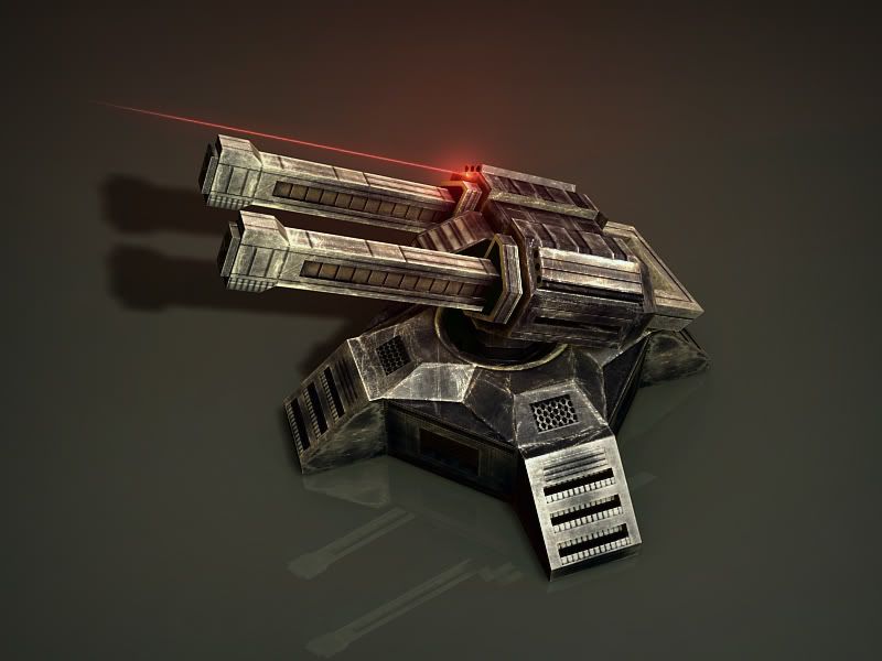
. !! It looks really detailed and beautiful.

¯\_(ツ)_/¯
Posted 30 June 2010 - 18:12
Director
Posted 01 July 2010 - 02:33
Pav:3d, on 30 Jun 2010, 11:02, said:
WarMenace, on 30 Jun 2010, 14:12, said:
Rocket soldier
Posted 01 July 2010 - 02:38

Chyros, on 11 November 2013 - 18:21, said:
¯\_(ツ)_/¯
Posted 01 July 2010 - 02:44
Director
Posted 20 July 2010 - 23:26

Edited by Nem, 20 July 2010 - 23:26.
[...beep...]
Posted 20 July 2010 - 23:28
Director
Posted 24 July 2010 - 05:57
Wizard, on 20 Jul 2010, 18:28, said:
<Custom title available>
Posted 24 July 2010 - 06:49
0 members, 1 guests, 0 anonymous users

Community Forum Software by IP.Board 3.2.0
Licensed to: Fallout Studios
