Your text in your latest one feels too big, perhaps instead of making large text, use two different lines. EG: One with your name and one with the subject of the sig.
If it was a Mario sig for example, you could put your name, and then under it you could put Mario.
Also, try to use colours from the render in the BG, but make sure the BG isn't just one colour, single colour BGs look boring and just don't work.
Try adding a border. There are multiple ways of adding a border in Photoshop and each produce different results. Here is my favorite way to add a simple border.
If you want to spice the border up, try changing the layer blending mode and/or the opacity of the layer (The blending modes are next to the opacity of the layers tab).

Aarons Zone
Started By Zhao, Dec 25 2009 14:53
98 replies to this topic
#27
-
- Project Team
-

- 619 posts
That pro guy.
-
Projects: Situation Zero
Posted 28 December 2009 - 04:49


I tried the text thing but the pieces never seem to fit together. I look online all over the place for tutorials that cover this but none of them do
#28
-
- Member
-

- 2591 posts
sniper extrordanare
Posted 28 December 2009 - 06:26
 Zhao, on 27 Dec 2009, 23:49, said:
i like this one, the lighting flows well, the text is noticable, but not overpowering, and it has a soft feel. The border feels a little off somehow, but i can't put my finger on it. overall a nice sig though.
Quote
this sig has potential, but to me, it seems unfinished. bowser looks like he was just slapped on, and the text is lacking. both are easy fixes though, bowser can be blended in with some lighting effects or a stock image overlayed, the text is really a feel thing, i've never been any good with text in my siggys, but playing with different effects and settings untill you get something that looks cool is always fun.
keep it up. you're doing well

Sig and avy by yours truly

#29
-
- Administrator
-

- 5846 posts
Whispery Wizard
Posted 28 December 2009 - 13:52
Zhao, on 28 Dec 2009, 4:49, said:
I tried the text thing but the pieces never seem to fit together. I look online all over the place for tutorials that cover this but none of them do
The reason they aren't "fitting" is that your rotating the text, it might be a good idea to keep it horizontal.
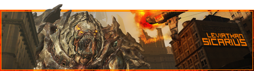
Also, it might be a good idea to use a "squarer" font, so they can stack together, much like this one i made for Sicarius.
Your sigs are looking alot better, its amazing how far you have come over a few days.

F O R T H E N S
#30
-
- Project Team
-
- 923 posts
Ecchi Toaster
-
Projects: Spam
Posted 28 December 2009 - 15:32
I agree with DR and also learnt the hard way that rotated text is a bitch to work with in sigs. Also its nice that there is CLEAR improvements from you last ones, keep up the work. One advice for you, use multiple brushes to create the background and NEVER use built in effect to make a bg.


Awesome radio
Quote
19:44 - Chyros: I'm very harmless
#31
-
- Project Team
-
- 619 posts
That pro guy.
-
Projects: Situation Zero
Posted 28 December 2009 - 15:35
I do you get it so your signatures stick out like they do.
There out of the borders oO
There out of the borders oO
Edited by Zhao, 28 December 2009 - 15:35.
#32
-
- Project Team
-
- 923 posts
Ecchi Toaster
-
Projects: Spam
Posted 28 December 2009 - 15:43
It is easily done with multiple layers and exported as a PNG.
Awesome radio
Quote
19:44 - Chyros: I'm very harmless
#33
-
- Project Team
-
- 2501 posts
Human Being number 80446219302
Posted 01 January 2010 - 10:47
You just erase all background and save the image as a PNG.
Borders are simply done manually by selections, filling, and different layer types. It's best to experiment really, thats the best way to learn.
Look for tutorials and apply other knowlege to the sig that comes through the tutorial. by the time you're done you will know of a load of tricks and effects that you can produce yourself.
You will come to learn that generic photoshop effects aren't that great; but when you edit settings, combine effects and tailor your own way of doing things, then you can vastly improve both quality and wow factor, even in the smallest of things.
Edited by Nidmeister, 01 January 2010 - 16:44.
#34
-
- Project Team
-
- 619 posts
That pro guy.
-
Projects: Situation Zero
Posted 11 April 2010 - 07:10
How do i add nice environment for renders like this?

+
(For example)

I can't find a switch in 3dsmax 7 enviroment tool that allows me to import a custom picture.
(aaron = zhao for all you admins )
)
+
(For example)
I can't find a switch in 3dsmax 7 enviroment tool that allows me to import a custom picture.
(aaron = zhao for all you admins
)
#35
-
- Gold Member
-

- 5114 posts
Formerly known as Scopejim
-
Projects: Life
Posted 11 April 2010 - 08:50
I think you would use Photoshop? You render it on a blank background as you did, then cut the render and add it in as a layer in PS and work it out.

#36
-
- Member
-
- 11705 posts
Member Title Goes Here
Posted 11 April 2010 - 09:13
It's far easier to render on a transparent background than on white.

#37
-
- Project Team
-
- 619 posts
That pro guy.
-
Projects: Situation Zero
Posted 11 April 2010 - 16:42
I clicked environment and tryed "None" And it showed a black background , how do i get it to show just the model and the rest transpartent , or is that just photoshop work
#38
-
- Member
-
- 11705 posts
Member Title Goes Here
Posted 11 April 2010 - 16:48
When you render the model in 3ds, save the output as PNG and make sure that "use alpha channel" is selected.
#39
-
- Project Team
-
- 619 posts
That pro guy.
-
Projects: Situation Zero
Posted 11 April 2010 - 17:22
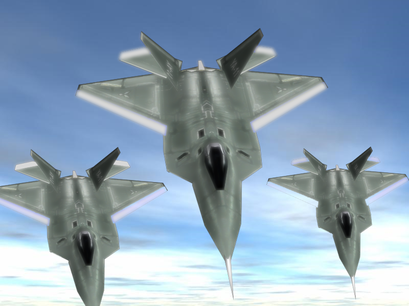
How could i improve this
#40
-
- Project Leader
-

- 7224 posts
YOUR WORLDS WILL BECOME OUR LABORATORIES
-
Projects: EC, CORE, ER
Posted 11 April 2010 - 17:58
Slightly less glow/blur, sharpen it up a bit.
Add exhaust trails and wing tip trails.
You need to define a light source, IE in the top right and add some fake shadows/highlights. (Or you could just render it in 3ds with shadows)
edit: also you need proper housecolor on those white areas
Add exhaust trails and wing tip trails.
You need to define a light source, IE in the top right and add some fake shadows/highlights. (Or you could just render it in 3ds with shadows)
edit: also you need proper housecolor on those white areas
Edited by Pav3d, 11 April 2010 - 18:06.
#41
-
- Gold Member
-
- 4950 posts
Light up life.
Posted 11 April 2010 - 18:46
And possibly alter the angle of descent, planes don't often descend all but vertically - make the image look more realistic, you don't have to display the entire one side of them.
For there can be no death without life.
#42
-
- Project Team
-
- 619 posts
That pro guy.
-
Projects: Situation Zero
Posted 11 April 2010 - 18:59
how do i add exhaust trails ' also angle of decent?
#43
-
- Gold Member
-
- 4950 posts
Light up life.
Posted 11 April 2010 - 19:11
Angle of descent. So instead of flying vertically downwards like the picture suggests, perhaps have them angled at about 50 degrees towards the screen:

For there can be no death without life.
#44
-
- Project Team
-
- 619 posts
That pro guy.
-
Projects: Situation Zero
Posted 12 April 2010 - 02:11
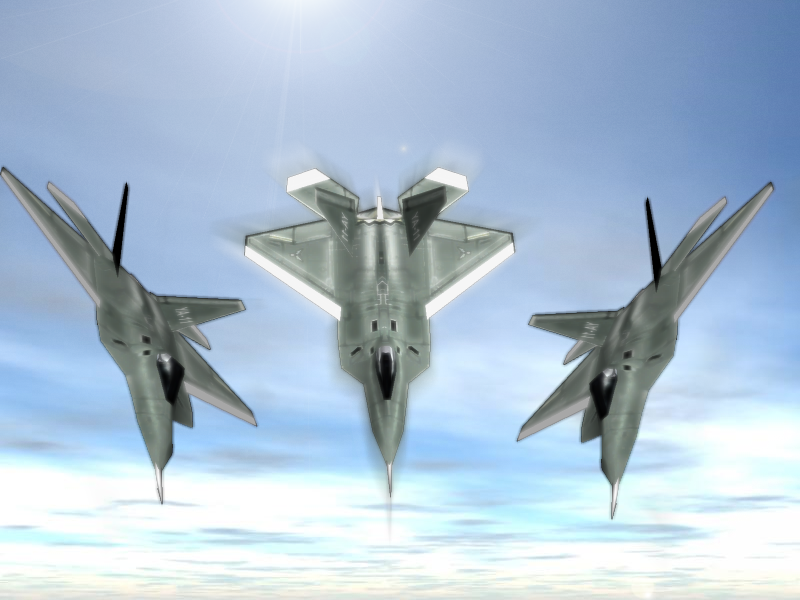
Better? i could not get the trails to save my life.
#45
-
- Administrator
-
- 9333 posts
Not a Wonky Gent.
Posted 13 April 2010 - 00:08
You still have a problem with descent angle. I would suggest using a different background... if you want to use the position you have at the moment, you need a birds-eye-view of a city or some land. Also the shadows still need a lot of work... from the looks of it, you just flipped the plane on the right to the left (or vise-versa) which, apart from being noticeable, it means the shadows/lighting doesn't make sense.
If you want trails, one method would be to find a picture of something along the lines of what you want, and copy + paste it in. (obviously editing where needed)
If you want trails, one method would be to find a picture of something along the lines of what you want, and copy + paste it in. (obviously editing where needed)
Edited by Bob, 13 April 2010 - 00:12.

F O R T H E N S

#46
-
- Project Team
-
- 619 posts
That pro guy.
-
Projects: Situation Zero
Posted 13 April 2010 - 00:56
How do i work on shadows?
#47
-
- Administrator
-
- 9627 posts
[...beep...]
Posted 13 April 2010 - 09:30
I'd work on fixing your photobucket account first mate.
#48
-
- Project Team
-
- 619 posts
That pro guy.
-
Projects: Situation Zero
Posted 13 April 2010 - 11:23
Fixed the 2 images neccesary
#49
-
- Member
-
- 11705 posts
Member Title Goes Here
Posted 13 April 2010 - 11:25
Use dodge and burn to work on the lighting.
#50
-
- Project Team
-
- 619 posts
That pro guy.
-
Projects: Situation Zero
Posted 07 May 2010 - 20:31
I have finally figured out how to use UVM as well as apply skins and create them on a basic level.
Now ill upload my 1st model/skin here to remind me how bad i was when i started
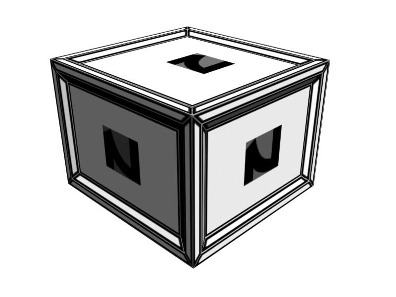
Does anyone know how to get rid of that werid stuff around the "Z"
Admins / Change the threads name to Aarons art zone kthxbai.
Now ill upload my 1st model/skin here to remind me how bad i was when i started
Does anyone know how to get rid of that werid stuff around the "Z"
Admins / Change the threads name to Aarons art zone kthxbai.
Edited by Aaron, 07 May 2010 - 20:35.
1 user(s) are reading this topic
0 members, 1 guests, 0 anonymous users

