Jump to content


Futschki Sigs.


11 replies to this topic

#1 Futschki

    Duh!

  • Member
  • 2835 posts

Posted 04 January 2010 - 16:23

Hello everyone, I'm formerly known as Abourror, and I was a kinda active member of the community.
So I thought I'd just make a sigs thread instead of a 'Hey I'm back' in general discussions.

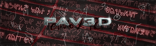
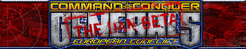
So since first semester is almost done in the uni, I have some freetime so I thought I'd go back to making sigs, anyway there we go:

Posted Image

I've been listening a lot to evanescence's songs lately ... Opinions :shakehead: ?
Posted Image

#2 Pav:3d

    YOUR WORLDS WILL BECOME OUR LABORATORIES

  • Project Leader
  • 7224 posts
  • Projects: EC, CORE, ER

Posted 04 January 2010 - 16:46

Looks gd! maybe sharpen it a bit?

Posted Image

Posted Image

#3 Futschki

    Duh!

  • Member
  • 2835 posts

Posted 04 January 2010 - 16:47

You mean sharpen the render, the background? or all of it?
Posted Image

#4 Pav:3d

    YOUR WORLDS WILL BECOME OUR LABORATORIES

  • Project Leader
  • 7224 posts
  • Projects: EC, CORE, ER

Posted 04 January 2010 - 16:49

Bg and render, words may come up funnily if sharpened, play with it :shakehead:

Posted Image

Posted Image

#5 TheDR

    Whispery Wizard

  • Administrator
  • 5845 posts

Posted 04 January 2010 - 16:52

I think he means sharpen it all.

The only thing i think its missing is a second colour, otherwise its very good.

Edit: It all depends on the level of sharpness and how blurry the text was before, i think that text would look fine after a sharpen, but i could be wrong :shakehead:

Edited by TheDR, 04 January 2010 - 16:53.

Posted Image
F O R T H E N S
Posted Image

#6 Futschki

    Duh!

  • Member
  • 2835 posts

Posted 04 January 2010 - 16:59

Hmm.. yeah I see your point, but I don't think it'd look better since that's not really a text, it's their lyrics brushes. But I think I could recreate those they'd look kinda better?

Edit: Sharpened a bit:
Posted Image

You can compare with my current sig, better?

Edited by Futschki, 04 January 2010 - 17:14.

Posted Image

#7 TheDR

    Whispery Wizard

  • Administrator
  • 5845 posts

Posted 04 January 2010 - 17:28

The sharping looks great, maybe it could do with being toned down a notch on the main text, but otherwise it looks much clearer and eye catching.
Posted Image
F O R T H E N S
Posted Image

#8 Ion Cannon!

    Mountain Maniac

  • Gold Member
  • 5812 posts
  • Projects: European Conflict - Particle FX & Coder

Posted 04 January 2010 - 17:29

Looks much better than the unsharpened version :shakehead:
Posted Image

Posted Image

#9 CJ

    Rocket soldier

  • Member Test
  • 2150 posts
  • Projects: Nothing yet

Posted 04 January 2010 - 17:57

Just remove the sharpening on your nickname as the font you used doesn't suit the effect well :shakehead:
Also, the avatar is way too blurry, and " where was my" looks like " where was mg" D:

Other than that, it's great :read:

View PostChyros, on 11 November 2013 - 18:21, said:

I bet I could program an internet


#10 Futschki

    Duh!

  • Member
  • 2835 posts

Posted 04 January 2010 - 18:38

Uhm tried to fix that:
Posted Image

Opinions?
Posted Image

#11 Nem

    Director

  • Gold Member
  • 1417 posts

Posted 04 January 2010 - 21:13

Not a fan of the dimensions but the that is some awesome font. Nice work, and good to see you around.

#12 Libains

    Light up life.

  • Gold Member
  • 4950 posts

Posted 04 January 2010 - 22:17

Good to see you again Fut, some nice work on that sig, especially with the few modifications made since the initial one :shakehead:
For there can be no death without life.


1 user(s) are reading this topic

0 members, 1 guests, 0 anonymous users