

Sic's artwork thread - SEEKING ATTENTION
Started By Sic, Jul 06 2006 08:28
685 replies to this topic
#676
-
- Project Team
-

- 5507 posts
Veteran
-
Projects: NLS 2D Artist, Code 13 Cameo Artist
Posted 29 May 2008 - 21:47


#677
-
- Administrator
-

- 9627 posts
[...beep...]
Posted 29 May 2008 - 21:58
May I be perhaps a touch on the hyper critical side?
Assuming I can be........I want to like this but there is something in it that is stopping me. I think it's the depth. As usual your BG is awesome, detailed, beautifully textured, great composition, well flawless. Sadly I can't say the for the render(s). I personally like the split focal as the choice of second render ruins the flow. I would've placed your nic to far left and then perhaps moved the render more into the centre, perhaps a third of the way across. I also am not overly keen how you have allowed the BG texture to overlay the render (or vice a versa). It does detract from the quality of it. Also the lighter shading behind the render removes any and all depth that it has. The light source seems to come from the upper right of the render and not behind it. The shadows are seemingly meaningless as a result and depth is removed.
If I can't be hyper critical.........I love it! Great work man!
Sorry if that sounds harsh, but just some general thoughts.
#678
-
- Project Team
-
- 5507 posts
Veteran
-
Projects: NLS 2D Artist, Code 13 Cameo Artist
Posted 30 May 2008 - 11:51
Criticism like that never sounds harsh, trust me. I like that kind of thing. But from the amount of it, I don't know what to start fixing  .
.
As for the render on the left, I created two copies on top of the layer and played with opacity and motion blur on them,
.As for the render on the left, I created two copies on top of the layer and played with opacity and motion blur on them,
Edited by Sic, 30 May 2008 - 11:52.
#679
-
- Administrator
-
- 9627 posts
[...beep...]
Posted 30 May 2008 - 16:03
I'd start by ermoving the texture on the render everywhere but the face. There it gives it an added edge. Then I'd remove the highlight behind the render as well. Perhaps also if you could flip the lefthand mini-render 180 degrees it might help improve the flow.
#680
-
- Project Team
-
- 5507 posts
Veteran
-
Projects: NLS 2D Artist, Code 13 Cameo Artist
Posted 30 May 2008 - 16:13
Good idea, I will update later.
#681
-
- Project Team
-
- 5507 posts
Veteran
-
Projects: NLS 2D Artist, Code 13 Cameo Artist
Posted 02 June 2008 - 07:12

#682
-
- Project Team
-
- 5507 posts
Veteran
-
Projects: NLS 2D Artist, Code 13 Cameo Artist
Posted 19 June 2008 - 17:46
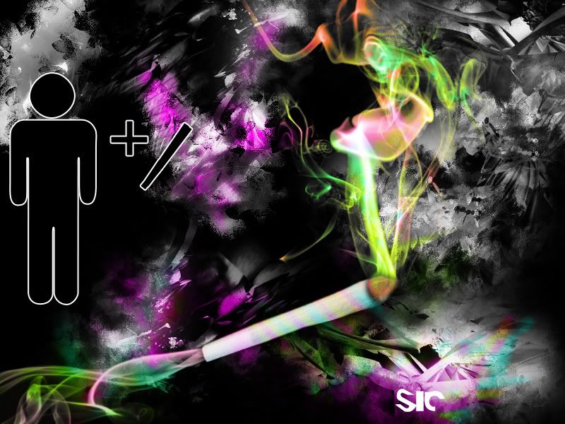

Spoiler
Edited by Sic, 19 June 2008 - 17:55.
#683
-
- Gold Member
-

- 4950 posts
Light up life.
Posted 19 June 2008 - 18:27
Well, while I don't approve of smoking in the least bit... that is:
Wierd
Wacky
Wonderful.
Nice work Sic!
Wierd
Wacky
Wonderful.
Nice work Sic!
For there can be no death without life.
#684
-
- Project Team
-
- 5507 posts
Veteran
-
Projects: NLS 2D Artist, Code 13 Cameo Artist
Posted 20 June 2008 - 14:54
The point was not smoking, the point was getting high.

Btw, smooder will love this.
Btw, smooder will love this.
Edited by Sic, 20 June 2008 - 14:55.
#685
-
- Gold Member
-
- 5114 posts
Formerly known as Scopejim
-
Projects: Life
Posted 23 June 2008 - 13:11
Joint!

#686
-
- Member
-

- 211 posts
Semi-Pro
-
Projects: Just Chilling
Posted 23 June 2008 - 13:16
Wow I love it  Trippy and awesome
Trippy and awesome

1 user(s) are reading this topic
0 members, 1 guests, 0 anonymous users

