Burnie´s Hot Photoshop Stuff
 Burnie
01 Apr 2006
Burnie
01 Apr 2006
OK i finished it 
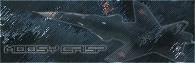
I hope you like it...maybe it´s not as good as cattmans, but I think it´s pretty good
Btw: Hope the Missing: ! in Mossy Crisp is no problem...unfortunatly the font had no ! in it. Don´t dorget to write a line like:"Sig made by Burnie" or somthing like that in your new sig.
And any comments from the others?
Burnie
01 Apr 2006
Tutorial??????????
I made this without any help or whatever.
and @Cboidy: Lol....i never saw that that looks like water..but OK xD
I made this without any help or whatever.
and @Cboidy: Lol....i never saw that that looks like water..but OK xD
Burnie
01 Apr 2006
Sry 4 dbbl post....but my next is so funny it should be on top 
So here´s it:
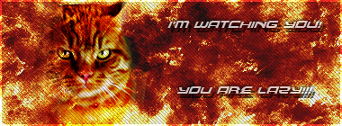
The Cat is in the sig, is my cat btw.
Like it?
So here´s it:
The Cat is in the sig, is my cat btw.
Like it?
Sgt. Nuker
01 Apr 2006
Very nice Burnie, very nice. It appears some people are just natural born sig makers
My best,
Major Nuker
My best,
Major Nuker
AKA_Slayer
03 Apr 2006
The one with the SU plane is nice, altough there is no focus to the work, I think
it will look better if you will put the SU's layer on top of the rest and apply like
60%-80% opacity, and maybe add a small effect to it.
The last one is also looking good(and funny ) but it is too empty. It still a good sig
dont worry
it will look better if you will put the SU's layer on top of the rest and apply like
60%-80% opacity, and maybe add a small effect to it.
The last one is also looking good(and funny
) but it is too empty. It still a good sigdont worry
Burnie
07 Apr 2006
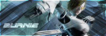
Uhmm...it´s the main caracter from a game called: P.N.03 or product number 03 
I never played it, but i thought the render looks pretty kool.
I never played it, but i thought the render looks pretty kool.
Cattman2236
07 Apr 2006
Hmmm it is indeed a lovely sig mate but i have some pointers for you.
1. The text needs to stand out a little more. Try giving the text a drop shadow of about 25% with the normal setting, then apply a stroke to the text...about a 2 pixel would be suficient.
2. This is optional but can improve the sig dramaticly. Get the Eraser tool, find a good soft nose brush (use the PS default brushes for that) and set the opacity and flow of the Eraser to about 50%, Then slightly erase the edges of the render, once finished it should hopefully blend in nicely.
Other than that mate, Nice job i like it.
Edited by Cattman2236, 07 April 2006 - 15:05.
but i have some pointers for you.1. The text needs to stand out a little more. Try giving the text a drop shadow of about 25% with the normal setting, then apply a stroke to the text...about a 2 pixel would be suficient.
2. This is optional but can improve the sig dramaticly. Get the Eraser tool, find a good soft nose brush (use the PS default brushes for that) and set the opacity and flow of the Eraser to about 50%, Then slightly erase the edges of the render, once finished it should hopefully blend in nicely.
Other than that mate, Nice job i like it.
Edited by Cattman2236, 07 April 2006 - 15:05.

Burnie
13 Apr 2006
Here´s a new abstract Sig from me 
Like it?

PS: Thanks to everyone who wrote me a pm due to my birthday
Like it?
PS: Thanks to everyone who wrote me a pm due to my birthday
Nexolate
13 Apr 2006
Very much so, a very nice sig...
I personally feel it's a little bit too green, if you understand what I mean...
I personally feel it's a little bit too green, if you understand what I mean...
Sgt. Nuker
14 Apr 2006
I hope your 16th b-day was a blast Burnie.
As for your sig, it reminds me of broken glass and a rainy night viewed through night vision. It's a good thing. I guess it's all based on who you are, as what I said is what I get out of it. Sort of reminds me of the Matrix too.
Good stuff Burnie!!
Regards,
Nuker
As for your sig, it reminds me of broken glass and a rainy night viewed through night vision. It's a good thing. I guess it's all based on who you are, as what I said is what I get out of it. Sort of reminds me of the Matrix too.
Good stuff Burnie!!
Regards,
Nuker
Burnie
16 Apr 2006
Sence I have nothing to do...here ya´ll go. Another fresh Sig by me.

Took ages to render the girl
And btw. the background is not just a pic of some cloud...too complicated to explain how I made it
And does anyone want a sig from me? Just to see what I could do and not always cattman
Took ages to render the girl
And btw. the background is not just a pic of some cloud...too complicated to explain how I made it
And does anyone want a sig from me? Just to see what I could do and not always cattman
Waris
16 Apr 2006
Is it just me, or her right hand burned to a shrink?
Other than that nice sig
Other than that nice sig
Baal-Zebub
16 Apr 2006
Burnie, on 17 Apr 2006, 05:36, said:
Yes.......very serious
I mean the gal does not appeal to me somehow...
Burnie
16 Apr 2006
btw: here´s a Sig, that I made for a friend:

Like it? Comments? more comments?
Like it? Comments? more comments?
