Wizard's Signatures
 Slightly Wonky Robob
09 Apr 2008
Slightly Wonky Robob
09 Apr 2008
 Wizard, on 9 Apr 2008, 13:35, said:
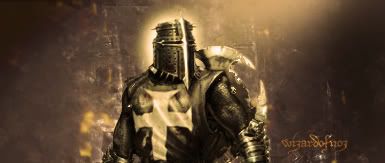
@ Bob, I burned the face and removed areas of several gradient maps to give it that effect. The original render was a great deal lighter but House always seems a moody bastard to me so I made it that way to make him seem more complex. Granted it isn't perfect. I personally like the shadows on his cheeks and the way his eyes pierce through the rest of the sig. As focal points go I was quite happy with that.
I think you may have misunderstood..
I'm fine with shadow, in fact i think, it gives it a little edge... however i think the satuartion / brightness is too high
EDIT: Apologies, it appears the screens at work are just crap, looking great here

Edited by Bob, 09 April 2008 - 16:54.
Wizard
09 Apr 2008
Dauth, on 9 Apr 2008, 15:07, said:
Wizard since you are opening the door to afore said shop.
Can I request a sig and avvy pairing, the only things I request, my name somewhere in the sig and that it looks ok in the blue theme (since it's the one I'll be looking at)
Cheers
Can I request a sig and avvy pairing, the only things I request, my name somewhere in the sig and that it looks ok in the blue theme (since it's the one I'll be looking at)
Cheers
Ah first customer. Certainly sir. *takes out measuring tape* Cash or account?
Troa Barton
11 Apr 2008
Wizardofnoz, on 7 Oct 2007, 2:50, said:
I know what you mean Hax. It's a bit cluttered. As I said this is a new style for me so it's gonna take a whole lotta time to get the composition and colouring right. Plus most of it was done with a hangover like a MOAB! :nurse: The retro look is really gonna burn me but I am gonna nail it if it kills me, or my PS!!! 
Thanks for your comments though. All greatly appreciated.
- Wizard
PS Like your new sig/avy combo! Nice!
Edit: Damn typos
Edit: Reworked sig
Thanks for your comments though. All greatly appreciated.
- Wizard
PS Like your new sig/avy combo! Nice!
Edit: Damn typos
Edit: Reworked sig
Wizardofnoz, on 6 Nov 2007, 22:43, said:
Thanks guys. Well done Major!!! But sorry to say that the Avy is actually transporter 2 as well. It's Lola!!
Here is my SOTW #49 entry

Had this one in my collection!
Here is my SOTW #49 entry
Had this one in my collection!
I like these two they're very cool!!!
Wizard
27 Apr 2008
Right, well good news is that I have foundly found my muse once again.


Edited by Wizard, 27 April 2008 - 22:01.
Edited by Wizard, 27 April 2008 - 22:01.
Dauth
27 Apr 2008
Looks good, I think the bottom one is the best.
May I have a word in you muse's ear?
May I have a word in you muse's ear?
LCPL Carrow
27 Apr 2008
Wizard, on 27 Apr 2008, 10:31, said:
I really like this one, if it wouldn't be a problem, would you mind replacing the M16/M203 with a SAW and putting my name on it please? If the SAW is too much, then just the name would be pure WIN too.

Outstanding job on all of your work, past and present. I just looked through this entire thread and I have to saw that I was very impressed with the quality of your work.
Wizard
27 Apr 2008
Sorry to say that the gun is stuck, it's a stock photo so not much I can do about it. But I will change the name for you tomorrow and you can have it. That said if you can find a decent picture, at least 500 x 500 px of something you like I will make you one.
LCPL Carrow
28 Apr 2008
That's awesome, thanks! Don't worry about the SAW, it's not that big a deal. I don't even like having to carry the thing anyway. 
Nid
31 May 2008
Wizard, on 31 May 2008, 20:29, said:

A very simple piece but just changing some normal rules.
Very nice piece, again, my friend.
Any chance you could get an Admin to implement that under your member information to the left of your posts?
Or is that impossible with this version of IPB?
Wizard
31 May 2008
Cheers mate. I am doubtful that IPB can cope with it. I know vBulletin can.
Sic
02 Jun 2008
This one is very nice, I like the background and the work on the render, but the font is too simple, I undestand it's your style but you could try to combine it with the render somehow, for example make it like it's engraved on his head.
You're art is the best on the forum at the moment.
Edited by Sic, 02 June 2008 - 06:50.
You're art is the best on the forum at the moment.
Edited by Sic, 02 June 2008 - 06:50.
Wizard
02 Jun 2008
I must admit the text did let it down. I spent so long working on the damn body I kinda got fed up with the text. I might try and fit the font in somewhere else, I quite like the idea of making it more discreet but I am not sure if engraving would conflict with the stylisation of the rest of it.....hmmm.
Thanks for the crit though Sic!
Thanks for the crit though Sic!
Slightly Wonky Robob
03 Jun 2008
Wizard, on 31 May 2008, 20:29, said:
A very simple piece but just changing some normal rules.
I never give 10/10 because I think nothing can be perfect... that gets a 9.9/10 from me (so close
)I don't really know what to say, tt is just made of win

Wizard, on 1 Jun 2008, 15:18, said:
Something new

Not as good as the other sig, but what is? Still a very nice sig, top notch work


Mr. Mylo
14 Jun 2008
That´s a nice signature... I really it.... especially the way you implemented your name.
Mr. Mylo himself
Mr. Mylo himself
Wizard
14 Jun 2008
Cheers Mylo
Here is another one

I think that this is probably at the highest standard of both technical skill, compostition and artisitic integrity I have ever made.
Here is another one
I think that this is probably at the highest standard of both technical skill, compostition and artisitic integrity I have ever made.
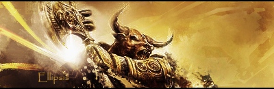
Ellipsis
14 Jun 2008
*drools*
Ahem, excuse me.
Nicely done, Wizard. Yet again, you have used your magical powers. :wink:
Do you think that you could make a sig for me out of this:

Thanks!
Ahem, excuse me.
Nicely done, Wizard. Yet again, you have used your magical powers. :wink:
Do you think that you could make a sig for me out of this:
Thanks!
Wizard
14 Jun 2008
hmmmmmm
*goes off to try something*
.......................ok
*tries it*
Edited by Wizard, 14 June 2008 - 16:02.
*goes off to try something*
.......................ok
*tries it*
Edited by Wizard, 14 June 2008 - 16:02.
