Wizard's Signatures
 Wizard
07 Jan 2009
Wizard
07 Jan 2009
Sweet Fuck-a-duck. What's this thread doing on page 4?!?!? Me thinks I have been slacking off.
*pours magical necro dust over thread*


My latest pairing. CnC please for anyone that cba'd.
*pours magical necro dust over thread*
My latest pairing. CnC please for anyone that cba'd.
Dauth
07 Jan 2009
They are just another level of swish, you haven't been afk, you've been making those sigs for the last 2 months haven't you?
Wizard
07 Jan 2009
 Dauth, on 7 Jan 2009, 9:53, said:
you haven't been afk, you've been making those sigs for the last 2 months haven't you?
*rumbled*
Slightly Wonky Robob
07 Jan 2009
Wizard, on 7 Jan 2009, 8:25, said:
I Don't think the thick white lines really work... it kinda looks like when someone puts a pick in paint, and don't know how to crop D:, but other than that, blending it top notch as usual.
Wizard, on 7 Jan 2009, 8:25, said:
Not much I can say on this one, just good work

Nid
07 Jan 2009
Welcome back Wizard.
You return with some more excellent work.
Nice to see you back again.
You return with some more excellent work.
Nice to see you back again.
Wizard
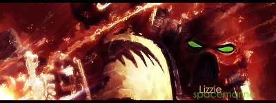
13 Jan 2009
Request from Lizzie
Edit: Damn img code
Edited by Wizard, 13 January 2009 - 21:39.
Edit: Damn img code
Edited by Wizard, 13 January 2009 - 21:39.
Wizard
15 Feb 2009
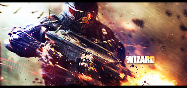
Latest bit I've done for myself. I need to get back into making these more often and now I have my new rig I probably will do.

Any thoughts are welcome.
Any thoughts are welcome.
Slightly Wonky Robob
15 Feb 2009
My main criticism (although more nitpicking  ) would be the white jagged shapes (which I presume) that have been set to overlay... they look kinda out of place. Other than that, yet another top notch sig
) would be the white jagged shapes (which I presume) that have been set to overlay... they look kinda out of place. Other than that, yet another top notch sig
Reaper94
18 Feb 2009
Very nice work, certainly better than anything I can do but I must agree that Bobs above comment about the white lines on your current sig don't work very well, I think it would look a lot better as just one image, as opposed to having half of it with the white line, other than that, very nice work and I await more. 
Ellipsis
21 Feb 2009
Wizard, on 15 Feb 2009, 16:41, said:
I like it, its different and it looks well.
Nice job, overall.
Wizard
10 Feb 2011
Gah fourth page of the desktop art forum .......  Shows you how long it's been since I made a signature.
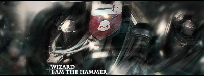
My variation on what TheDr. did for me.

Not that great imo, but I am fumbling my way back into it.
Shows you how long it's been since I made a signature.My variation on what TheDr. did for me.
Not that great imo, but I am fumbling my way back into it.
Slightly Wonky Robob
10 Feb 2011
Other than the rather harsh pixels you mentioned in IRC, looks pretty good.
TheDR
10 Feb 2011
Wizard, on 7 Jan 2009, 8:25, said:
Sweet Fuck-a-duck. What's this thread doing on page 4?!?!? Me thinks I have been slacking off.
Wizard, on 10 Feb 2011, 21:11, said:
Gah fourth page of the desktop art forum ....... Shows you how long it's been since I made a signature.
Shows you how long it's been since I made a signature.Two page 4 revives on the same page! A new record!
The sig looks pretty good, it flows well and you have made the character look positively angry. However you have turned it's awesome art style of Brink into what looks like a browny shooter. I guess i always try to capture the style of the game in the sig itself, maybe thats just a personal preference thing.
Anyway, glad to see you starting sigs again. Welcome back!
Wizard
10 Feb 2011
TheDR, on 10 Feb 2011, 21:37, said:
However you have turned it's awesome art style of Brink into what looks like a browny shooter.
Yeah, in all honesty you make a very good point there. However this wasn't an attempt to follow the art style, or even highlight it, it was more me trying to familiarise myself with some of the old techniques I've used in the past. In retrospect, it wasn't the ideal choice of stock to use, just something that I had in mind.
I could really use some suggestions for a stock or a render to work on next btw. I have soo many stored that I'm struggling to chose one and Bob is being no help

Edited by Wizard, 10 February 2011 - 21:48.
Slightly Wonky Robob
10 Feb 2011
Like I said on IRC, I do not like the stray pixels everywhere, it just looks completely out of place IMO.
TheDR
10 Feb 2011
I agree with Bob, it looks like random noise. Otherwise its very nice, the text and colours are a lot better this time.
Edited by TheDR, 10 February 2011 - 23:56.
Edited by TheDR, 10 February 2011 - 23:56.
Wizard
10 Feb 2011
TheDR, on 10 Feb 2011, 23:55, said:
it looks like random noise.
It's supposed to be random particles however, I think perhaps I didn't erase them as well as I should've done. And now they are about 8 "apply images" down so it'll have to stay that way.
TheDR
14 Feb 2011
I would like to request a signature for myself using one of these Timesplitters 2 images.
I'm making a FS Timesplitters Sig collection and each sig will be in my rotation (don't pick the same one Bob picked).
I'm making a FS Timesplitters Sig collection and each sig will be in my rotation (don't pick the same one Bob picked
).
Wizard
14 Feb 2011
No problem. Would you like me to it in the Time Splitters style or come up with something of my own?
Wizard
18 Apr 2011
Sorry Doc, I totally forgot about that request...... after I made several attempts at rubbish and gave up 
Anyway, found a decent stock to work with for a new sig.
Anyway, found a decent stock to work with for a new sig.
TheDR
18 Apr 2011
I really like the effect on that sig. The only part i'm not too keen on is the left, before the character. It just seems too dark compared to the rest of the sig.
