Wizard's Signatures
 Wizard
18 Apr 2011
Wizard
18 Apr 2011
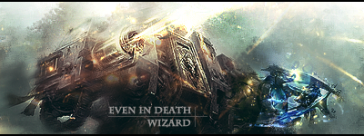
We'll call that a bit of an error. I was trying for a Imperial Sigil in there, then realised it looked terrible, so ended up having to fudge something to replace it.
TheDR
18 Apr 2011
Why not just copy the dude on the right of the sig. Yeah it would be repeating the same image, but I think the sig could manage to pull that off.
Wizard
18 Apr 2011
Tbh it's bit late rather heavily underneath a lot of layers. I'll live with it and just make a better pass at the next sig.
Wizard
18 Apr 2011
Nem, on 18 Apr 2011, 22:28, said:
Ace coloring and brushing as usual.
Thank you skwire

TheDR, on 18 Apr 2011, 20:39, said:
Why not just copy the dude on the right of the sig. Yeah it would be repeating the same image, but I think the sig could manage to pull that off.
Oh alright...here's another go....
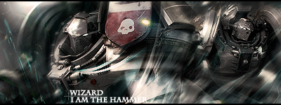
*Facepalmdesk.......incomingtraffic*
yeah for checking font placement
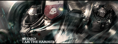
Edited by Wizard, 18 April 2011 - 21:43.
Ion Cannon!
18 Apr 2011
Pav:3d
18 Apr 2011
Looks very good, maybe a slight ott on the blurring imo, but it gives a nice movement to it.
Sgt. Nuker
19 Apr 2011
Wizard, on 18 Apr 2011, 17:40, said:
Oh alright...here's another go....
*Facepalmdesk.......incomingtraffic*
*Facepalmdesk.......incomingtraffic*
Much lighter, and much better than before. The eerie blackness that seemed to be functioning as an ad hoc warp tear was a bit off, even if it did serve only one purpose to hide a silly fault.

I much prefer this one, as the ornate feature on the breastplate can be seen as isn't hidden by text.
Wizard
19 Apr 2011
Pav:3d, on 18 Apr 2011, 23:48, said:
Looks very good, maybe a slight ott on the blurring imo, but it gives a nice movement to it.
Yeah, quite a bit went into it, but that was to really excentuate the focals (which shouldn't be split that far tbh). It's not that often you can find a seriously good image/stock like that, that you can work with. Just have to make the most of it.
Sgt. Nuker, on 19 Apr 2011, 1:56, said:
Much lighter, and much better than before. The eerie blackness that seemed to be functioning as an ad hoc warp tear was a bit off, even if it did serve only one purpose to hide a silly fault.
I much prefer this one, as the ornate feature on the breastplate can be seen as isn't hidden by text.
I much prefer this one, as the ornate feature on the breastplate can be seen as isn't hidden by text.
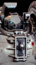
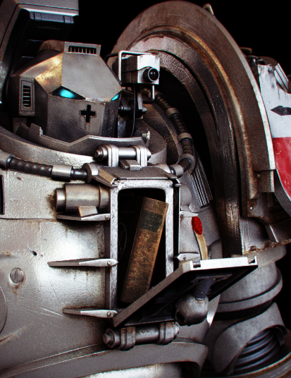
I kinda liked the grim darkness of the original. Just decided on the reworked version to remove some redundant layers. Turns out they added the grimdark. If you like ornate breastplates. Check out these bad boys.
Wizard
19 Apr 2011
*Double post & new content FTW*
I am not entirely happy with this, some cnc please?
I am not entirely happy with this, some cnc please?
Sgt. Nuker
19 Apr 2011
I rather like the style, however, the upper edge seems a bit on the bright side of things. It's almost as if the image was captured by a photographer and the light from the sun and promethium fueled fire caused lens flare. Other than that, it's not bad.
