Hangar 13 Design
 Mbob61
22 May 2008
Mbob61
22 May 2008
Nice job
Very different from what we usually see in here but you have pulled it of very nicely.
Mike
Very different from what we usually see in here but you have pulled it of very nicely.
Mike
Crazykenny
22 May 2008
That thing looks really sweet. All it misses is the digital display and the wartorn details to the skin 
Jok3r
22 May 2008
My new personal logo, will go on my new site when its up and running.
~Swimmer
UnderFlow
22 May 2008
The model: looks very good, although I'd prefer it with with less stains (but that 's a matter of tastes).
The logo: interesting (where "interesting" is not an euphemism for "meh" but means "interesting")
I'd personally consider to make it more simple (most logos that I can think of now are quite easy (like those of Adidas of Apple), and being remembered is the purpose of logos, isn't it?).
Mind to share what the meaning of the logo is?
Edited by UnderFlow, 22 May 2008 - 20:40.
Jok3r
22 May 2008
Well, its something I've been drawing for a while. Its meant to resemble an eye. Mainly, I thought it looked cool  . Also- I drew it freehand.
~Swimmer
. Also- I drew it freehand.~Swimmer
Libains
29 May 2008
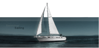
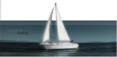
That's a really nice one Swimmer - really nice indeed - I'd have to go for the bottom one above the top one simply because I feel that the glowy effect doesn't work perfectly on the sails protruding from the sig box. Really good going though!
Wizard
29 May 2008

Jok3r
31 May 2008


Comments?
EDIT: Removed the retarded white border.
Edited by The Swimmer, 31 May 2008 - 04:37.
Centric
31 May 2008
Jok3r
31 May 2008
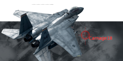
I think its one of the Ace Combat games, but I got it off PlanetRenders a while ago... what do you think of the new AYB ticker?
̀̀̀̀█
31 May 2008
The Swimmer, on 28 May 2008, 22:53, said:
Personally I would go for this, but with less bloom on the boat itself.
As for the ticker, adding some text other than all your base would be nice, as is there i no need to have it rotate like that.
Other than that, the lets rock and roll could use a different font, and the live feed is there why?
Wizard
31 May 2008
The ticker is a nice touch, but I am not sure why you put it in a white border when you should've extended the metallic edge theme from the rest of the sig.
Jok3r
05 Jun 2008

Another one that looks better (tho I didn't realize it 'til now) in the soviet skin. CnC, plz.
-Swimmer
EDIT: Sig edited. I really also want help with the font/text placement

EDIT AGAIN: Wanted to show this off. Forgot before
.
Edited by The Swimmer, 05 June 2008 - 03:50.

Alias
08 Jun 2008
It's nice, but all it is is a photo with some lighting effects applied, and text added.
Whitey
08 Jun 2008
But it all works out quite nicely, thus it can't really be criticized for its simplicity.
-Boidy
-Boidy
