Hangar 13 Design
 BeefJeRKy
16 Feb 2009
BeefJeRKy
16 Feb 2009
Looks like you melded three sigs. It's interesting I guess and well implemented.
darkwolf08
21 Apr 2009
Could someone plz make me a sig
if you message me i'l tell you what i would like
thanks
if you message me i'l tell you what i would like
thanks
Wizard
21 Apr 2009
Swimmer hasn't been around for a while darkwolf08. I suggest you try someone else, we have plenty of very talented artists on the forums. Which btw, welcome to. Don't forget to introduce yourself and read the rules.
TheDR
12 Jun 2009
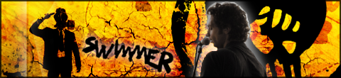
I don't like the glow around the dude, but everything else is awesome, the colours work really well 
And welcome back btw
And welcome back btw
Jok3r
12 Jun 2009
TYVM- I'll fix that glow when I work up the effort to cut the render properly xD.
TheDR
12 Jun 2009
I thought that might be the reason
Render cutting is the worst part of sig making, but its got to be done.
Render cutting is the worst part of sig making, but its got to be done.
BeefJeRKy
18 Jul 2009
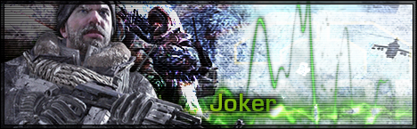
I don't really like the green text but the rest is pretty awesome. Modern Warfare 2 should be fun.
Jok3r
31 Dec 2009
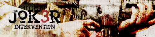
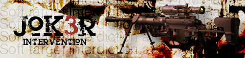
This is the closest any of you are ever going to get to a picture of me. Apologies for the crap stock, but I think it turned out ok.
Libains
03 Feb 2010
Quite nice mate, just feels a little too dark in the bottom right hand corner of the sig compared to all the rest, and the gun could do with a little more grime perhaps, as it looks too shiny and slick a render to really be integrated into the rest. Good stuff nonetheless though, and love the avvie.
Wizard
03 Feb 2010
Loose the Intervention and you've got a nice sig there. Perhaps change the layer style on the background picture if you don't want to, what is it set to? Saturation? Hue?
Smoking Aces font?
Smoking Aces font?
Jok3r
03 Feb 2010
It's actually like three layers, two on overlay and one on burn, and a couple more just with low opacity. I'm going to try messing around with the intervention image, because I get what you're saying: too clean. And Wiz, it's Heroin 07 from DaFont. Thanks guys.
Wizard
03 Feb 2010
 Jok3r, on 3 Feb 2010, 17:01, said:
Double Post, but it's my thread, so...
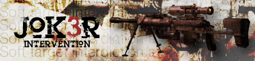
New version. Thoughts?
New version. Thoughts?
Mbob61, on 3 Feb 2010, 17:02, said:
I like the new version a lot more 
Mike
Mike
Sorry mate, what have you done? You've just made it red[er] than it was! and even added in some green. To start with you need a bigger render. That small little one doesn't cut it in a 500px sig. Not easy to find but just because you want to some like you use an Intervention doesn't mean you have to have the a pic in the sig. Loose that render, highlight the sniper chap more and if you 'have' to the set the render to overlay 10% and have it in the background.
Pav:3d
03 Feb 2010
I prefer the old, the new version looks rather saturated.
You need a bigger intervention picture, the bg is very nice tho
You need a bigger intervention picture, the bg is very nice tho
Jok3r
03 Feb 2010
CheyTac has some very nice, very big pictures on their site. I'm really not sure what I think of this version, though. Further CnC? Also, Wiz: the picture in the background is fairly low res, which is why I'm not trying to make it more of a focus.
Wizard
03 Feb 2010
Hmmm, not much better tbh. You've saturated the render too much here and just masked and obscured the bg. I am not sure what you can do to sort it out 
Mbob61
03 Feb 2010
Wizard, on 3 Feb 2010, 17:09, said:
Jok3r, on 3 Feb 2010, 17:01, said:
Double Post, but it's my thread, so...
New version. Thoughts?
New version. Thoughts?
Mbob61, on 3 Feb 2010, 17:02, said:
I like the new version a lot more
Mike
Mike
Sorry mate, what have you done? You've just made it red[er] than it was! and even added in some green. To start with you need a bigger render. That small little one doesn't cut it in a 500px sig. Not easy to find but just because you want to some like you use an Intervention doesn't mean you have to have the a pic in the sig. Loose that render, highlight the sniper chap more and if you 'have' to the set the render to overlay 10% and have it in the background.
I liked the fact that the newer one seemed to have more light (couldn't think of a better way of saying it) and both the sniper and text seemed to stand out more.
Mike
Slightly Wonky Robob
03 Feb 2010
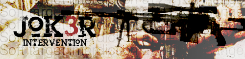
Out of the three versions posted, I much prefer the first one, but tbh the sniper rifle doesn't fit at all in the sig. Remove the sniper rifle from the first sig, and maybe the odd change here and there, and you'd be on to a winner.