Hangar 13 Design
 Jok3r
08 Mar 2008
Jok3r
08 Mar 2008
Even more new stuff
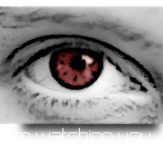
Not so good, just me messing around with pop-ups
and a revision of the other one
~SLG
Edited by The Swimmer, 08 March 2008 - 02:48.
Not so good, just me messing around with pop-ups
and a revision of the other one
~SLG
Edited by The Swimmer, 08 March 2008 - 02:48.
Wizard
08 Mar 2008
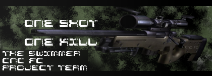
Oh now this is better! The sniper rifle is a much better use of brushes and colour choice than I have seen before. I also like the cinematic border choice. Glad to see others branching out into this style. Definitely my favourite of yours.
Jok3r
08 Mar 2008
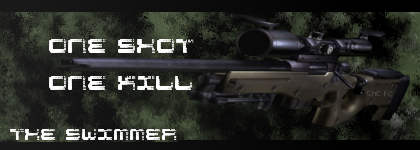
Yeah, I'm liking that one a lot too. It's so sad I can't change me SOTW entry now...
~SLG
~SLG
Lord Atlantis
14 Mar 2008
That signature is much better than the others IMO. Your skillz are getting better, but there is alot of work ahead of you. 
Jok3r
27 Mar 2008
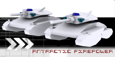
I was messing around and made this
It doesn't feel quite right, but I'm not sure what to do (aside from re-cut the render, which I am to lazy to do ATM, I had a good cut in elements, then I had to save it, realized it was a .jpg, and was to lazy to make it a png- now I'm suffering- anyone want to re-cut it for me? pretty please?)
http://i256.photobucket.com/albums/hh174/t.../ffow1up142.jpg
and the un-cut version
http://i256.photobucket.com/albums/hh174/t...9/ffow1up14.jpg
Advice?
~Swimmer
Lord PieMonster
30 Mar 2008
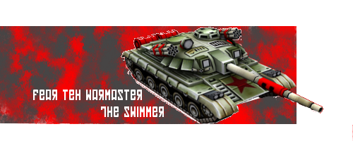
nice, i love the warmaster one you posted earlier, but the others are sick too.
good job, keep up the good work.
The Admiral
good job, keep up the good work.
The Admiral
Jok3r
30 Mar 2008
Thanks man. Its funny, because I thought I did pretty crap on that one (overdose is our resident kwai whore, so its not surprising he liked it).
~Swimmer
~Swimmer
Jok3r
01 Apr 2008
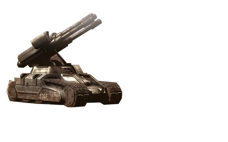
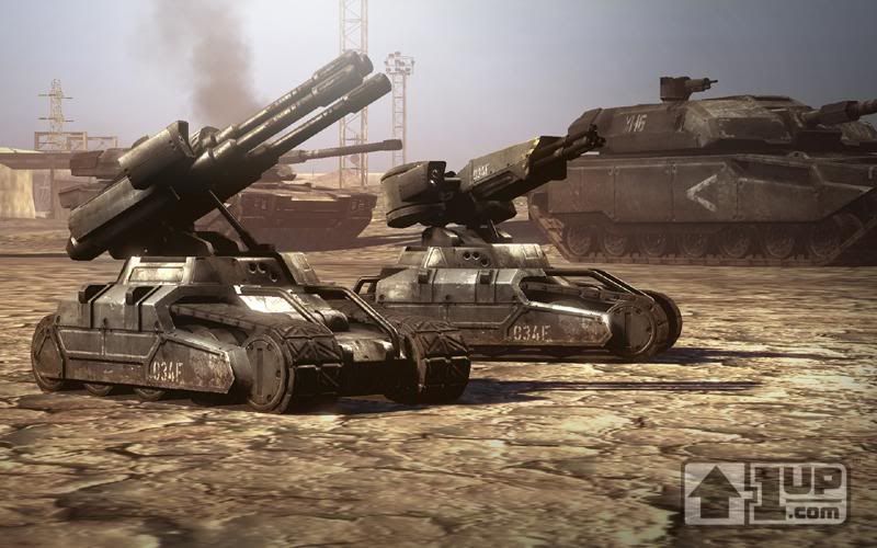
Well, I'm waiting for final clearance to release some stuff, but in the mean time, I've got some mod-related propaganda.

Both by me, do not rip.
Also, I recently read the "short story" type thing, Home, by Robert Muchamore, and liked it (its available for free download HERE)
So... I decided to make a cover for it. Its crap, I know, but can I get any constructive criticism?
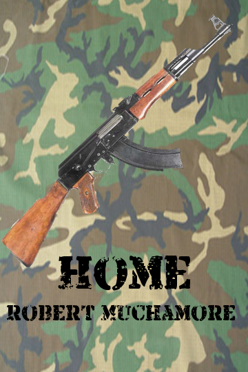
Comments PLEASE
~Swimmer
Edited by The Swimmer, 01 April 2008 - 02:48.
Both by me, do not rip.
Also, I recently read the "short story" type thing, Home, by Robert Muchamore, and liked it (its available for free download HERE)
So... I decided to make a cover for it. Its crap, I know, but can I get any constructive criticism?
Comments PLEASE
~Swimmer
Edited by The Swimmer, 01 April 2008 - 02:48.
Jok3r
02 Apr 2008
OK, not feeling very original, but... inspired? by warbz. Went from this

To this
to THIS, which would be my avatar if I could get it to load
Whadda ya think? I was only inspired by warbz, and used the same stock. What I made is totally original... except...
~Swimmer
To this
to THIS, which would be my avatar if I could get it to load
Whadda ya think? I was only inspired by warbz, and used the same stock. What I made is totally original... except...
~Swimmer
Lord Atlantis
06 Apr 2008
Its ok... I think if you messed around with the selective gaussian blur you could get something just as kewl looking. =)
Jok3r
15 Apr 2008
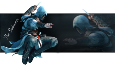
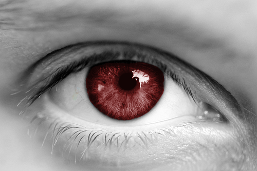
This little beauty, currently filling my sig space, is, IMHO, my best work so far (as well as its matching avatar). CnC Please?
~Swimmer
Waris
15 Apr 2008
Very nice. I don't like the font placement and the overall repetitiveness of your theme because you used the same render for both the sig and the avatar.
TheDR
15 Apr 2008
I agree with Waris, Get a different avvy and place the text somewhere else.
Otherwise it looks cool.
Otherwise it looks cool.
Jok3r
15 Apr 2008
Ok, I hear you guys. I can do something with the avvy, but I really have no idea were else to place the text/what font to use. Any sugestions?
~Swimmer
~Swimmer
Warbz
18 Apr 2008
The blending on your avvy is excellent, I especially like the fading grid.
Great sig too.
Great sig too.
Dr. Strangelove
20 Apr 2008
EDIT: If you make me an avatar as you said over the IRC, I'd prefer you use the fourth "capitalist".
I'd like two si'vous plait.
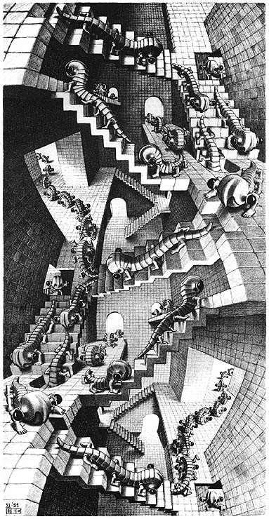
This one should say "I Am A Strange Loop". It should include the following pieces of artwork from my favorite artist, Mauritius Cornelius Escher:


The next one should say "Capitalist: A=A", and should use these pics(If you have a hard time deciding which "capitalist" to use, I like number 2 the best):


Edited by J.R. Bob Dobbs, 22 April 2008 - 00:06.
I'd like two si'vous plait.
This one should say "I Am A Strange Loop". It should include the following pieces of artwork from my favorite artist, Mauritius Cornelius Escher:
The next one should say "Capitalist: A=A", and should use these pics(If you have a hard time deciding which "capitalist" to use, I like number 2 the best):
Edited by J.R. Bob Dobbs, 22 April 2008 - 00:06.
Jok3r
22 Apr 2008
First try at the first one...
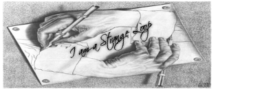
What do you think? That was pretty much a resize/text job... I'll do the other one soon.
~Swimmer
Edited by The Swimmer, 22 April 2008 - 00:40.
What do you think? That was pretty much a resize/text job... I'll do the other one soon.
~Swimmer
Edited by The Swimmer, 22 April 2008 - 00:40.
