Drag#!'z Artworkz
 TheDR
15 Nov 2013
TheDR
15 Nov 2013
Sorry for not replying sooner!
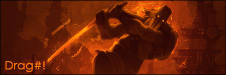
I really like the ads you made, I agree with CJ that they look very professional and confused me a bit as well
I like your sig, the character is in the correct place and your name flows up/down from the sword, the composition is great. Also the single colour also really helps to create a distinct style. However I do feel the contrast could be increased to give it a bit more 'pop'.
I drew a white layer ontop and then set it to overlay.
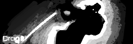
Here is the final image below.
As you can see, just changing the contrast really gives the image a striking look. I can send you the PSD if you are interested.
Keep up the good work
I really like the ads you made, I agree with CJ that they look very professional and confused me a bit as well
I like your sig, the character is in the correct place and your name flows up/down from the sword, the composition is great. Also the single colour also really helps to create a distinct style. However I do feel the contrast could be increased to give it a bit more 'pop'.
I drew a white layer ontop and then set it to overlay.
Here is the final image below.
As you can see, just changing the contrast really gives the image a striking look. I can send you the PSD if you are interested.
Keep up the good work
TheDR
15 Nov 2013
Here you go. You can also try the same with the black, adding some darkness to the character on an overlay (or soft light) layer and then lowering the opacity.

TheDR
15 Nov 2013
Kaido
14 Feb 2014
Alright I made a wallpaper this time. And I can already see on what I have failed: Tree branches to the right and the sword looks weird

Alias
14 Feb 2014
Composition wise (layout), not too bad.
You need to work on your cutting (as you mentioned, it's quite dodgy on most edges). It could use some more contrast as well, there doesn't seem to be much depth and differentiation between layers outside of what is forced by the DOF.
Getting better source images would help a ton too.
Besides that, pretty decent effort.
Edited by Alias, 14 February 2014 - 16:28.
Kaido
15 Feb 2014
Alright, I have fixed the sword and the tree. I also removed the c4d effects.

General
15 Feb 2014
It looks better now! If you attempted to do a katana, it should've been thinner, tip of the sword is good but if you make it %50 thinner to the bottom part of the steel, it will add more perspective and will look more correct 
Kaido
06 Aug 2014
Little update here.
School thing #1]
School thing #2
School thing #3
School thing #4
And some gaming related images
School thing #1]
Spoiler

School thing #2
Spoiler

School thing #3
Spoiler

School thing #4
Spoiler

And some gaming related images
Spoiler

Spoiler

Spoiler

Kaido
28 Oct 2015
Uhh, over a year has passed away. I guess its update time again!
Daft Punk - One More Time animation, A car animation, 3D logo of my school.
My school got a 3D Printer, so I made a keycap with it.
A short animation film about Wood Fuel:
There's probably more stuff, but I can't remember it atm.
Daft Punk - One More Time animation, A car animation, 3D logo of my school.
My school got a 3D Printer, so I made a keycap with it.
A short animation film about Wood Fuel:
There's probably more stuff, but I can't remember it atm.
TheDR
28 Oct 2015
Nice, they all look great. What program did you use to create the animation?
Also, that is an excellent keycap.
Also, that is an excellent keycap.
Kaido
24 Mar 2016
Some kind of a update I guess. I finished my school and now I have to find a job! Meanwhile I have redone my portfolio page and in the beginning of this year I stared to do a 100 Day UI Challange. Currently I am on Day 84:
Spoiler