Drag#!'z Artworkz

 TheDR
04 Jan 2009
TheDR
04 Jan 2009
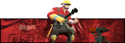
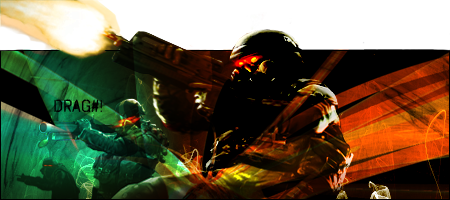
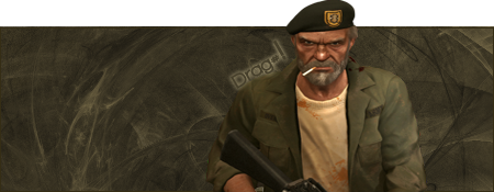
I'm coming to sap your sentry! Muhahahaha
Its nice a simple and works well with the chosen render. To improve it maybe place the bottom boarder above the engineers legs and his sentrie.
Also a few layers of Darker or Lighter shades of the main BG colour in the BG can help to give a more full image.
Also have you every tried using Scanlines, i feel they add a simple and cool effect onto a background of a sig/avvy. You can find out how to do them here.
Keep up the good work
Kaido
04 Jan 2009
Thx for the hint Doc 
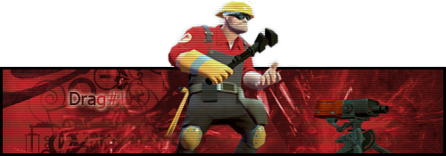
But You Will NEVER Zap My Turrets Again...
Edited by Drag#!, 06 January 2009 - 18:10.
But You Will NEVER Zap My Turrets Again...
Edited by Drag#!, 06 January 2009 - 18:10.
TheDR
04 Jan 2009
If you use a clipping mask on the scanlines Layer, it will save having to erase it. If you don't know how to, this should explain how.
Wizard
05 Jan 2009
Hmmm, it isn't bad but there are several changes that could be made.
1/ Sadly I disagree with Dr on the BG. It's far to busy for what is a static render. You have a spiral[ish] vector, something that appears to be runes/japanese writing overlapped by a smashed fractal, which imo doesn't work and is compositional murder on the eyes.
2/ The render is massively undersized for the signature width. I would have suggested using a larger version with less body and more face/chest and then cropping out the turret and making more of it. Alternatively you could've have duplicated the turret and perhaps used it as a "tight in" backdrop to the main engineer. 3 or 4 turrets pointing each way from behind the engineer and then used the C4d/fractal or vector brushes to highlight that.
3/ Scan lines can work, but should always be used sparingly when you have little depth in the signature. Also I would suggest never placing them over a cutout render.
4/ Clipping masks aren't great for cutouts as it will take ages to fine tune the pixels. Now you have too much bleed spilling with your outer glow and it doesn't look clean enough [imo]. In future find the layer that has the BG and ctrl+a, new layer then fill. If necessary duplicate the render and place on top or move the scans underneath.
5/ Colouration. Too much red. I'd suggest throwing in some yellow as it does form quite an obvious part of the engineers uniform.
6/ Focus. This has none. You have your render separated and name even further which makes this sig too spaced out. Always, always try and keep your name as close to the focus of the art as you can. And NEVER use arial [iirc that is, although I stand to be corrected]. As a rule always use century gothic unless you have a piece that requires the use of a certain stylised font ie CnC sig with ZH font.
I hope some of that helps? You have shown some skillz none-the-less.
Kaido
06 Jan 2009
 Wizard, on 5 Jan 2009, 23:54, said:
Hmmm, it isn't bad but there are several changes that could be made.
And NEVER use arial [iirc that is, although I stand to be corrected].
And NEVER use arial [iirc that is, although I stand to be corrected].
Its Tahoma

Pav:3d
08 Jan 2009
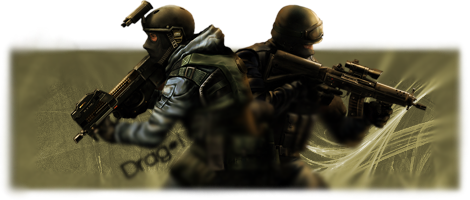
No its the other way around, look at the barrel
Nice sig btw, not too sure about the scan lines working on the popout part though
Nice sig btw, not too sure about the scan lines working on the popout part though

Wizard
02 Feb 2009
Not too bad, it's a nice render [and would be helpful if you could either post it or link to it  ] but the background seems washed out and lacking in some contrast.
] but the background seems washed out and lacking in some contrast.
Libains
02 Feb 2009
I'd imagine it's this one.
However, I agree with Wiz, in that the background looks a little washed out. Nice stuff nonetheless.
However, I agree with Wiz, in that the background looks a little washed out. Nice stuff nonetheless.
Libains
02 Feb 2009
Whoops, my bad, although you have to admit the two look identical, which just speaks for the quality of the cut - nice work on that!
TheDR
06 Feb 2009
Have you thought about using different colours in the background, it seem a bit flat at the moment
Kaido
06 Feb 2009
The Dr, on 6 Feb 2009, 21:54, said:
Have you thought about using different colours in the background
No o0
Edited by Drag#!, 06 February 2009 - 21:16.
Lord Atlantis
06 Feb 2009
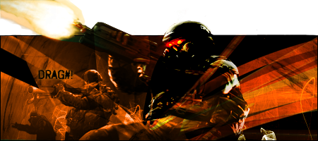
That and the render seems kinda fuzzy. Did you scale it up for use in that signature?
That and it looks like it is the same background from your SOTW entry.
Edited by Lord Atlantis, 06 February 2009 - 22:35.
That and it looks like it is the same background from your SOTW entry.
Edited by Lord Atlantis, 06 February 2009 - 22:35.
Kaido
14 Apr 2009
*Cleans Dust*
Meh Posting Some Sigs That i Have done...
Modified it Today
Teh one tat was in SOTW
SOTW Sig again
And Again
Some old sigs now( 1 Month Old i Think)


Meh Posting Some Sigs That i Have done...
Modified it Today
Teh one tat was in SOTW
SOTW Sig again
And Again
Some old sigs now( 1 Month Old i Think)

Pav:3d
21 May 2009
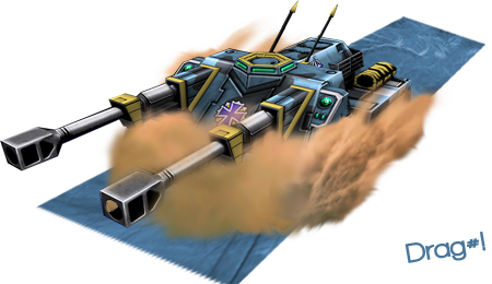
The jagdmummut has WAY too much dust/sand even if it was going right through a sand dune, and the floor doesnt seem to fit.
Great perspective though
Great perspective though
Kaido
26 May 2009
@Pav3d
Yea, That Pretty Much Failed With "Floor", Tough I Didnt Want To Place Any Sand There At All...
SOTW Sig Nows

Yea, That Pretty Much Failed With "Floor", Tough I Didnt Want To Place Any Sand There At All...
SOTW Sig Nows
