Nid's Art Base
 TheDR
02 Jan 2009
TheDR
02 Jan 2009
NOM NOM NOM, ITS A TASTY SIG!
Nice work Nid, the only thing i dislike is the lack of border on the Avvy.
I really like the font effects, they work really well.
Nice work Nid, the only thing i dislike is the lack of border on the Avvy.
I really like the font effects, they work really well.

Wizard
05 Jan 2009
The sig works really well Nid. Really captures the theme nicely. However I reckon the Avvy should be just the head without a bg. That would be cool.
E.V.E.
05 Jan 2009
Nice work on that Signature, Niddy.
I personally think that everything blends in nicely.
- E.V.E.
I personally think that everything blends in nicely.
- E.V.E.
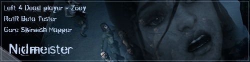
Nid
18 Feb 2009

The latest avatar.
Yes I'm aware of the work that needs doing, like the shadow on the text overlapping the bottom of the image, and getting rid of or improving the grey border.
Text could do with a touch up as well.
I just dont feel like editing all the frames again D:
Edited by Nidmeister, 18 February 2009 - 20:01.
Pav:3d
18 Feb 2009
Transparency in gif will always give you that grey border, just slap on a bg instead if you want to get rid of it
Looking gd tho nice effect
Looking gd tho nice effect
Nid
18 Feb 2009
 Pav3d, on 18 Feb 2009, 20:07, said:
Transparency in gif
It's an APNG file, I put the border there ;_;

Alias
14 Apr 2009
Looks quite nice, a little bit small for my tastes though, and you could've chosen a better background colour too, the colour harmony with the skin isn't too good.
Other than that, it's good. :3
Other than that, it's good. :3
Crazykenny
14 Apr 2009
Whats that white spot underneath his nose? That isnt what I think it is... right...? 
Nid
14 Apr 2009
Crazykenny, on 14 Apr 2009, 14:00, said:
Whats that white spot underneath his nose? That isnt what I think it is... right...?
lolol
Only just noticed that, it's the result of a ripple filter on a duplicated version of the render, underneath the main render, I think.
Nid
15 Apr 2009

Seems to be massively flooded in yellow and red, but still, was good practice with C4Ds for me.
Edited by Nidmeister, 15 April 2009 - 09:48.
Wizard
15 Apr 2009
Interesting, but waaaaaaaaaaaaaay to cluttered. I can't work out exactly what I'm looking at. I think there is a guitar in there and a small man, possibly a pigmy of somekind in a smock?!?!
I think that the focal needs to be moved to about 1/3rd of the way into the sig so its more obvious, then you can get away with that much BG, but right now you can't make much our apart from the frets on the guitar.
Good to see you trying something different.
I think that the focal needs to be moved to about 1/3rd of the way into the sig so its more obvious, then you can get away with that much BG, but right now you can't make much our apart from the frets on the guitar.
Good to see you trying something different.
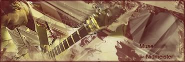
Nid
15 Apr 2009
Wizard, on 15 Apr 2009, 10:55, said:
Interesting, but waaaaaaaaaaaaaay to cluttered.
You should have seen it before I put all the clipping layers over the top, what you see before you is an attempt to De-clutter everything..
The image I used for the render kind of cut the top of Matt Bellamy's head off, which is why he's fit nice and snug in the corner there.
I'll see what I can do with it from here on though.

Nid
16 Apr 2009
I got about this far with the Muse sig, before giving up D:
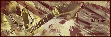
I then moved on to playing around with another Link themed sig.

I then moved on to playing around with another Link themed sig.
TheDR
16 Apr 2009

Font choice = Epic.
The only thing i think could be improved is maybe making the main render bigger.
Nid
23 Apr 2009


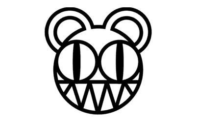
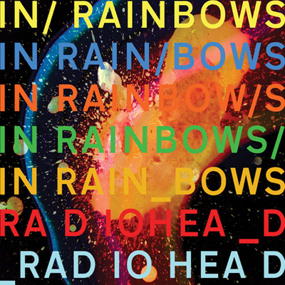
A very simple Sig + Avvy combo I whipped up for SotW,I t was originally going to be a little more complex with the bear logo sticking out of the sig, but I decided against it as it really didint fit, thus leading me to decide to keep it very very simple.
Source
In Rainbows album cover (font choice + style)
Edited by Nidmeister, 23 April 2009 - 00:12.
TheDR
27 Apr 2009
Its nice a simple
Tho maybe the small amount of white fuzz could be removed from the avvy but that would be just me being a bit of a magnify glass
Tho maybe the small amount of white fuzz could be removed from the avvy but that would be just me being a bit of a magnify glass
Nid
05 May 2009

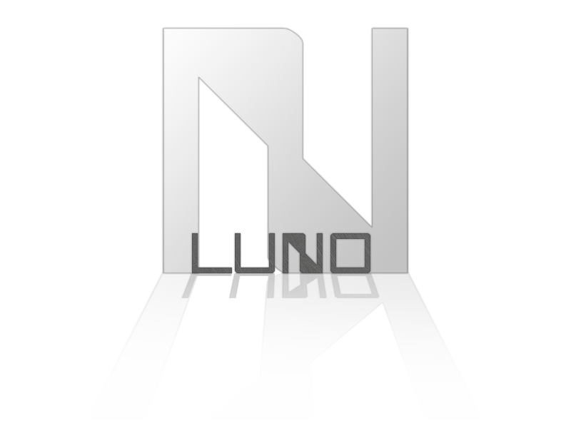
Just two of the best from a set of Logos that I have designed for a friend's band.
TheDR
05 May 2009
That second one is awesome.
I really like the metal texture on the bottom font.
I really like the metal texture on the bottom font.
Nid
05 May 2009
The Dr, on 5 May 2009, 23:03, said:
That second one is awesome.
I really like the metal texture on the bottom font.
I really like the metal texture on the bottom font.
The problem with the second one was that I didint think the font stood out from the logo well.
