Nid's Art Base
 Nid
06 May 2009
Nid
06 May 2009
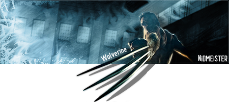
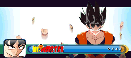
I had high hopes for both the cut out, and the sig.
UTTER FAIL. |:
Source
Edited by Nidmeister, 06 May 2009 - 17:10.
Wizard
06 May 2009
The cut is, as usual for you, superb. Only issue I see is that it's cloudy and it's never a good idea to cut an image that has smoke. The sig would work better if you made the render larger and moved it over left.
Libains
06 May 2009
The little extra on the bottom claw is also a tad out, sadly. However, as Wiz says, your cut is phenomenal, as is usual. The lighting on his right arm doesn't flow with the sig at all, is my only other gripe.
Nid
06 May 2009
 Wizard, on 6 May 2009, 19:02, said:
Only issue I see is that it's cloudy and it's never a good idea to cut an image that has smoke. The sig would work better if you made the render larger and moved it over left.
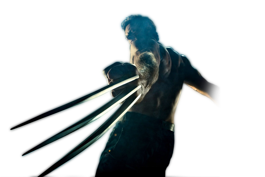
Well I was thinking that luckily, what with the focus bieng on his claws instead of his face this would be asily fixable by just lowering the saturation or chaning the hue of the smoke over his face.
Unfortunately what with the size limitations in SotW, I can't make the render too much bigger without removing either the claws or his face, however, I'll move him over with my 1 allowed edit.
AJ, on 6 May 2009, 19:04, said:
The little extra on the bottom claw is also a tad out, sadly. However, as Wiz says, your cut is phenomenal, as is usual. The lighting on his right arm doesn't flow with the sig at all, is my only other gripe.
Duly noted, but what extra bit on the bottom claw?
TheDR
06 May 2009
Nidmeister, on 6 May 2009, 21:26, said:
Wizard, on 6 May 2009, 19:02, said:
Only issue I see is that it's cloudy and it's never a good idea to cut an image that has smoke. The sig would work better if you made the render larger and moved it over left.
Well I was thinking that luckily, what with the focus bieng on his claws instead of his face this would be asily fixable by just lowering the saturation or chaning the hue of the smoke over his face.
Unfortunately what with the size limitations in SotW, I can't make the render too much bigger without removing either the claws or his face, however, I'll move him over with my 1 allowed edit.
AJ, on 6 May 2009, 19:04, said:
The little extra on the bottom claw is also a tad out, sadly. However, as Wiz says, your cut is phenomenal, as is usual. The lighting on his right arm doesn't flow with the sig at all, is my only other gripe.
Duly noted, but what extra bit on the bottom claw?
I think it is because its a bit too black and doesn't really fit with the rest of the claw.
Nid
06 May 2009
WNxMastrefubu, on 6 May 2009, 21:28, said:
a lil bit of the bottom claw is cut of but its no biggy
Thats called "where the original image ends"
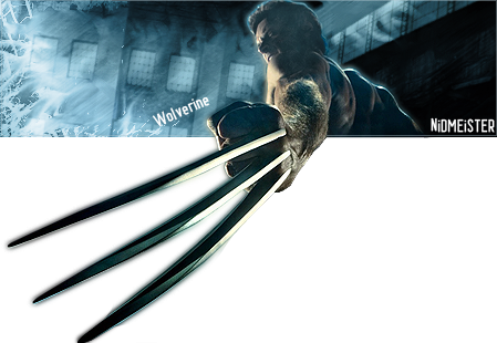
Anyways, following advice given.
This one goes in SotW:
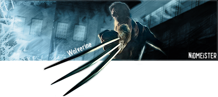
And this one goes in my signature:
(A whopping 310 pixels tall, it just about fits)
Edited by Nidmeister, 06 May 2009 - 21:14.
WNxMastrefubu
06 May 2009
its still a good sig regardless, im just sayin what im think AJ was reffering too
Nid
23 Jun 2009
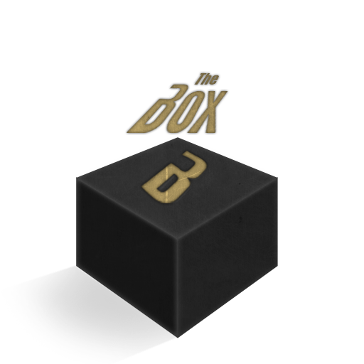
This was a logo design for a media TV network I thought up, it was just a small practice for myself, the network doesn't exist (afaik), and it was in fact just an inspired piece.
TheDR
24 Jun 2009
Good old photoshop transform 
The Box itself is good, its in shape ect but i would say that it would add to it if you had a second brighter colour to the text.
The Box itself is good, its in shape ect but i would say that it would add to it if you had a second brighter colour to the text.
Nid
14 Jul 2009
as part of my desktop:

(Thumb)
EDIT:
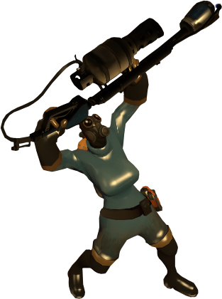
For anyone who wants the female pyro Model/Skin.
Edited by Nidmeister, 14 July 2009 - 12:34.
Nid
20 Sep 2009

First sig in a long time

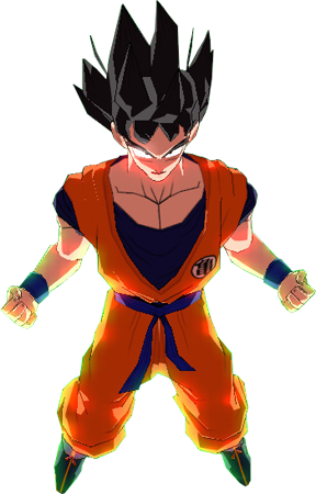
http://www.dafont.com/saiyan-sans.font
Enjoy the resources
The game I used:
http://www.moddb.com/games/zeq2lite
Edited by Nidmeister, 20 September 2009 - 11:46.
Destiny
20 Sep 2009
Yeah. Not bad, though I wonder if you can be bothered to make it a gif and such.
Not bad, though I wonder if you can be bothered to make it a gif and such.
Destiny
20 Sep 2009
Not bad, Nid! It seems it took alotta work, so you don't have to muck around with the power bar then
...i r haet typos.
Edited by Destiny, 20 September 2009 - 13:44.
It seems it took alotta work, so you don't have to muck around with the power bar then ...i r haet typos.
Edited by Destiny, 20 September 2009 - 13:44.
TheDR
08 Oct 2009
Nice cut, must of taken ages!
Cutting is my least favorite bit of making sigs and stuff
Cutting is my least favorite bit of making sigs and stuff
Sgt. Nuker
08 Oct 2009
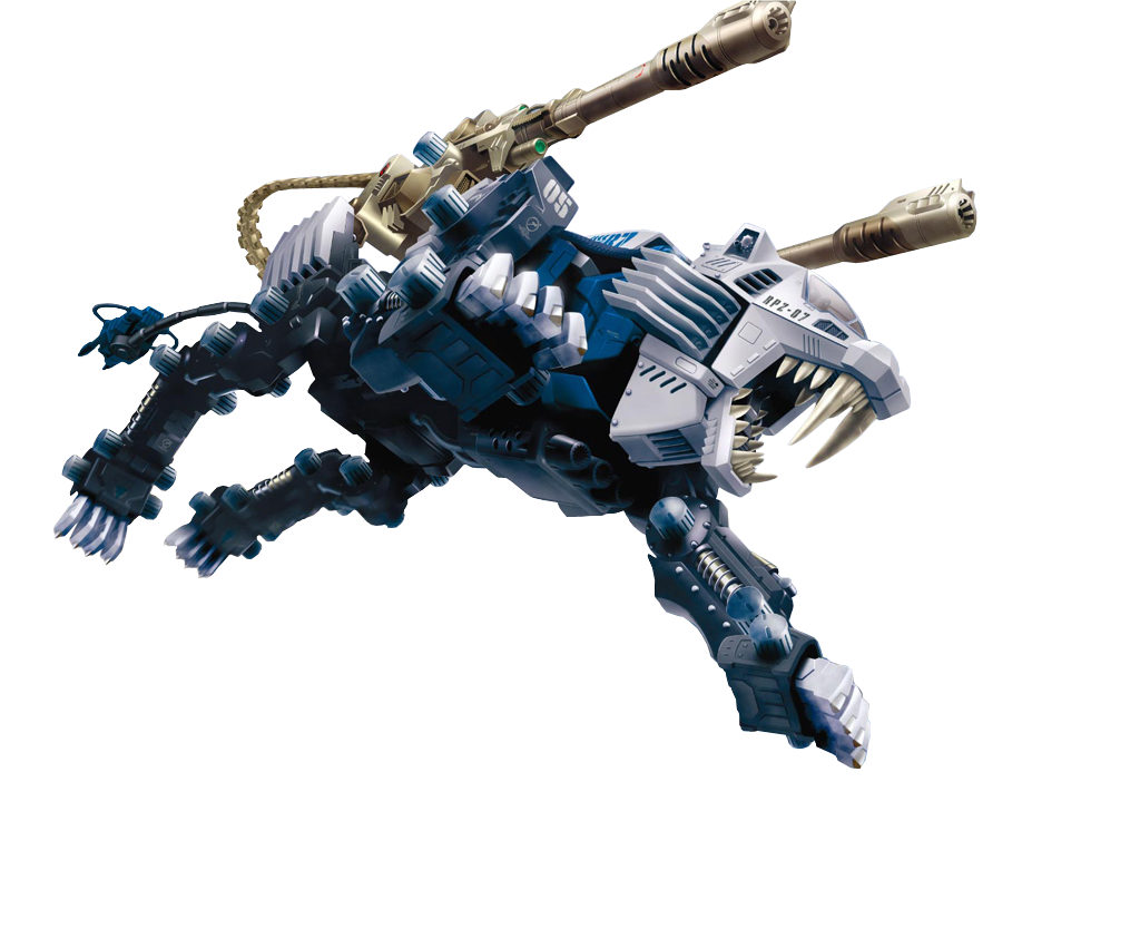
Zoids, haven't seen that show in ages, nice.  It must have taken you ages to trim and cut, but I'd imagine you're getting a bit faster at that since you've been doing it a while now.
It must have taken you ages to trim and cut, but I'd imagine you're getting a bit faster at that since you've been doing it a while now.
