Nid's Art Base

 TheDR
07 Sep 2008
TheDR
07 Sep 2008
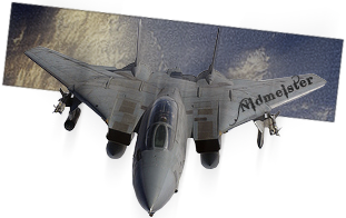
I really like it but i don't like the way the Russian Logo Overlaps the main render, i think it should go behind.
Other than that the colours and the font work really well
Other than that the colours and the font work really well
Nid
03 Oct 2008
Experimenting again

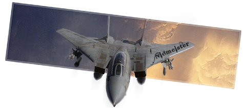
It's been a while though, n0t the best cut ever

A little too blurry for my liking as well
Edited by Nidmeister, 03 October 2008 - 17:14.
TheDR
03 Oct 2008
Good concept but its flaws are what you said, too blurry and not a particularly great cut and its a bit small for my tastes.
Edit: typo D:
Edited by The Dr, 03 October 2008 - 17:19.
Edit: typo D:
Edited by The Dr, 03 October 2008 - 17:19.
Brad
03 Oct 2008
I like the style, but the falws you pointed out and the size lowers it 'score'
A little too small
A little too small
TheDR
04 Oct 2008
Much better
I would say to try and match the colours in the BG to the ones on the render.
I would say to try and match the colours in the BG to the ones on the render.
Alias
04 Oct 2008
Points of improvement:
Currently: 6.5/10.
With modification: up to 8/10.
- Clouds in the sky are to the east. Looks out of place. I suggest replacing the background with either all blue sky or all cloud. If you do end up replacing the background, I suggest you modify it to match the lighting of the jet.
- Render doesn't blend in too well, the edges stand out too much.
- I'd suggest you move the text from the wing to a corner (as it is angled, you have more freedom with this).
- Other than that, it is a pretty good, simplistic sig.
Currently: 6.5/10.
With modification: up to 8/10.

Nid
04 Oct 2008
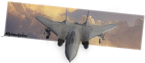
Updated with all points taken into consideration.
Instead of making the BG match with the render I went the other way, It helped with the lighting on the render as well.
Nid
31 Oct 2008

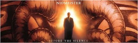
Just to Bump this topic, lest it get lost in the depths of the forum. This is my halloween Avvy and Sig.
Edited by The Tooth Fairy, 31 October 2008 - 12:19.
Nid
10 Nov 2008
 Warbz, on 10 Nov 2008, 17:44, said:
New font pls.
Nem put you up to this!
Well, I'll be back, with a better font!
Slightly Wonky Robob
11 Nov 2008
The Dr, on 10 Nov 2008, 19:11, said:
I wouldn't say the font was too bad but just too many effects on the font.
Agreed. I can't stand the effect bevel/emboss, never looks good. If you want a 3D look, I feel that painting on the shadows and highlights by hand always looks much better.
Sgt. Nuker
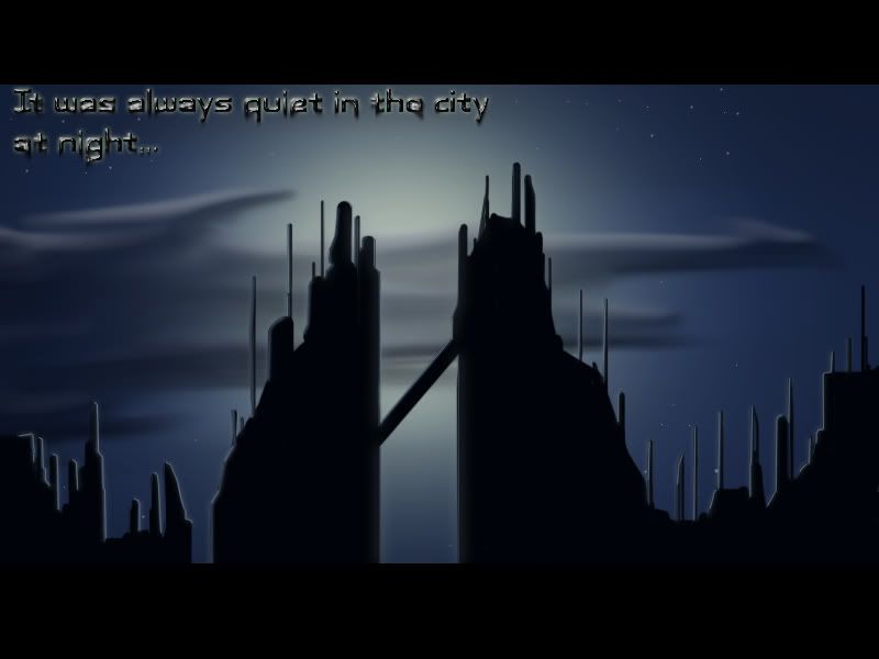
16 Nov 2008
What other font did you have in mind? Although you mentioned the piece is still a WIP, the font needs to be deep six'd. If you're going for a grungy, industrial look, maybe have a font that looks like it's oil stained, like it was a piece of metal on an oil rig, or at the very least, a font that looks like it belongs on an alarm clock. Two very different styles that would convey two very different images for the city in the back ground. One suggesting what the text would lead one to suggest, and that is there are thieves and criminals lurking, stalking about the streets in the dead of night. The other suggesting that the city is a target or the location being introduced in the opening scene of a movie.
Perhaps you could add an animation, make the stars twinkle or the clouds roll by (the latter being the more difficult I think, but netting the best result). Maybe combine the two?
Perhaps you could add an animation, make the stars twinkle or the clouds roll by (the latter being the more difficult I think, but netting the best result). Maybe combine the two?
Nid
29 Nov 2008
I never got around to adding the improvements D:
But thanks for the advice, everything gets taken into consideration for future pieces.
I will probably come back to that piece sooner or later anyway.
In the mean time, I've been keeping in with the attempts at evirnonmental design:
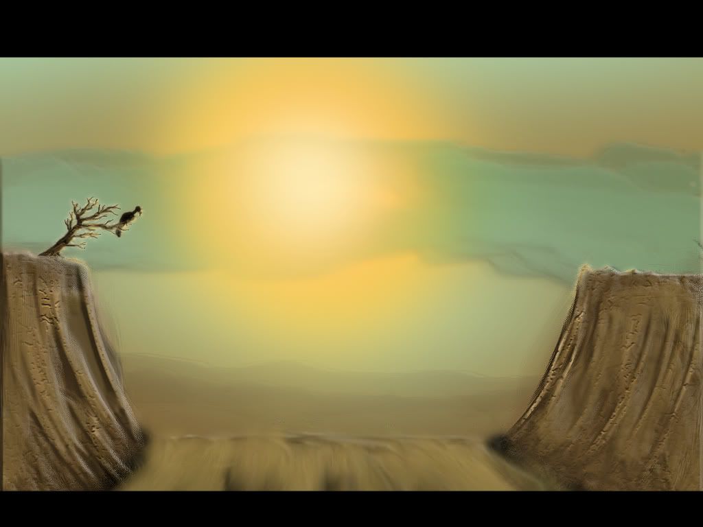
I know it's not great, so bear that in mind, I am still, really, just a begginer with this, but remember that everything I have done, and will do in Environment design is created by myself, no images are used or taken from other sources.
Edited by Nidmeister, 30 November 2008 - 21:01.
But thanks for the advice, everything gets taken into consideration for future pieces.
I will probably come back to that piece sooner or later anyway.
In the mean time, I've been keeping in with the attempts at evirnonmental design:
I know it's not great, so bear that in mind, I am still, really, just a begginer with this, but remember that everything I have done, and will do in Environment design is created by myself, no images are used or taken from other sources.
Edited by Nidmeister, 30 November 2008 - 21:01.
Slightly Wonky Robob
30 Nov 2008
Considering this is still some of your early work, it's pretty good