My new start
 Thunderstruck
18 Aug 2008
Thunderstruck
18 Aug 2008
I am a beginner at making images. But i like doing it. Here is my first image I have made. please have a look, and maybe give me some critique on how to improve. Thanks.

here is my first moage. I did a bad job at cutting. Anyways. I use GIMP. If you have any tips or pointers, please say so.
here is my first moage. I did a bad job at cutting. Anyways. I use GIMP. If you have any tips or pointers, please say so.

Thunderstruck
18 Aug 2008
Actually, it was a brush, and there are about 4 in use there.
i really am just learning. I love it. I need to get better at cutting though. And the use of layers too! Amongst MANY other things. I am scratching the surface.
Edited by Carnage18, 18 August 2008 - 18:10.
i really am just learning. I love it. I need to get better at cutting though. And the use of layers too! Amongst MANY other things. I am scratching the surface.
Edited by Carnage18, 18 August 2008 - 18:10.
Thunderstruck
18 Aug 2008
Yes. Amateur our has arrived. here is another image. But I am stuck. Throw me some pointers so I can do better.
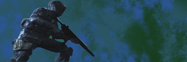
Call of Duty 4.
here is another image. But I am stuck. Throw me some pointers so I can do better. Call of Duty 4.
WarMenace
18 Aug 2008
Sure looks better then my stuff, I suck at GIMP. 
But not bad, keep it up! Just add a border it'll look better then.
But not bad, keep it up! Just add a border it'll look better then.
Thunderstruck
18 Aug 2008
Ah well. I am, switching to Photoshop momentarily. just give me a bit and I will throw up some decent images.
WarMenace
18 Aug 2008
PS is hard to get used to, really, but once u got it, omg everything would be so different and nice... beauty of the sigs at its best.
Wizard
18 Aug 2008
Start by using a smaller canvas. The larger you make it the more you have to do to fill it. Also, try using colours that go together.
Lord Atlantis
18 Aug 2008
Also, when cutting out renders, learn to use the paths tool. It allows for much cleaner cutting. When you have it cut out, create a new transparent image and put the render on it and save it as a .png. Then take that image and use it with your signature.
WarMenace
18 Aug 2008
he's switching to PS, I dont think he'll be using GIMP anymore after that
Thunderstruck
19 Aug 2008
Well. i switched to Photoshop. Anyone wanna see the results of my first image? It is actually kinda cool.
Here is my first Photoshop image. Please leave a comment.
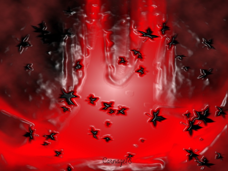
Here is my first Photoshop image. Please leave a comment.
Libains
19 Aug 2008
Agreed with MasterChief - although the use of the filters in this case is reasonably obvious - such as the PlasticWrap that's been applied to the whole image, and the brush work with the stock (i believe) leaf brush. However, for a first time bit of Photoshop work, it's not half bad, and I've seen people do far worse. Keep up the good work
Camille
19 Aug 2008
ah the joy of photoshop brushes & filters...
the hardest part is to avoid using those. or at least to combine them to something original.
the hardest part is to avoid using those. or at least to combine them to something original.
Reaper94
19 Aug 2008
 Carnage18, on 19 Aug 2008, 5:26, said:
Well. i switched to Photoshop. Anyone wanna see the results of my first image? It is actually kinda cool.
Here is my first Photoshop image. Please leave a comment.
Here is my first Photoshop image. Please leave a comment.
that actually really looks good
keep it up and youll get better really fast, check youtube/google for tutorials as well

Thunderstruck
19 Aug 2008
Thank you. I am... nevermind that part. Anyways, yeah. Since that picture, I have made some pretty neat images. I just have to use a better color theme in them.

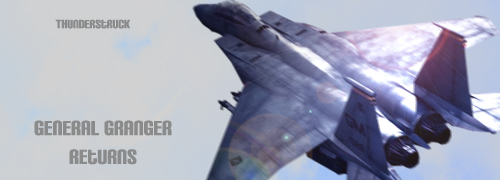
Heres my "Sig of the Week" entry. If ya want it, just ask.
Edited by Thunderstruck, 21 August 2008 - 16:56.
Anyways, yeah. Since that picture, I have made some pretty neat images. I just have to use a better color theme in them.Heres my "Sig of the Week" entry. If ya want it, just ask.
Edited by Thunderstruck, 21 August 2008 - 16:56.
Mbob61
21 Aug 2008
Nice Nice, you are improving very quickly
He is a little dark but not bad at all
Mike
He is a little dark but not bad at all
Mike
Thunderstruck
21 Aug 2008
I hope this one isn't as dark. It is bland, I know, but i felt like improving my cuts. I am getting better, and it is taking me less time every time I make a new one. So, here ya are.
Rayburn
21 Aug 2008
Pretty good for a start. Keep it up.
Here's a tip: When you use renders and put them in front of a background, it looks nicer if the background - atleast the part around the actual render - has similar colours. That way, the render blends into the background more nicely. One thing that is REALLY important is using a decent render. Try planetrenders.net, there are plenty of high quality cuts from various games. One thing you should avoid is using a small render and making it bigger. That way, you'll lose quality and the result can ruin an otherwise decent signature. Also, when you have a screenshot that includes your render, try using the rest of the pic as part of your signature instead of cutting out a single object. It allows for some interesting effects.
Edited by Rayburn, 21 August 2008 - 18:59.
Thunderstruck
21 Aug 2008
So, use some part of the original render besides the character/object I am cutting?
Rayburn
21 Aug 2008
Take this pic for example. There are multiple ways to approach this. You can either cut out the guy in front and use the render OR you can cut out a rectangle shaped section the size of the sig you want to make which includes the guy and, for example the pipes, the steam, the lighting and so on. You can use this section as a basis to add further effects. Eventually, the sig will not only show the render but also a part of the scenery.
Edited by Rayburn, 21 August 2008 - 19:07.
Edited by Rayburn, 21 August 2008 - 19:07.
Thunderstruck
21 Aug 2008
Ahhhhhhhhh. Ok. I will try for something like that. Just wait for my next siggy.
