Motoshi Design's
 Motoshi
24 Nov 2008
Motoshi
24 Nov 2008
So well i got nofting to say....only thing that i design by my heart.Not like using tuts or something...It took me long enough to understand photoshop it will take another 2 years to make everything propely.Never liked ppl teaching me,only when i really find someone to ask 
Hell no who ever understood me...please explain to others
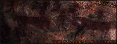
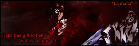
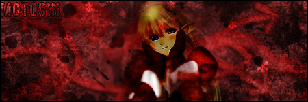
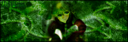
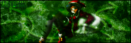
Heres my works: Didnt post everything only latest


 (Thumbnail)

Edited by Motoshi, 15 March 2010 - 21:10.
Hell no who ever understood me...please explain to others
Heres my works: Didnt post everything
only latest (Thumbnail)
Edited by Motoshi, 15 March 2010 - 21:10.
Shirou
24 Nov 2008
I'm rather impressed. I really like some of them. Nice use of brushes out there.
You could however take a bit more practice at blending a render into your signatures. Just friendly criticism.
You could however take a bit more practice at blending a render into your signatures. Just friendly criticism.
TheDR
24 Nov 2008
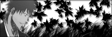
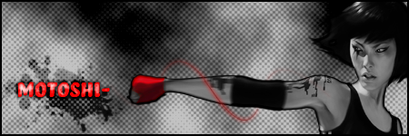
I love the Mirrors edge sig the most, it has real style.
The rest i think are good but that's just to personal taste and not sig quality.
I would comment on them but i feel it would be hard to do them all so i will just wait for your next sig
Looking forward to seeing more.
The rest i think are good but that's just to personal taste and not sig quality.
I would comment on them but i feel it would be hard to do them all so i will just wait for your next sig
Looking forward to seeing more.
Motoshi
25 Nov 2008
 Aftershock, on 24 Nov 2008, 20:09, said:
You could however take a bit more practice at blending a render into your signatures. Just friendly criticism.
Its just...huh....Every Render dosent have to blend with the bg.If it blends too much...its just unwatchable
Next sig i will do for the SOTW i guess......really wanna join it XD

Edited by Motoshi, 25 November 2008 - 18:47.

Warbz
29 Nov 2008
I like the text placement, but the words in the corner annoy me. lol
'Key to win is sealth' ???
The key to winning is stealth.'
'Key to win is sealth' ???
The key to winning is stealth.'
Waris
29 Nov 2008
Warbz, on 29 Nov 2008, 23:03, said:
I like the text placement, but the words in the corner annoy me. lol
'Key to win is sealth' ???
The key to winning is stealth.'
'Key to win is sealth' ???
The key to winning is stealth.'
How could you say that?
Motoshi said:
Im designing with own mind.Anything against my sigs or picture...you better belive your alive
I agree still. :(
Edited by Waris, 29 November 2008 - 12:45.
Motoshi
29 Nov 2008
About the text on the sig....So ?
and what waris quoted means....I dont care what people think about my works.....
and what waris quoted means....I dont care what people think about my works.....
Dauth
29 Nov 2008
It's just him complaining about the poor English, and providing a more suitable option.
Motoshi
29 Nov 2008
Jesus christ...Im freaking 14 years old i have studied english 6 or 7 years.First 3 years the marks were like A/B (For americans).After that i started studing but still...I was better than my class mates...Due coming to filand i started to lack english because the level of experience the teachers are giving us is LOWWWWWWWWWWWWWWWw
L-O-W
i have studied english 6 or 7 years.First 3 years the marks were like A/B (For americans).After that i started studing but still...I was better than my class mates...Due coming to filand i started to lack english because the level of experience the teachers are giving us is LOWWWWWWWWWWWWWWWwL-O-W
Motoshi
29 Nov 2008
Well i want to hear.....Then i know what to change next time...I havent said anything real against it....The sentence was written half joke
Only thing what i hate is when people start nagging about my english
Edited by Motoshi, 29 November 2008 - 15:17.
Only thing what i hate is when people start nagging about my english
Edited by Motoshi, 29 November 2008 - 15:17.
Nid
29 Nov 2008
Nobody is nagging, just giving advice/help.
I suggest you take it before people DO start nagging
And the last sig you did is just a little too blurry IMO.
Especially the render.
I suggest you take it before people DO start nagging
And the last sig you did is just a little too blurry IMO.
Especially the render.
Motoshi
29 Nov 2008
Its meant to be so.
because th ninja is moving fast...You see the render and right of sig is blurry
but left isnt because his not there yet
Edited by Motoshi, 29 November 2008 - 17:57.
because th ninja is moving fast...You see the render and right of sig is blurry
but left isnt because his not there yet
Edited by Motoshi, 29 November 2008 - 17:57.
Motoshi
07 Jan 2009


Vaughan
08 Jan 2009
Awh, Count Alucard, I presume?
Looks good - The psychedelic colours and the toxic logos don't quite fit Alucard, however.
~V.
Looks good - The psychedelic colours and the toxic logos don't quite fit Alucard, however.
~V.


Crobar
16 Jan 2009
Pretty good - I like the last one especially. The middle one is a little tall for my tastes but that doesn't necessarily mean that its bad - Just a matter of personal taste. Keep up the good work
Wizard
17 Jan 2009
You have some good skills here Motoshi, however you don't do yourself any favours but over filling the sigs with brush works. Quite often I see too much in a signature and the brushing doesn't always fit to the render. Remember:
Quote
Less IS More
Slightly Wonky Robob
18 Jan 2009
Wizard, on 17 Jan 2009, 11:46, said:
You have some good skills here Motoshi, however you don't do yourself any favours but over filling the sigs with brush works. Quite often I see too much in a signature and the brushing doesn't always fit to the render. Remember:
Quote
Less IS More
I couldn't agree more
You have some serious talents there, but they are currently looking very cluttered, and you actually have to search for the talent in the sigs.

TheDR
18 Jan 2009
Simple sigs can look the part, your sigs are very organized and show creativity but as Bob and Wizard have mentioned adding too much
to sigs can create a blur, i would say just adding a few brushes on the foreground and maybe a simpler brush on the background could make it less busy.
Keep up the good work, you can only get better
to sigs can create a blur, i would say just adding a few brushes on the foreground and maybe a simpler brush on the background could make it less busy.
Keep up the good work, you can only get better
Motoshi
18 Jan 2009
Thanks for the info 
My weakness atm with brushes is i dont know how to make the background if i find empthy space
God i forgot the word -.-
My weakness atm with brushes is i dont know how to make the background if i find empthy space
God i forgot the word -.-
Wizard
18 Jan 2009
There are plenty of good ways to make your BG without brushing. I personally haven't made a sig that has brushes in for ages (not strictly true but I use brushes only for clipping masks and not for the brushes themselves).
Best bet is to use your render as the platform for the BG, either as a blurred version or by taking two of the most obvious colors and making a gradient from them. You can them smudge out this gradient or a combo of the gradient and a copy of the render to form you BG and it will fit perfectly with the focal render.
I'd suggest you take a look at Bob's tutorial to get an idea of what I mean. A fairly simple (no offence Bob) way of explaining this that can be done using no brush work at all. In fact I'd suggest finding the exact render from Bob's tut and trying to copy it exactly, just for your own understanding of how it was made. Once you know you can apply the techniques to your own creations. I have made a few tuts like this that don't involve brushes, I'll dig them out for you at some point. Failing that I have a new years resolution to make some more tutorials and I will try and do that in a few weeks.