Motoshi Design's
 Futschki
13 May 2009
Futschki
13 May 2009
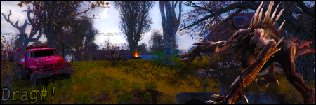
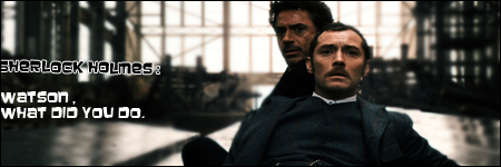
uhm the DRD ricardo sig uhhh i think the render kinda doesnt flow with the background not color-wise I mean
all the rest are quite cool
all the rest are quite cool
Motoshi
13 May 2009
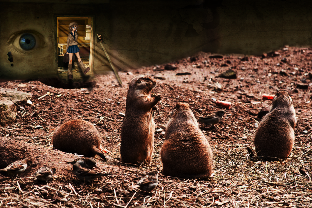
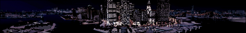
 it failed...that was my experimental sig for flow into bg
Pav:3d
05 Jun 2009
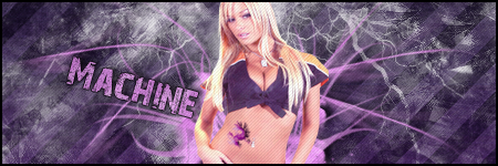
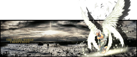
Sort out the blur where the two images meet, since it doesnt make sense if the character and the wall and that whole section is in focus/not far away when halfway through the image it isnt.
TheDR
07 Jun 2009
That is odd 
Anyway i feel the birds down the bottom are a little bit blurry everything else is not too bad but i seriously don't understand it
Anyway i feel the birds down the bottom are a little bit blurry everything else is not too bad but i seriously don't understand it
Motoshi
08 Jun 2009
You dont have to xD who said manipulation has to be understandable ....anyway the birds were blurry at the start...sooo the contest picture was kinda fucked


Pav:3d
16 Mar 2010
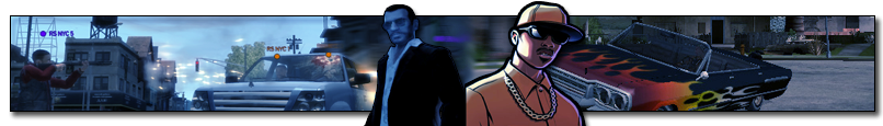
Wow, some great stuff in there. Particularly the GameDRD and toxic game sigs
