Pav3d's Stuff
 Im waiting for it also
 WNxMastrefubu
17 Jun 2009
WNxMastrefubu
17 Jun 2009
 Pav3d, on 17 Jun 2009, 13:58, said:
Damnit, returned to loop 
i think it looks better that way anyway, its a nice surprise, and id hate to miss it
Pav:3d
17 Jun 2009
@Motoshi: recently got very much into playing bad company over xbox live. So im very much looking forward to the next indeeeed
Here is HeartBreak 1 aka Sergeant Major Kid's request.
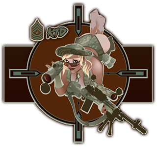
Main pic is by this guy who makes alot of badass military pin ups
Font is called Fighting Spirit
Here is HeartBreak 1 aka Sergeant Major Kid's request.
Main pic is by this guy who makes alot of badass military pin ups
Font is called Fighting Spirit

TheDR
24 Jun 2009
I like your new (oldish now  ) avvy, imagine if BC2 had that kind of graphics, it could be awesome if done right.
But what i really like is the new EC logo because its got to be the best variation of the Generals logo i have seen.
) avvy, imagine if BC2 had that kind of graphics, it could be awesome if done right.But what i really like is the new EC logo because its got to be the best variation of the Generals logo i have seen.
Pav:3d
03 Jul 2009
Rayman sig request from mike/mbob61
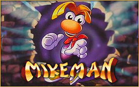
We tried to find a better shot of this pic but it just didnt happen. So thats why it looks a bit fuzzy
Mikeman is "built" from copy/pasting/clonetool/etc the classic rayman logo
Edited by Pav3d, 03 July 2009 - 21:36.
We tried to find a better shot of this pic but it just didnt happen. So thats why it looks a bit fuzzy
Mikeman is "built" from copy/pasting/clonetool/etc the classic rayman logo
Edited by Pav3d, 03 July 2009 - 21:36.
Pav:3d
12 Jul 2009
An update of my bad company 2 sig. I have hoarded every piece of bad company 2 artwork I can find

Also added a quote from the first one which pretty much sums up why I like the game
Also some info about the new EC logo.
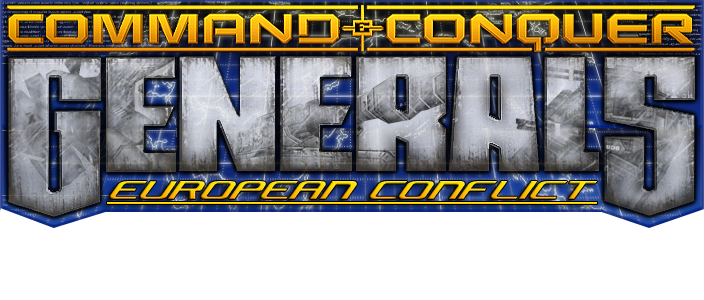
I searched high and low for a blank 3d generals logo but couldnt find one, so I made do with the one from EA's site.
the shadows of the units are the starchild, atlas and quickfire. I choose em coz they were my fave of each faction.
I dirtied up the logo alot coz gens is old
If anyone has any requests... let me knw...
Edited by Pav3d, 12 July 2009 - 15:44.
Also added a quote from the first one which pretty much sums up why I like the game
Also some info about the new EC logo.
I searched high and low for a blank 3d generals logo but couldnt find one, so I made do with the one from EA's site.
the shadows of the units are the starchild, atlas and quickfire. I choose em coz they were my fave of each faction.
I dirtied up the logo alot coz gens is old
If anyone has any requests... let me knw...
Edited by Pav3d, 12 July 2009 - 15:44.
Brad
12 Jul 2009
Some good work there Pav3d!
I especially like that logo, looks really good :3
I especially like that logo, looks really good :3
Pav:3d
18 Jul 2009
Thought id make a MW2 sig
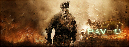
The main pic is from a fan made wallpaper, I added some more sparks n other little touch ups
The main pic is from a fan made wallpaper, I added some more sparks n other little touch ups
Pav:3d
21 Jul 2009
Wars can get a little dirty
Here is Kalos request:


Here is the original image. It took quite a while to cut it all out
Normally Im not a huge fan of anime, but I thought this picture was pretty cool. (even though my initial thought was "so theyre being raped by music or sth?"
Here is Kalos request:
Here is the original image. It took quite a while to cut it all out
Normally Im not a huge fan of anime, but I thought this picture was pretty cool. (even though my initial thought was "so theyre being raped by music or sth?"
Libains
21 Jul 2009
Colour range option in CS4 ftw - it's so damn accurate it scares me - far better than any other select tool. It would have had that 95% out in seconds
Pav:3d
21 Jul 2009
AJ, on 21 Jul 2009, 23:14, said:
Colour range option in CS4 ftw - it's so damn accurate it scares me - far better than any other select tool. It would have had that 95% out in seconds
FFFFFFFFFFUUUUUUUUUUUUUUUUUUUUUUUUUUUUUUUUU
*looks for CS4*
Libains
21 Jul 2009
Hehe, get it on the 'cheap' mate. Seriously though, that tool is very good as you can do fuzziness, range, distance and all sorts. Sometimes it causes problems with transparencies, but that is nothing that can't be solved quickly. Cut the image for Scope's sig out using mostly that tool, and it took it nearly all away in one go.
Pav:3d
21 Jul 2009
Damnit, I mainly want it for the rendering while skinning feature, coz that just makes things 100000000 times easier, not to mention I dont have to keep switching between 3ds or w3d viewer all the time.
Anyways here is the second version of Kalos combo, he said he was expecting some abstract purple, so here it is


Anyways here is the second version of Kalos combo, he said he was expecting some abstract purple, so here it is
Kalo
22 Jul 2009
I greatly appreciate you taking what I said to heart, but the vanilla versions look alot better. Thank you very much Pav.
TheDR
11 Aug 2009
Awesome sig 
The things i like are the transparency, as it works really well and the size of it is near perfect imo.
The bits that i think could do with some work is the text, the bg is just a tad bit busy and the text looks jumbled, and then top bit near his head, the light ray things could do with a less sudden finish (Simple eraser job?).
Sgt. Nuker
11 Aug 2009
Layer upon layer, and pixel after pixel of sheer awesome.....ness. Way to go Pav3d.
