Dedicated!
 Zhao
13 Oct 2010
Zhao
13 Oct 2010
Sgt. Nuker
13 Oct 2010
Wizard
13 Oct 2010

Libains
13 Oct 2010
*Insert very big admin boot right here.*
Camille, Nem, we all know of your previous disputes, and I have respect for the way both of you work. This also means you are equally able to earn my disrespect for being generally irritating. You're both fine artists in your own right.
Camille, I would point out I kinda like the stuff Nem does in an abstract manner, at least it's not a hamster drawing a picture using a wheel covered in paint (and yes that has been passed off as 'modern art'). Equally Nem, you yourself have previously done work involving editing a photo of your own, so I wouldn't judge Camille's avatar so, you could be accused of double standards (also note that people consider the photography itself an art form).
All artists have had differences of opinion, and have probably voiced opinions more vocally than the pair of you. However, that does not make it the right thing to do - Camille's critique could be a little less barbed, and Nem, you could exaggerate it slightly less. This is a forum, by it's definition an area for debate, but it not a place for descending into nonsensical arguments, acting like 'total jerks'.
Just try and not post in this topic for the next 12-24hrs, the pair of you. It'll allow you both to calm down and reflect a little, but I'm not going to kill off a person's work thread. Lets just move on and forget about it, eh?
Note, Aaron, seriously, learn when to stay out of things.
^^Ninja'd too, damn you Wiz.
Nem
14 Oct 2010
@AJ wise words I'm done with this dispute.
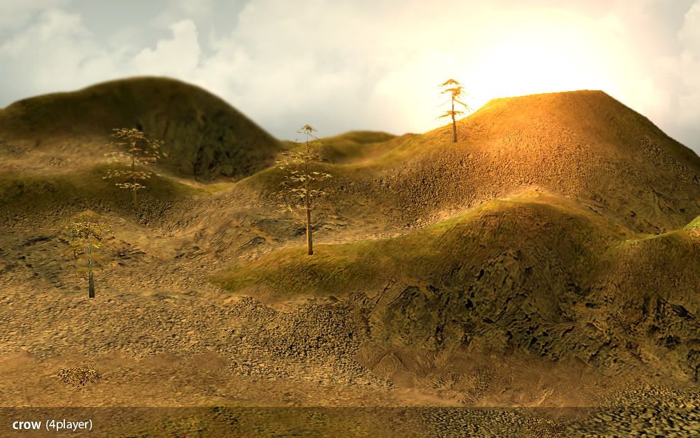
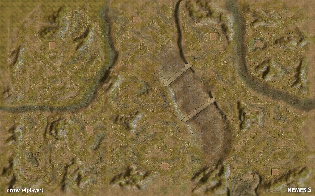
Two separate maps for Shockwave as well as Rise of the Reds. The first being "Throttle" a 2 player competitive style map, and the second being "Crow" a 4 player expanded variant.
Edited by Nem, 14 October 2010 - 19:52.
Two separate maps for Shockwave as well as Rise of the Reds. The first being "Throttle" a 2 player competitive style map, and the second being "Crow" a 4 player expanded variant.
Edited by Nem, 14 October 2010 - 19:52.
Nid
14 Oct 2010
hay nem i like your maps and stuff and your avvy is cool too i hope you like mine because i do and i think it is really cool and sutff as i spend so long on it and yeah i tyhink you should really like it
Pav:3d
14 Oct 2010
Yeah Nid we get it, you're trolling camille, you've posted that in 3 threads already.

Sgt. Nuker
15 Oct 2010
Nidmeister, on 14 Oct 2010, 18:55, said:
hay nem i like your maps and stuff and your avvy is cool too i hope you like mine because i do and i think it is really cool and sutff as i spend so long on it and yeah i tyhink you should really like it
Don't believe for a second that you are above reproach, Nid.
Nem
15 Oct 2010
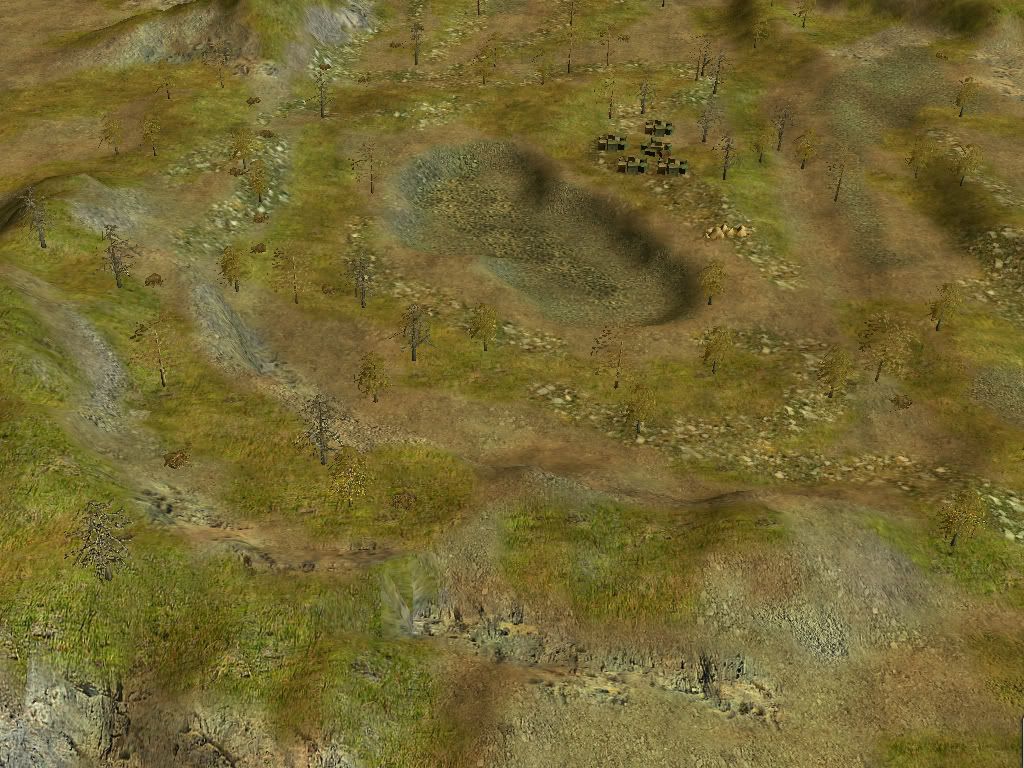
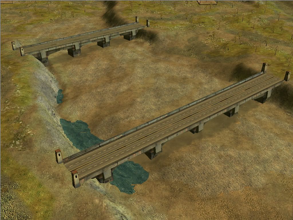
Place a few RPG troops up there and reign down fire on the many vehicles that pass through on a proper game.
Though really, you are right, they are more eye candy then anything else.
Though really, you are right, they are more eye candy then anything else.
Nem
03 Nov 2010
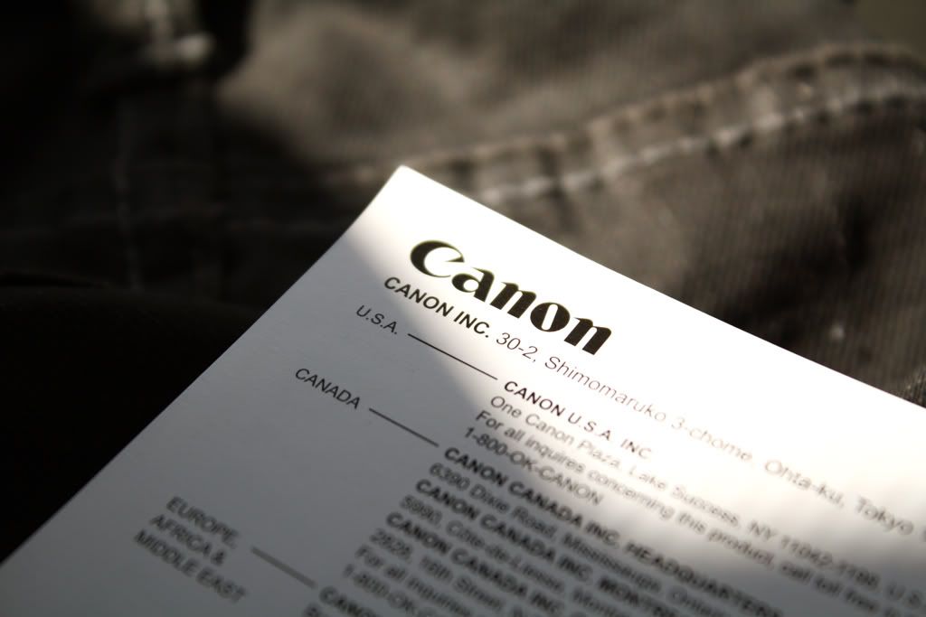
New cannon. Any silly person with a decent camera thinks they are a photographer these days, I'm going to do my best to set myself apart.
Meh at Photobuckets crap quality.
Edited by Nem, 14 April 2011 - 19:32.
Meh at Photobuckets crap quality.
Edited by Nem, 14 April 2011 - 19:32.
Nem
25 Apr 2011

Came out nice for an hour of work

Tried to make something nice without the use of any gradation, Meh.
Edited by Nem, 25 April 2011 - 22:11.
Wizard
25 Apr 2011
Whilst I appreciate the workmanship that goes into animating a signature, I am not sure that the megaman one needed it. The background doesn't feel like it goes with it either.
The hobo with a shotgun signature is just pure WIN, however.
Edit: also, wat is wrong with gradients?
Edited by Wizard, 25 April 2011 - 22:11.
The hobo with a shotgun signature is just pure WIN, however.
Edit: also, wat is wrong with gradients?
Edited by Wizard, 25 April 2011 - 22:11.
Nem
13 May 2011
Ugh. I guess this belongs here, There are like two video guys on this forum. Anyway, I produced this teaser for a small feature film shot here in Orlando.
Edited by Nem, 13 May 2011 - 00:41.
Edited by Nem, 13 May 2011 - 00:41.
Wizard
13 May 2011
I am guessing you are going for a creepy and scarey vibe in that. The only problem is that you've made some of those cuts too long. The fade on the text is good, but doesn't work well with the transparency of the image behind it. One because it's not very clear what it is, two because it obscures the text 
Nice work though
Nice work though
Nem
25 May 2011
Thanks for the input, I was a bit lazy with the titles, and I agree there are some cuts that could have used some shortening, I was in a rush. 
Original

Collouur

Final

Came out ok I guess, I didn't really have any inspiration, I just needed a sig so I wiped one up.
Edited by Nem, 25 May 2011 - 22:06.
Original
Collouur
Final
Came out ok I guess, I didn't really have any inspiration, I just needed a sig so I wiped one up.
Edited by Nem, 25 May 2011 - 22:06.
Wizard
26 May 2011
Nem, on 25 May 2011, 23:05, said:
This one worked the best imo. I see you might have come around to using gradients?
I would say that the patch of white on the right hand side doesn't really work, unless you may perhaps fade it to make it look like smoke, in which case you need to seriously lower the opacity of it. That, and the dropshadow on the character doesn't work as it gives depth to something that doesn't need it.I still like it a lot though
