Dedicated!
 Nem
27 May 2010
Nem
27 May 2010
Inspired by new elite awesome Droid, and it's wonderful internet teathering abilities.
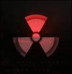
Basicly the top caution symbol is suppose to spin, however I don't have the resources to animate it here. I think it's an interesting logo, with the potential to be
used elseware in the future. :sly :

Edited by Nem, 27 May 2010 - 16:53.
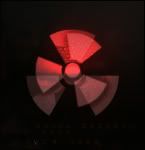
Basicly the top caution symbol is suppose to spin, however I don't have the resources to animate it here. I think it's an interesting logo, with the potential to be
used elseware in the future. :sly :
Edited by Nem, 27 May 2010 - 16:53.
Nem
27 May 2010
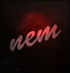
There was also a verison of the 'ol fashioned big Nem. Sadly those days are coming to an end, as they never made sense, Why have an avy that states your name when your name is listed right above it?
SILLYNESS!
Edited by Nem, 27 May 2010 - 17:15.
SILLYNESS!
Edited by Nem, 27 May 2010 - 17:15.
Nem
27 May 2010
Yes, however I would like to continue working on it at home where I have additional animation tools as well as time.
Edited by Nem, 27 May 2010 - 18:25.
Edited by Nem, 27 May 2010 - 18:25.
Nem
08 Jun 2010

A new take on "Sunset" from a while back. Was quite happy with the amount of contrast I managed in the end, Perhaps it's good enough to trick your eye into thinking it's bright.

Super Harsh photography. Notable because the picture was taken with my Droid, I look to be nude from the angle, Nope.
Edited by Mr.Dr., 08 June 2010 - 08:45.
CJ
08 Jun 2010
Making women cry is totally not cool!
I must say that the second photo's quality is rather impressive for a smartphone, but why did you put that green filter on it? D:
I must say that the second photo's quality is rather impressive for a smartphone, but why did you put that green filter on it? D:
Nem
08 Jun 2010

BeefJeRKy
08 Jun 2010
Yeah I don't like the White Balance in the photo tbh. The sunset one is a bit cliché but nicely done.
Nid
08 Jun 2010
Nem
25 Jun 2010
TheDR
25 Jun 2010
I think it looks nice, maybe a bit less glow on the design bit (Destiny will kill me for saying that  ).
).
).
Alias
25 Jun 2010
The main text is fine, but the transparent reversed reflection is ugly as hell.
Nem
30 Jun 2010
Alias, on 25 Jun 2010, 6:22, said:
The main text is fine, but the transparent reversed reflection is ugly as hell.
It's a soon to be solved issue with layer blending. It's set to overlay, and since the background is transparent it's opacity increased, lots.
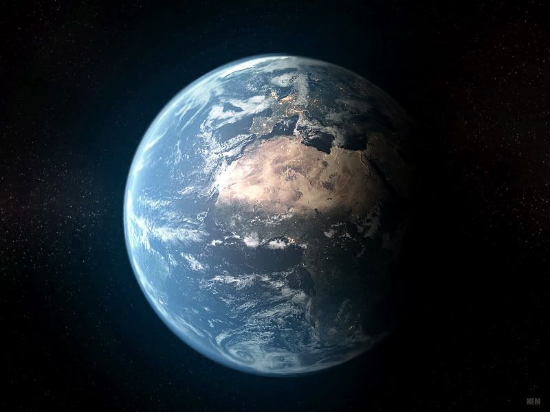
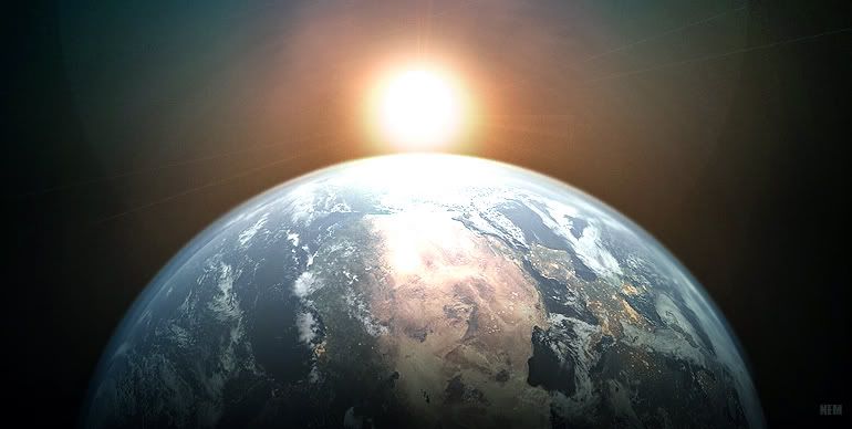
I have gotten quite skilled at making planets while working on Core, To demonstrate, Earth!
Edited by Nem, 30 June 2010 - 08:06.
Chyros
30 Jun 2010
partyzanpaulzy, on 30 Jun 2010, 16:15, said:
I don't think Earth athmosphere is so blue... not anymore. 
 .
.Nice pic though, I'm a sucker for planet images like this
 !! It looks really detailed and beautiful.
Nem
01 Jul 2010
Pav:3d, on 30 Jun 2010, 11:02, said:
Nice work nem, how was that made?
You know you are doing something right when people ask this question.
5 perfect spheres layerd on top of each other in 3DS, with the land sphere actually having displacement maps for height variance. Photoshop was used to create the star map as well as color correction.
WarMenace, on 30 Jun 2010, 14:12, said:
Nem, that is indeed beautiful, you should show us more planets.
Later this summer you will be seeing a much more complex planet.
CJ
01 Jul 2010
Hmmm, pretty cool indeed, but I'm wondering : How did you get the actual terrain's texture? Did you use some satellite imaging or did you draw it? 
I'd be very impressed if it was the former
I'd be very impressed if it was the former
WarMenace
01 Jul 2010
I look forward to your artwork. Hopefully we'll get to see a planet getting destroyed? Lol, jk anyway dude, keep up the good work.
Also, looking forward to your CORE mod, it looks glorious.
Also, looking forward to your CORE mod, it looks glorious.

Nem
24 Jul 2010
Whitey
24 Jul 2010
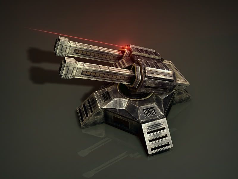
The barrels are too square-uular
Otherwise I like the texture. Looks like it'd make a cool gatling gun, like in RA2. Like Yuri's but more square-ular.
Otherwise I like the texture. Looks like it'd make a cool gatling gun, like in RA2. Like Yuri's but more square-ular.
