Stalker's Zero Hour Models
 Ion Cannon!
18 Oct 2009
Ion Cannon!
18 Oct 2009
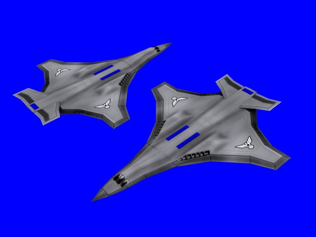
Your skinning skills have improved substantially. I like the model as well, except the wire between the tail and the body of the aircraft.
JJ
19 Oct 2009
Ah cool, looks like something GLA would use. The housecolour bit at the base of the wire looks kinda odd though.
Wizard
12 Jan 2010
I agree with the others that it does look very flat, however the render angle could have something to do with it. The skin is very good though. Your skins have improved a lot! Well done you.
Stalker
12 Jan 2010
It's not really flat. I'll post some renders from different angles when I'm at home.
Wizard
13 Jan 2010
 Stalker, on 12 Jan 2010, 12:25, said:
It's not really flat.
Are you certain about that? It couldn't look much flatter if you tried. What render settings are you using?
Pav:3d
13 Jan 2010
Its far too flat  could pick up the rear wings slightly which would make it look less flat
could pick up the rear wings slightly which would make it look less flat
Stalker
13 Jan 2010
You're right it is flat ;-)
But I like it as it is and I'm more concerned about Ingame-looks.
I tried. Doesn't look good
But I like it as it is and I'm more concerned about Ingame-looks.
Quote
could pick up the rear wings slightly which would make it look less flat
I tried. Doesn't look good
Dauth
13 Jan 2010
Could you show us some shots in game to show off the effect you're trying to get with the flatness?
Ion Cannon!
13 Jan 2010
I can't see how it would look worse if it was less flat, I imagine it would look alot better in fact.
JJ
14 Jan 2010
You sure those renders aren't stretched? Because the plane looks so flat that it gives that impression.
Shirou
14 Jan 2010
Also the cockpit textures look messed up, they should be more sharp edged as well. Now it looks really weird, like the windows are just slapped on it, not naturally.
Edited by Shock, 14 January 2010 - 12:27.
Edited by Shock, 14 January 2010 - 12:27.
Stalker
14 Jan 2010
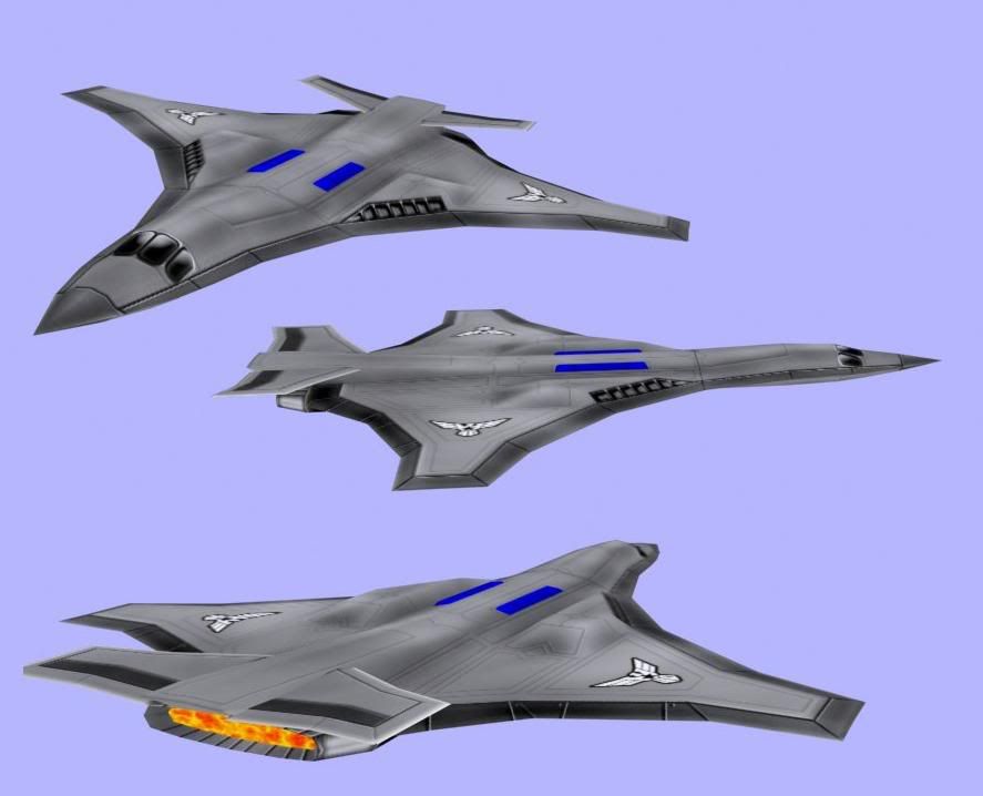
less flat version:
I'm not sure yet which version I like best.
also I don't have it ingame yet, my point was that It wouldn't really make a difference ingame.
And I can't really see what's wrong with the cockpit texture. Sure It could be better, but ... <see sentence above>
I'm not sure yet which version I like best.
also I don't have it ingame yet, my point was that It wouldn't really make a difference ingame.
And I can't really see what's wrong with the cockpit texture. Sure It could be better, but ... <see sentence above>
Wizard
29 Jan 2010
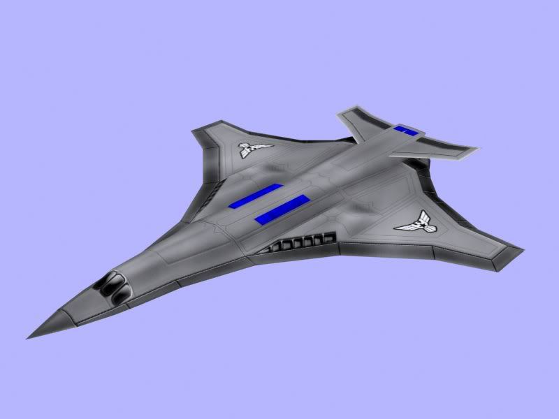
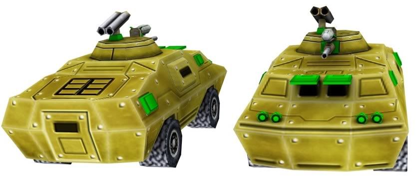
That is a very nice model you've got there. My only criticism is that you need to add some darker areas to the skin. Right now all of the panels join up. Traditionally there are dark lines that separate the skin at the joins or corners. What you have are lighter areas, these don't contrast enough imo. That said you've still done a great job with it.
JJ
29 Jan 2010
Yea, just needs to be burned, a lot, otherwise, quite good actually, you have no problems with adding details.
Pav:3d
29 Jan 2010
Indeed, darker areas is a must, also try some splatter burning with some grungy brushes to make it look more like scratched up metal. Could also try instead of just lightening the edges make them look as thought the paintwork has been scratched off.
Stalker
29 Jan 2010
Thanks for your comments
Update:
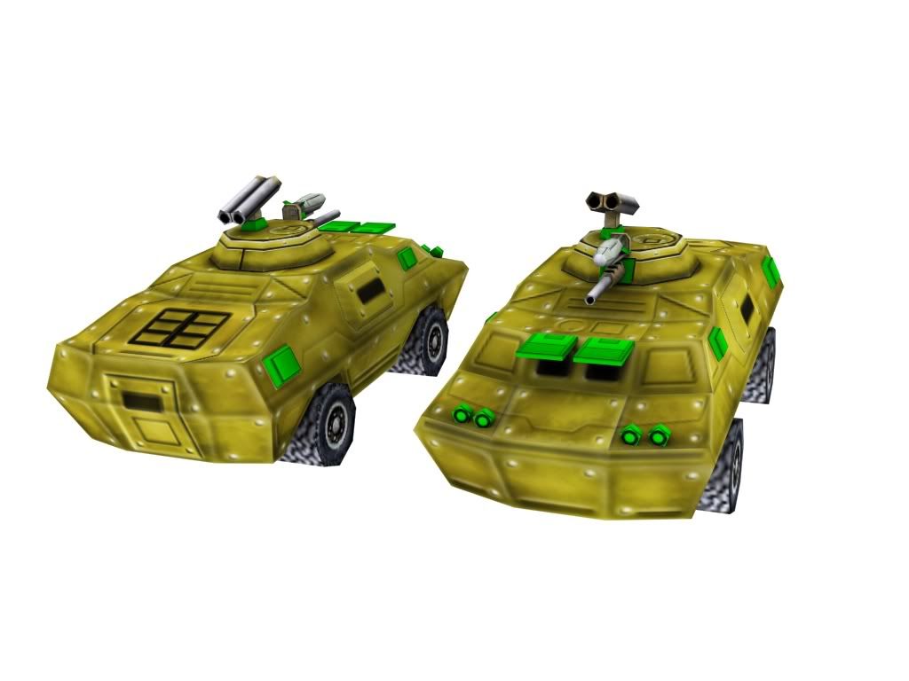
I'm not really sure if this really looks better
EDIT:
I'm a bit confused now, on my laptop it looks light brown and on my PC it looks orange
Edited by Stalker, 29 January 2010 - 17:25.
Update:
I'm not really sure if this really looks better
EDIT:
I'm a bit confused now, on my laptop it looks light brown and on my PC it looks orange
Edited by Stalker, 29 January 2010 - 17:25.
CJ
29 Jan 2010
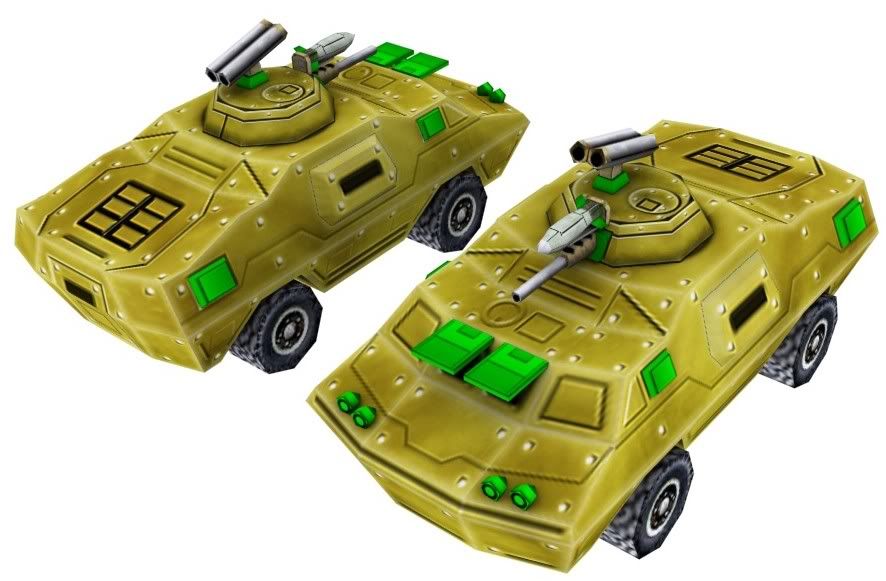
Well it's color is goldish on my screen :o
I like the model, but the skin is definitely too bright, especially those wheels D:
I like the model, but the skin is definitely too bright, especially those wheels D:
