Dreae's Art Shoebox
 Dreae
06 Jan 2010
Dreae
06 Jan 2010
Here is some of my stuff from newest to oldest. Most of it made in GIMP.

Don't forget that C&C
Don't forget that C&C
Ion Cannon!
06 Jan 2010
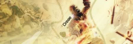
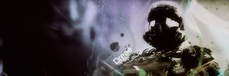
Some nice stuff. However in the 3rd sig down, the render blends into the background to much, making it indistinct.
Dreae
06 Jan 2010
 Ion Cannon!, on 6 Jan 2010, 16:39, said:
Some nice stuff. However in the 3rd sig down, the render blends into the background to much, making it indistinct.
Yea I have that problem, I like for my art to flow and it's easy to get carried away.
Brad
06 Jan 2010
Nice work there, but I suggest trying new styles. If you stay just using one technique, soon you will find that you cannot do much more.
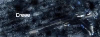
I think my favourite is the fourth one down. I think the render and background fit together nicely.
I think my favourite is the fourth one down. I think the render and background fit together nicely.
BeefJeRKy
06 Jan 2010
Pretty cool to see a new artist pop up. I guess your "flowing" style does make images less distinct. Try to vary the colors some more in the background. Right now many of the backgrounds look like a variation on the original scene which looks nice in some but muddles up others like the 1st and 3rd one imo.
Libains
06 Jan 2010
The flow of the sigs, as others have commented, are very nice indeed. However, the colours sometimes meld together just a little too well, even by upping the saturation of your BG images by a few percentage points you could just differentiate the two, and make sure that they don't meld too well together - flow tends to be more from shapes than it does from colours anyways, so complimentary colours may not be a bad idea, come to think of it. Keep up the good work though, and please post more if you want to 
ΓΛPTΘΓ
11 Jan 2010
IMO the 5th sig is one of the best work I've seen. The render really does flow with the background but not overpowered by it. Rather neat.
Wizard
12 Jan 2010
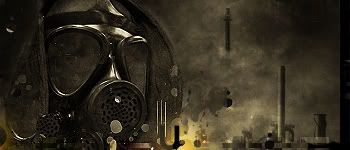
I agree with Raptor here. Your use of subnetmasks in the Stalker signature is very good. Although I think that you might have been better off using some smaller splatter brushes than the circular ones shown. That said I can see at least one splatter, just that the circles are more prominent due to their positioning and the lighter portion of the sig you've moved under the brush. Good work though.
Your first sig is the next best in the assortment. You have blended the render well into the background. Although you haven't really positioned the render or chosen the ideal size for the tag. There is a sense of flow/movement, but it has less effect as you've made the focus too small. You really could've gotten away with a larger focus and therefore I think created more movement to the piece. It does show that you have the understanding for it though, which is half the battle.
The rest are nice but you've blurred the renders into the backgrounds too much and lost the focus.
