CreepyMotos Roulette ! [CRITICS IN THI...
 CreepyMoto
19 Aug 2010
CreepyMoto
19 Aug 2010
So yeah your probably wondering , "Whos that Nablette"
Well basicly i have a second acount which password i dont remember and email account is lost ENUFF OF MY STORY
lets talk about Se...... KRHM , graphics .

So im here to get some critisismmzzzz so i could try and change my point of view into digital art.
The pics in this thread will only be the best works (on my opinion) i have done .
So lets give it a shot . Wait i need to breath abit.
*HUUMMPHHH*
Ahh all better.


[IGNORE THIS NEXT ONE]

[YOU CAN LOOK AGAIN]

[CLICK PICS BELOW]


Edited by CreepyMoto, 19 August 2010 - 17:22.
Well basicly i have a second acount which password i dont remember and email account is lost
ENUFF OF MY STORY lets talk about Se...... KRHM , graphics .
So im here to get some critisismmzzzz so i could try and change my point of view into digital art.
The pics in this thread will only be the best works (on my opinion) i have done .
So lets give it a shot . Wait i need to breath abit.
*HUUMMPHHH*
Ahh all better.
[IGNORE THIS NEXT ONE]
[YOU CAN LOOK AGAIN]
[CLICK PICS BELOW]


Edited by CreepyMoto, 19 August 2010 - 17:22.
Futschki
20 Aug 2010
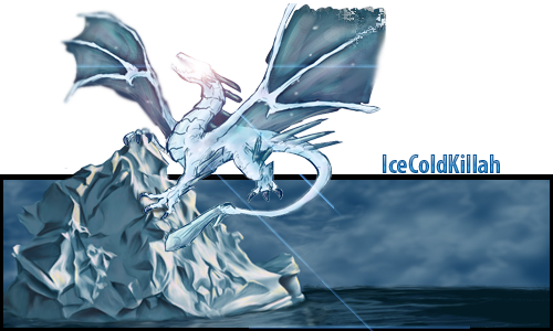
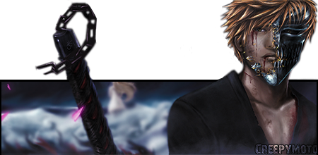
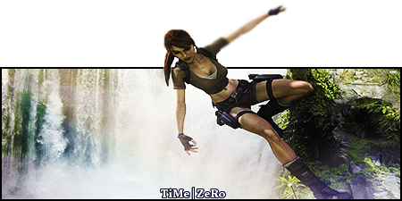
I see you're trying to master the pop-up signature which is a nice way to get some kinda "signature" sigs.
Anyway, gotta say you've got some nice ones and here are some remarks :
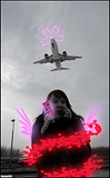
I noticed that you're having a bit of a problem cutting the render to look nice while its popping up, maybe use the polygonal lasso tool because it seems you're using the eraser tool which makes it look rather blurry.
Also, you're stretching some of your renders and making them look out of proportion.
And uhm, the border is getting boring, I mean you do have great ideas for the whole sigs but you should get a bit more creative on the borders.
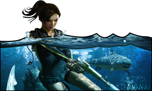
Nice idea on the tomb raider one, I liked it but you should work a bit more on the water surface, it looks kinda cartoonish.
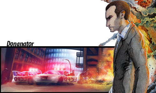
In the gta one, the render looks out of place and the colors don't blend together but the rest has a nice flow in the color.
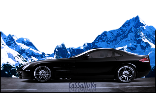
I liked the mercedes one the best even though it would've looked better with a gradient black to transparent border instead of the cut.
All in all, you've got the ideas and you've got the creativity, and that's the most important thing, just keep practicing and you'll do great. ^.^
Anyway, gotta say you've got some nice ones and here are some remarks
:I noticed that you're having a bit of a problem cutting the render to look nice while its popping up, maybe use the polygonal lasso tool because it seems you're using the eraser tool which makes it look rather blurry.
Also, you're stretching some of your renders and making them look out of proportion.
And uhm, the border is getting boring, I mean you do have great ideas for the whole sigs but you should get a bit more creative on the borders.
Nice idea on the tomb raider one, I liked it but you should work a bit more on the water surface, it looks kinda cartoonish.
In the gta one, the render looks out of place and the colors don't blend together but the rest has a nice flow in the color.
I liked the mercedes one the best even though it would've looked better with a gradient black to transparent border instead of the cut.
All in all, you've got the ideas and you've got the creativity, and that's the most important thing, just keep practicing and you'll do great. ^.^
CreepyMoto
21 Aug 2010
Well honestly , i dont use eraser . I just blur the edges so it wont look like i failed to cut it XD , well it worked on white background forums but this is different story.
But to cut i use pen tool , i make a path and then cut it out . Easier than Poly lasso because thats all straight line , pen tool is bendable
But to cut i use pen tool , i make a path and then cut it out . Easier than Poly lasso because thats all straight line , pen tool is bendable


TheDR
14 Feb 2011
It looks very polished, but the background is quite boring, it would be nice to have another image/colour in the background to add some more detail to the sig 
CreepyMoto
15 Feb 2011
Well im trying to do stuff without renders or taken effect pictures from google or other sites Lately i have understood why ppl hate when their work is being stole.
Lately i have understood why ppl hate when their work is being stole.
TheDR
15 Feb 2011
Use Mayang's free textures then, you should be able to get some good textures from that
CreepyMoto
16 Feb 2011
Something i did when i was boored. Yes the picture is made by me :DP
Ya i know the prespective of the warning is wrong but i didn't save the psd to fix it atm
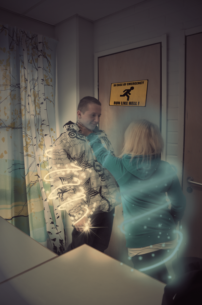
Edited by CreepyMoto, 16 February 2011 - 15:47.
Ya i know the prespective of the warning is wrong but i didn't save the psd to fix it atm
Edited by CreepyMoto, 16 February 2011 - 15:47.
Dutchygamer
16 Feb 2011
 TheDR, on 15 Feb 2011, 14:51, said:
Use Mayang's free textures then, you should be able to get some good textures from that
Interesting link Doc. I'll keep it for future use.
