So what do you guys think:

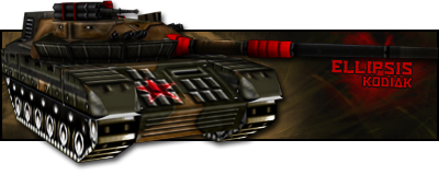
I know that there is a really dark spot in the left. I had no time to fix it.
~Redeemer

<Custom title available>
Posted 15 November 2007 - 01:41
I am Iron Man
Posted 15 November 2007 - 04:54
 ) its a good sig.

Greenskin Inside
Posted 15 November 2007 - 06:12

[...beep...]
Posted 15 November 2007 - 08:45
Edited by Wizard, 15 November 2007 - 13:33.
<Custom title available>
Posted 15 November 2007 - 12:16
[...beep...]
Posted 15 November 2007 - 13:34
Edited by Wizard, 15 November 2007 - 13:35.
[Pantsu-Dan]
Posted 15 November 2007 - 13:41


 Black Lagoon OST
<Custom title available>
Posted 15 November 2007 - 13:41
Edited by Redeemer, 15 November 2007 - 13:42.
[...beep...]
Posted 15 November 2007 - 13:49
<Custom title available>
Posted 15 November 2007 - 13:51
0 members, 1 guests, 0 anonymous users

Community Forum Software by IP.Board 3.2.0
Licensed to: Fallout Studios
