Jump to content


Smooder's Sigs


43 replies to this topic

#1 smooder

    America's Rage Leader

  • Member
  • 1870 posts
  • Projects: Americas Rage

Posted 23 November 2007 - 23:17

Here's a few of my experimental abstract sigs.

If anyone wants one just say i'll change the name...

This one is a bit big but i think is my best... I might claim it for myself actually.

Posted Image


A stereotypical abstract number

Posted Image


Another stereotypical one with a bit of a femenime look. I don't think this one is as good as the others.
Posted Image

Thanks comments on how I could improve are very welcome :P

Edited by smooder, 29 April 2008 - 20:19.


#2 Warbz

    IRC is just a multiplayer notepad.

  • Project Team
  • 4646 posts

Posted 23 November 2007 - 23:29

Im not a fan of abstract artwork, so my comment here is undoubtedly biased, but i really dont like them. mostly, i think, because of how random they seem. but the background on the first one looks like when my Graphics card driver went belly up and all the color on the screen went wierd.

anyway i think you should stick to the style of your current sig. much better IMO.

Posted Image

#3 Rayburn

    People-Hater

  • Gold Member
  • 4802 posts

Posted 24 November 2007 - 17:33

I actually have to agree with Warbz here but you should keep trying. You WILL improve as long as you don't give up. I would say you didn't approach the whole thing the right way. Abstract sigs - going by a very simplistic definition - use fractal renders which don't consist of a specific object. Instead, they are just colours and shapes, but NOT random, so to say. Here's an example of mine:
Posted Image
As you can see, just colours and shapes, a fractal render. I didn't make the render myself but you can get some very nice looking images from here
http://planetrenders...ls.php?album=10
Just look through the gallery and if you find something, play around with it.
Later on, you can also try to combine these fractal backgrounds with actual renders. :P

Edited by Rayburn, 24 November 2007 - 17:42.


#4 Sgt. Nuker

    Greenskin Inside

  • Global Moderator
  • 13457 posts
  • Projects: Shoot. Chop. Smash. Stomp.

Posted 24 November 2007 - 20:04

None of the sigs have that spit 'n polished look we've grown accustomed to here, but that's okay. They have their own unique flavor, your flavor. Out of the three though, the first two are your best. Abstract is exactly that, abstract, and there's not looking past that fact. What it changes though is the audience that likes it. Personally, although I'm a fan of how you included the TV in your first sig, I like the second one the best. Keep it up Smlitz, I think you've stumbled onto something :P .


Note: Instead of making a seperate topic for each kind of sig or artwork you make, just make one general art topic :cool: .


My best,

Nuker
Posted Image

#5 smooder

    America's Rage Leader

  • Member
  • 1870 posts
  • Projects: Americas Rage

Posted 24 November 2007 - 20:21

That other topic was about the program unfreez and these are some sigs i'd like to show :P

Thanks for that link I'll take a look

Edit: Did you mean like this

Posted Image
Well literally all i did here was get the BG and add text. So i'm not sure if i did what you meant.

Edited by Smlitz, 24 November 2007 - 20:40.


#6 Rayburn

    People-Hater

  • Gold Member
  • 4802 posts

Posted 24 November 2007 - 20:50

That is exactly what I meant, mate. Nice one, the colours fit together and for a start, it's pretty good.
Now you can try to spice it up a little; combine different layers with different fractals to create new patterns, modify the colours,
whatever you can think of. As I said before, you can also use such a fractal as a background and add an actual object as a render.

Edited by Rayburn, 24 November 2007 - 20:51.


#7 smooder

    America's Rage Leader

  • Member
  • 1870 posts
  • Projects: Americas Rage

Posted 24 November 2007 - 21:00

One for jesus when he finally visits the boards
Posted Image
used one of those renders added clouds and transparency and a spotlight effect. I think it looks pretty cool compared to the other

#8 Rayburn

    People-Hater

  • Gold Member
  • 4802 posts

Posted 24 November 2007 - 21:17

Getting better :P
It looks more simple but it does convey a nice atmosphere. Fits the theme as it does have a "heavenly" feeling to it.
Here's a sig I just made in <10 minutes. See it as an example of a fractal background combined with a render. Nothing too fancy but it should work.
Posted Image

#9 smooder

    America's Rage Leader

  • Member
  • 1870 posts
  • Projects: Americas Rage

Posted 24 November 2007 - 21:19

Thanks :P I'm not too sure on what render to get... I think i might remake my first sig with the TV.

#10 Rayburn

    People-Hater

  • Gold Member
  • 4802 posts

Posted 24 November 2007 - 21:23

That link I gave you offers a plethora of renders, ranging from games to movies. There are also objects such as cars and planes and you can also find the one or the other nice pic on their forums. An important aspect is that you use renders which are png's by default. You should also look for BIG renders; making them smaller doesn't lose as much quality as making a small render big.

#11 smooder

    America's Rage Leader

  • Member
  • 1870 posts
  • Projects: Americas Rage

Posted 24 November 2007 - 21:30

Hows this??
Posted Image

#12 smooder

    America's Rage Leader

  • Member
  • 1870 posts
  • Projects: Americas Rage

Posted 24 November 2007 - 22:00

Okay a eurosmooder.
No frame

Posted Image

Maybe I should add one?
Edit: sorry dp.

Edited by Smlitz, 24 November 2007 - 22:07.


#13 Sgt. Nuker

    Greenskin Inside

  • Global Moderator
  • 13457 posts
  • Projects: Shoot. Chop. Smash. Stomp.

Posted 24 November 2007 - 23:45

All your current one lacks really is a nice border (personal opinion). Other than that mate, you ARE getting much better :P .


My best,

Nuker

Edited by Major Nuker, 25 November 2007 - 00:04.

Posted Image

#14 Warbz

    IRC is just a multiplayer notepad.

  • Project Team
  • 4646 posts

Posted 24 November 2007 - 23:46

the jesus render needs to be cut out better IMO, but it is a great improvement.
Your euro sig is pretty cool. :P

Posted Image

#15 smooder

    America's Rage Leader

  • Member
  • 1870 posts
  • Projects: Americas Rage

Posted 25 November 2007 - 00:23

Posted Image

I might change my sig to that. It looks nice. But also looks like I did'nt make it.

#16 Alias

    Member Title Goes Here

  • Member
  • 11705 posts

Posted 25 November 2007 - 01:40

You need to work on those borders.

Posted Image

#17 smooder

    America's Rage Leader

  • Member
  • 1870 posts
  • Projects: Americas Rage

Posted 25 November 2007 - 12:16

What would make a better border for them I have no idea.

#18 Warbz

    IRC is just a multiplayer notepad.

  • Project Team
  • 4646 posts

Posted 25 November 2007 - 13:37

a stroke border?
it would help if you told us what program u were using, unless u have told us and i missed it.
All i know is your not using a stroke border.

Posted Image

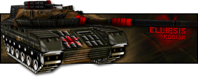
#19 Ellipsis

    <Custom title available>

  • Member
  • 806 posts
  • Projects: Co-Leader of Zero Hour:Unleashed

Posted 25 November 2007 - 14:46

I love the Jesus one.

~Ellipsis
Posted Image
Thanks for the sig and avatar, 'Dr.

#20 Rayburn

    People-Hater

  • Gold Member
  • 4802 posts

Posted 25 November 2007 - 15:35

 Warbz, on 25 Nov 2007, 14:37, said:

a stroke border?
it would help if you told us what program u were using, unless u have told us and i missed it.
All i know is your not using a stroke border.


Just wondering, what is a stroke border? 2 pixel white border with that effect whose name escapes me right now like in yours and mine?

Edited by Rayburn, 25 November 2007 - 15:36.


#21 Warbz

    IRC is just a multiplayer notepad.

  • Project Team
  • 4646 posts

Posted 25 November 2007 - 15:38

ah bugger. i meant all i know is your not using photoxhop.

and yeah a stroke border is a fairly plain line going around the edge of the sig/artpiece.

Edited by Warbz, 25 November 2007 - 15:39.


Posted Image

#22 Ellipsis

    <Custom title available>

  • Member
  • 806 posts
  • Projects: Co-Leader of Zero Hour:Unleashed

Posted 25 November 2007 - 15:39

A border with a stroke in it, :read:.
And yes that true, Rayburn.

~Ellipsis
Posted Image
Thanks for the sig and avatar, 'Dr.

#23 smooder

    America's Rage Leader

  • Member
  • 1870 posts
  • Projects: Americas Rage

Posted 25 November 2007 - 16:05

I can do that. Which one would suit that do you think? I use photo express... Like short stuff.

#24 Warbz

    IRC is just a multiplayer notepad.

  • Project Team
  • 4646 posts

Posted 25 November 2007 - 18:01

i dont know anything about the usage of that then sorry.

Posted Image

#25 smooder

    America's Rage Leader

  • Member
  • 1870 posts
  • Projects: Americas Rage

Posted 07 December 2007 - 00:16

Yayo gave me an idea so i tried to do it in nice comic book style.Hope it doesnt look too gay.

Posted Image
Yayo's name in tribute :P


1 user(s) are reading this topic

0 members, 1 guests, 0 anonymous users