Hangar 13 Design
 Jok3r
05 Jan 2008
Come inside, take a look around, request something please
-------------------------------------------------------------------------------------------------------------------------------------------------------------------------
I'm going to put some sig's and stuff I make up here- comments and criticism would be greatly appreciated-
My first sig, an experiment in photoshop
Another sig similar to the first, same line of sigs... I'm not so sure about the font in this one, so comments on that would be great
third sig in that line... the one I like the least- but, I don't know... same deal- comments please

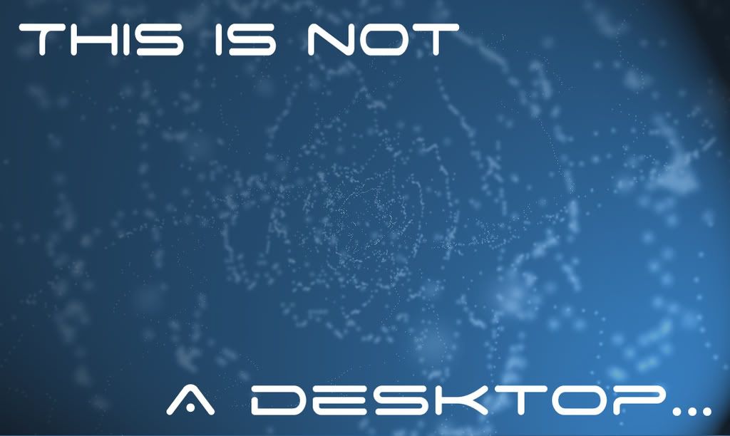
A wallpaper I did for my friend
Edited by Swimmer, 02 August 2008 - 01:10.
 Lord Atlantis
05 Jan 2008
Hmmm... you have some interesting work here. Kudos for creativity. More would be nice. 
 Jok3r
05 Jan 2008
A new sig I did today- I'm not so sure about the font, but this one was more of an experiment than anything else
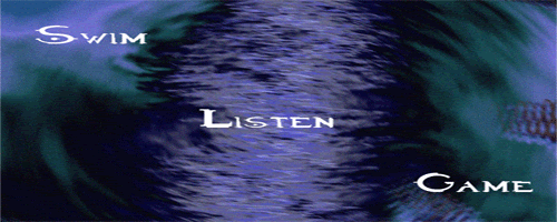
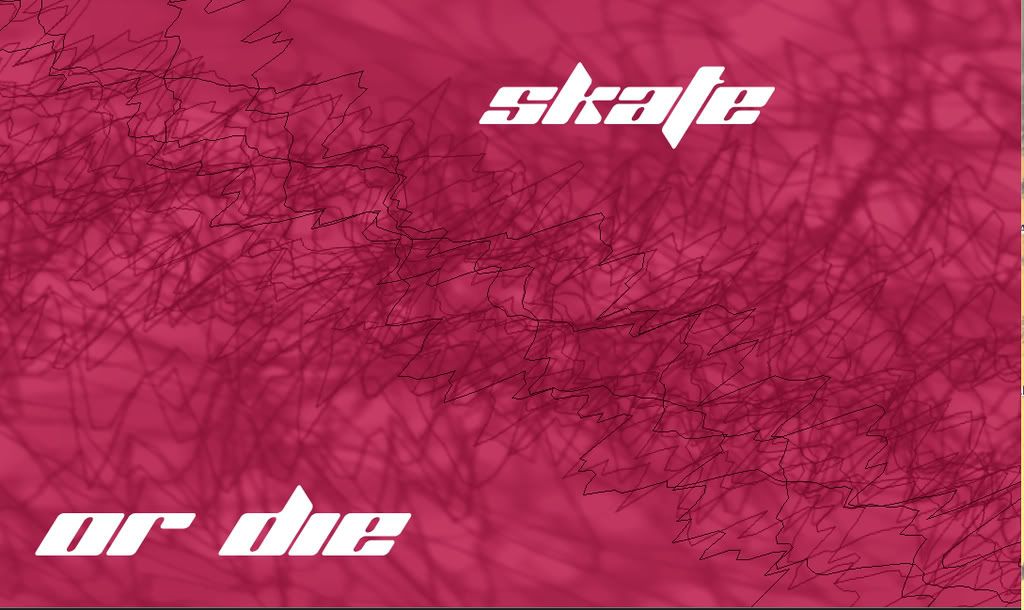
A wallpaper I made for my little brother
Swim~Listen~Game
P.S. how do you add borders in photoshop?
Edited by swim-listen-game, 05 January 2008 - 21:27.

A wallpaper I made for my little brother

Swim~Listen~Game
P.S. how do you add borders in photoshop?
Edited by swim-listen-game, 05 January 2008 - 21:27.
 Wizard
05 Jan 2008
there are about 100 ways to do it. easiest is to create a new layer > ctrl + a > edit > stroke > decide the number of pixel deep & color and you're done.
Seriously if you got PS questions, click my first banner, register and ask away. It's a forum dedicated to signatures and Photoshop art. Ask anyone round here and they'll tell you we know what we are up to.
Nice first pieces btw.
Seriously if you got PS questions, click my first banner, register and ask away. It's a forum dedicated to signatures and Photoshop art. Ask anyone round here and they'll tell you we know what we are up to.
Nice first pieces btw.
 Jok3r
05 Jan 2008
Thanks wizard, I think I'll set up an account there when I get a chance
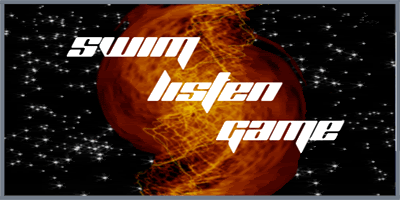
here's another sig I did today- I like this one, but some as always, comments and critism would be great
Swim~Listen~Game
Edit: Made text bigger
Edited by swim-listen-game, 05 January 2008 - 23:02.
here's another sig I did today- I like this one, but some as always, comments and critism would be great

Swim~Listen~Game
Edit: Made text bigger
Edited by swim-listen-game, 05 January 2008 - 23:02.
 Jok3r
05 Jan 2008
Thanks, I use that font a lot... maybe too much  btw it's planet kosmo's from dafont
swim~listen~game
Edited by swim-listen-game, 06 January 2008 - 02:11.
swim~listen~game
Edited by swim-listen-game, 06 January 2008 - 02:11.
 Jok3r
06 Jan 2008
Sorry for the double post, but I have a new sig in 2 versions... I can't decide which font to use
Here's version 1
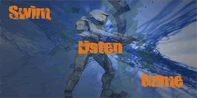
Here's version 2
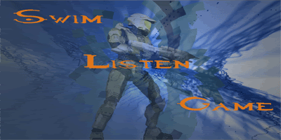
comments and criticism please
Swim~Listen~Game
EDIT: version 3
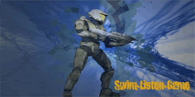
Edited by swim-listen-game, 06 January 2008 - 17:40.
Here's version 1

Here's version 2

comments and criticism please
Swim~Listen~Game
EDIT: version 3

Edited by swim-listen-game, 06 January 2008 - 17:40.
 Jok3r
06 Jan 2008
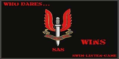
An SAS sig for all the brit's here... I really like this one, but I think it's... Lacking something- I don't know what, comments and criticism
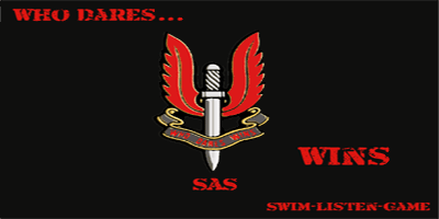
Edit: border version
Edited by swim-listen-game, 06 January 2008 - 19:44.

Edit: border version

Edited by swim-listen-game, 06 January 2008 - 19:44.
 LDM125
06 Jan 2008
Aren't those visualizations in Windows Media Player? Otherwise nice though.
-LDM
-LDM
 Jok3r
06 Jan 2008
Ahh you've figured me out! :wahhhhhaa: nah, they're from iTunes visualiser!!! all it does is run a script to create random images based on quartz composer parameters... and most are heavily edited... do you like the SAS sig?
Edited by swim-listen-game, 06 January 2008 - 20:11.
Edited by swim-listen-game, 06 January 2008 - 20:11.
 Jok3r
07 Jan 2008
New avatar aswell... anyone like?
Swim~Listen~Game
almost a rocket soldier!!!
Swim~Listen~Game
almost a rocket soldier!!!
 Futschki
07 Jan 2008
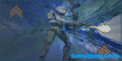
they are alright Id give 6.5/10 for average ... as they are a bit bland for my liking even tho the idea of using those visualisation are good but u need to fill the whole sig with things IMO(Brushes I advise) and then give the whole sig a good fitting color ... for example in the soldier sig (even tho its ur best) ... the orange font doesnt fit ... maybe u should create a hue/saturation layer and use blue ...
also a sig will look better if the Width is like 2.5Height I mean more than double ... and thats IMHO ...
...
other than that, that's a good start ... u dont want to see my first sigs ...
I hope you dont take my criticism as offensive and well ... KEEP ON PRACTICING AND KEEP EM COMING!!!!
Edited by Abourror, 07 January 2008 - 13:48.
also a sig will look better if the Width is like 2.5Height I mean more than double ... and thats IMHO
other than that, that's a good start ... u dont want to see my first sigs ...
I hope you dont take my criticism as offensive and well ... KEEP ON PRACTICING AND KEEP EM COMING!!!!
Edited by Abourror, 07 January 2008 - 13:48.
 Jok3r
07 Jan 2008
I don't take that as offensive at all. I started the thread so that I could see what my sig's needed. When I get the time, I'll mak ethose edits and see how it looks. By "the soldier one" you mean the master chief sig? or the SAS one? I know they could both use some improvement.
Thanks
Swim~listen~game
EDIT: whats a hue/saturation layer? and I have no brushes, and no idea how to use 'em... any help there would be GREATLY appreciated
Edited by swim-listen-game, 08 January 2008 - 00:02.
Thanks
Swim~listen~game
EDIT: whats a hue/saturation layer? and I have no brushes, and no idea how to use 'em... any help there would be GREATLY appreciated
Edited by swim-listen-game, 08 January 2008 - 00:02.
 Lord Atlantis
08 Jan 2008
Its still using the visualization as the background, but I think he was getting at was a background created from texturing a layer, then adding some color overlays/effects.
 Wizard
08 Jan 2008
Quote
whats a hue/saturation layer? and I have no brushes, and no idea how to use 'em... any help there would be GREATLY appreciated
That is a lot to answer. A hue saturation layer is a tool in PS that can adjust the coloration of the image, or a given layer. Allowing you to tweek the image to your liking. PS has quite a few powerful abilities that are not instantly visible in the tool bar that can do some impressive things and I (and indeed Abs) can wax lyrical about them all day. If you really want to know more mate you know where to come and ask me
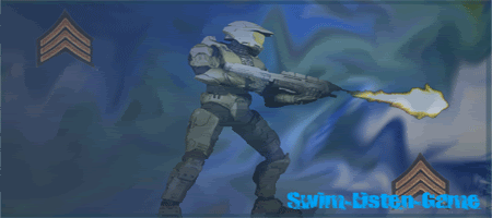
On your siggy here, I can give you a few suggestions. Turn off the Master Chief image (called render from now on) and then do the same with your text. So you left with just what you have used to make the background. Take the smudge brush (the one with the finger) and go crazy all over the background so you can't recognise it.
Make the render visible again and then click the single line marque tool (the semi-dotted box/circle in the top left of your tool bar) Hold down the mouse until you see the 4 options pop up. Select the one that is vertical and then click somewhere on your render that has the greatest height. Oce done, rightclick in the marqueed area and then select Create layer via copy and a new layer of one pixel wide and x high will appear.
Then hit ctrl+t to activate the transform function and drag the side boxes apart, basically streching your new pixel wide layer across your image. Then select "overlay" from the blend options in the layer menu and you should have a half decent background.
Make your text visible again and lets see the results.
If none of that made sense we can talk later.
- W
Edited by Wizard, 08 January 2008 - 08:32.
 Futschki
08 Jan 2008
u can join Sig craze if u want to get some help ... and u can add wizard's msn and mine too if u want help too
 Jok3r
08 Jan 2008
I'm sorry If I wasn't clear before, but I'm using PS elements on a mac... I can't find either of those tools
swim~listen~game
swim~listen~game
 Wizard
08 Jan 2008
All of those facilities should will be available on a mac to. What version of PS are you using? If you had MSN profile I'd add you and talk you through some stuff. Here is a very disjointed way of providing crit.
 Jok3r
08 Jan 2008
Never mind, I found the smudge tool, on the mac, they hid it... but I found it eventually. I may set up an MSN account eventually, but I have enough passwords to keep track of now... later, I may, and I'll set up an account at sig craze eventually aswell. I am using elements
swim~listen~game
EDIT: like this? In elements, you only get 2 marquee options- rectangular and eliptical, so I don't know what to do with that one- but here's the version with a fixed background
Edited by swim-listen-game, 08 January 2008 - 20:48.
swim~listen~game
EDIT: like this? In elements, you only get 2 marquee options- rectangular and eliptical, so I don't know what to do with that one- but here's the version with a fixed background

Edited by swim-listen-game, 08 January 2008 - 20:48.
 Futschki
09 Jan 2008
this is better fo sure ... now u should try this with other sigs and I recommend using bigger Renders ... also try to find some brushes and mess with them and ull get som good results... also try to make another type of border ... try No-Skillz tutorial of tech border ...
Edited by Abourror, 09 January 2008 - 17:15.
Edited by Abourror, 09 January 2008 - 17:15.
 Wizard
09 Jan 2008
Agreed it is much better. You might want to think about making your sigs a touch smaller as well. The larger the sig the more space you have to fill with something.
