Hangar 13 Design
 Jok3r
08 Jun 2008
Jok3r
08 Jun 2008
1. Its not a photo, its a heavily 'shopped terragen. I like that you believed it was a photo, tho 
2. Thanks Boidy
3. Then what do you suggest I do to improve it, alias
4. Smaller version- good or bad?
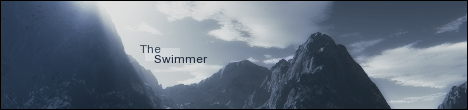
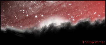
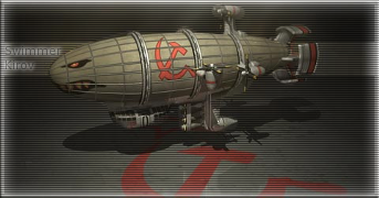
5. What do you guys think of these?


If I use 'em, my sig will be liek this- good?
+ROTR userbar, and links.
Does this look good, tho?
-Swimmer
2. Thanks Boidy
3. Then what do you suggest I do to improve it, alias
4. Smaller version- good or bad?
5. What do you guys think of these?
If I use 'em, my sig will be liek this- good?
+ROTR userbar, and links.
Does this look good, tho?
-Swimmer
Whitey
08 Jun 2008
To tall of a signature in entirety for my tastes. But artistically nice.
-Boidy
-Boidy
Jok3r
23 Jun 2008
Haven't had much inspiration lately  . Anyway, a little piece I was messing around with (needs s'more work, though I like it)
And that cut Niddy did a little while back, but after I adjusted the lighting. A lot. Most use of overlay layers and the dodge/burn tool by me in a long while. It'll go in a sig when I think of something. In the meantime, any suggestions for things to make/requests (please, I'm bored)
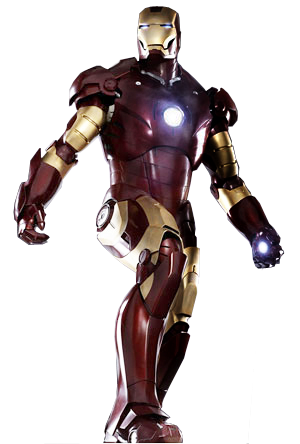
Thanks Nid
-Swimmer
. Anyway, a little piece I was messing around with (needs s'more work, though I like it)And that cut Niddy did a little while back, but after I adjusted the lighting. A lot. Most use of overlay layers and the dodge/burn tool by me in a long while. It'll go in a sig when I think of something. In the meantime, any suggestions for things to make/requests (please, I'm bored
)Thanks Nid
-Swimmer
Ellipsis
23 Jun 2008
Warboss Derkuz says:
Ironmean=win
Warboss Derkuz says:
*ironman
The_Swimmer says:
well
Warboss Derkuz says:
The first one is cool.
The_Swimmer says:
I just adjusted the colors and lighting and such
Warboss Derkuz says:
Reminds me of the Dark Hand from Jackie Chan adventures
Warboss Derkuz says:
They sweep in like ninjas under the glowing sky
I like Swimms. :o
Keep it up!
Edited by Warboss Derkuz, 23 June 2008 - 14:47.
BeefJeRKy
23 Jun 2008
If you are bored swimmer, maybe you can work on a signature + avatar for me? Theme would be Dead Space. Linky in case you haven't seen or heard of this game 
Jok3r
23 Jun 2008
Yup, I've heard about it, I can do something. Any idea what in specific you want?
Swimmer
Swimmer
BeefJeRKy
26 Jun 2008
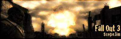
Actually Swimmer I'd prefer a sig+avatar of Fallout 3 please. I'll trust your creativity, so you can make it any way you want. Post apocalyptic RPG games FTW!
Jok3r
29 Jun 2008
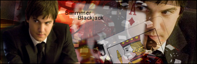
I'm going to need just a tiny bit more info to do that . Perhaps you could find a pic you would like used? I think that would help a lot. In the meantime, IMO, my best work so far-
CnC?
Swimmer
EDIT: Fiddled with the text a bit. Still not really satisfied with that part, though...
Edited by The Swimmer, 29 June 2008 - 04:42.
. Perhaps you could find a pic you would like used? I think that would help a lot. In the meantime, IMO, my best work so far-CnC?
Swimmer
EDIT: Fiddled with the text a bit. Still not really satisfied with that part, though...
Edited by The Swimmer, 29 June 2008 - 04:42.
TheDR
29 Jun 2008
My first one is join Russia, it would go with the sig more
My second is change the font to a orange colour, like the one on the visor.
My second is change the font to a orange colour, like the one on the visor.
Jok3r
29 Jun 2008
The problem is, when I tried that, you couldn't see the text. Maybe... *goes to try again*
Swimmer
Swimmer
Jok3r
29 Jun 2008
Still messing around with the text on that one, but... another little piece. Very simple, but I like how it turned out.
CnC?
Swimmer
CnC?
Swimmer
BeefJeRKy
29 Jun 2008
Jok3r
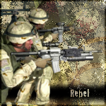
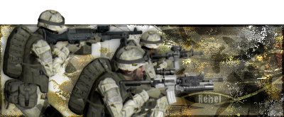
02 Jul 2008
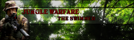
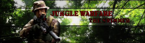
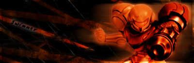
I'll have that ready soon. In the meantime, CnC on this set? (I'm thinking I might ditch it soon, and not liking the name as much as I thought I would... but, still...)

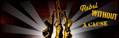
Rebel Without a Cause
Rebel Without a Cause
Nid
06 Jul 2008
It's a little late, but nice job adjusting the lighting on my Ironman Cut.
Looks super
Looks super
BeefJeRKy
21 Jul 2008
Kinda late but its a shame for them to go to waste. I'll save them and perhaps use them a bit later. Thanks a lot though.
TheDR
22 Jul 2008
The irony of your sig being the us army and yourself being called rebel
The only problems i can see is the font being a bit too small, other wise it looks good.
The only problems i can see is the font being a bit too small, other wise it looks good.
