Hangar 13 Design
 Jok3r
26 Sep 2008
Jok3r
26 Sep 2008
Just saw that, sorry mate. I'll get it for ya this weekend. Any particular stock?
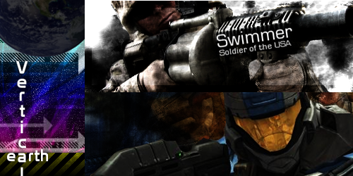
Update:
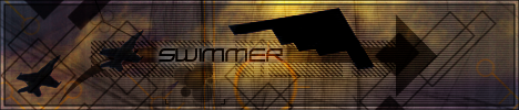
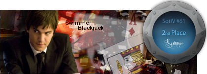
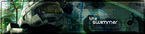
Swimmer
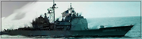
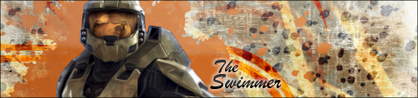
Update:
Swimmer
Dr. Strangelove
26 Sep 2008
You know, MadMen related stuff. Its a TV show, in fact most Emmy nominations of any drama on TV.
Jok3r
26 Sep 2008
I know what it is (though admittedly, don't watch it). What I was asking is if you wanted anything in particular from the show.
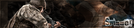
Swimmer
Swimmer
Dr. Strangelove
26 Sep 2008
No
EDIT: The Dr was taking a while making a sig based on the same request and I thought that he had forgotten, but I didn't want to be rude/impatient with him so I asked you. Apparently, he did remember and was just busy doing other stuff. If you still want to try making this, its fine with me, I'll just choose the better of the two.
Edited by Dr. Strangelove, 27 September 2008 - 04:26.

Alias
27 Sep 2008
It's alright.
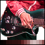
Points of Improvement:
Points of Improvement:
- C4D in the corner is too strong. Reduce opacity.
- Obscure C4D line at the far left going through the text. Erase.
- At the right hand side, just below the text the edge between the red/black and the white is too straight, isolating the corner. Blend this together.
- The render could use a bit of better blending here and there.
- The light source on the render is different to the light source on the background. Modify with dodge/burn.
- The bluish tinge at the top of the guitar is an isolated colour. Desaturate it to grey.
- The borders on the sig and the avatar do not match.
- The white background on the avatar is tame. Either make it transparent or add some colour.

Wizard
04 Oct 2008
Alias, on 27 Sep 2008, 7:34, said:
It's alright.
Points of Improvement:
Points of Improvement:
- C4D in the corner is too strong. Reduce opacity.
- Obscure C4D line at the far left going through the text. Erase.
- At the right hand side, just below the text the edge between the red/black and the white is too straight, isolating the corner. Blend this together.
- The render could use a bit of better blending here and there.
- The light source on the render is different to the light source on the background. Modify with dodge/burn.
- The bluish tinge at the top of the guitar is an isolated colour. Desaturate it to grey.
- The borders on the sig and the avatar do not match.
- The white background on the avatar is tame. Either make it transparent or add some colour.
+ some clipping masks would've made this sig pure, freakin', feckin' win.
9/10 for effort mate.
Alias
05 Oct 2008
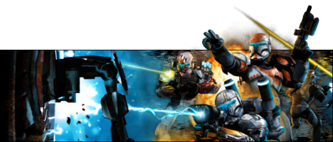
Points of improvement:
- WAAAAAY too cluttered.
- Inconsistent popup. The soldier is over the border, yet the explosion isn't, etc.
- That yellow line serves no purpose. Remove it.
- Text is in a very awkward place.
- Focal point is too far to the left, instead of on the soldiers.
- Too many colours, reduce using gradient maps and fade overlays.
- Background on the right side of the sig is too out of place. It needs more correct lighting.
Wizard
06 Oct 2008
Swimmer, on 5 Oct 2008, 20:16, said:
Wiz, I still don't know what a clipping mask is 
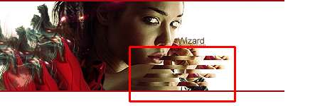
The red box shows you the clipping mask. Not the greatest example of it that I have but I am not at home so my resources are limited.
Simply put a clipping mask is a brush stroke or shape on top of the main image which you use to mask the behind. I have a tutorial for it somewhere. I'll post it another day.
Nid
06 Oct 2008
Just to expand on Wizards' post.
The clipping layer masks all parts of the image apart from anything in the layer that the clipping layer is attached to.
The examples in that sig, is the large text over the red star, and the woman's face in the other star.
The clipping layer masks all parts of the image apart from anything in the layer that the clipping layer is attached to.
The examples in that sig, is the large text over the red star, and the woman's face in the other star.
Jok3r
21 Oct 2008
I still don't entirely understand, but I'll look around a bit more myself.
New set-
+Avatar
CnC?
Swimmer
EDIT: I know the avvy is crap, I'm planning on replacing it.
Edited by Swimmer, 21 October 2008 - 02:33.
New set-
+Avatar
CnC?
Swimmer
EDIT: I know the avvy is crap, I'm planning on replacing it.
Edited by Swimmer, 21 October 2008 - 02:33.
Alias
08 Nov 2008
I would give you criticism, but when I have in the past you've never listened so I'm really not going to bother.
Jok3r
08 Nov 2008
Alias, I have done revisions on most all of the sigs you've criticized (with the exception of the republic commando one, as the compo on that sig was so crap to begin with, there was little I could do that wasn't an overhaul, and I didn't really want to at that time). I just haven't posted that one.
Libains
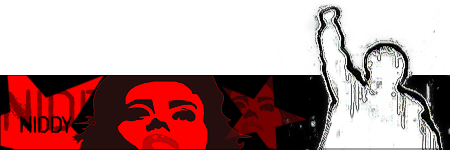
08 Nov 2008
It's good mate, but not one of your best. I'd say that the R from Swimmer needs a bit of altering as the C4D/vector image under it is over some of the stuff on the R, which makes it's depth look very odd - the same applies for the C4D/vector images on the rest of the image with the shadowed area around the text - again they have different depth levels that cause it to look a little strange. Oh, and just because - have you used the same vector image in both the avvie and sig? I think I've seen them before 
Libains
08 Nov 2008
Yup, used them in the previous sig that I did (the fiery one). Good set they are
Slightly Wonky Robob
11 Nov 2008
I've got those brushes too 
I just wish I could do that abstract / vector style you seem to be so fond of (and good at) D:
I just wish I could do that abstract / vector style you seem to be so fond of (and good at) D:
Jok3r
11 Nov 2008
Its really not that hard . If only I could get the damn C4D's and clipping masks right .
. If only I could get the damn C4D's and clipping masks right .
BeefJeRKy
17 Nov 2008
I would like to request a sig + avatar with the Lebanese flag as its center point and the sig should have this expression:
22nd November 1943
65 Years of Immortality
Do whatever you want with it, but I'd prefer if you can keep it somber (maybe have a blood drip effect from the top Red Bar of the Flag). Thanks in advance...
Edited by Scope, 17 November 2008 - 00:16.
22nd November 1943
65 Years of Immortality
Do whatever you want with it, but I'd prefer if you can keep it somber (maybe have a blood drip effect from the top Red Bar of the Flag). Thanks in advance...
Edited by Scope, 17 November 2008 - 00:16.
Dr. Strangelove
16 Dec 2008
I have a request:
A sig and avy that uses a render of Liberty Prime, and some of his favorite quotes.
Had enough, pansy ass pinko!?
EDIT: Oh, and replace 'Democracy' with 'Capitalism'.
Edited by Dr. Strangelove, 17 December 2008 - 00:58.
A sig and avy that uses a render of Liberty Prime, and some of his favorite quotes.
Had enough, pansy ass pinko!?
EDIT: Oh, and replace 'Democracy' with 'Capitalism'.
Edited by Dr. Strangelove, 17 December 2008 - 00:58.