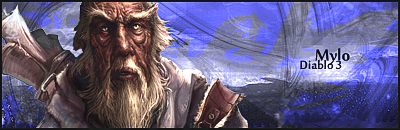
Halo Personal Sig - 8/10
An odd combination of colours with the text and render, but it somehow works.
Also, I like the way the tech brushes focus the attention on the Cheif.
Mapper Guild Sig - 7/10
Simple, effective and pleasing to look at.
All I have to say.

Rate teh Siggy!
Started By Baal-Zebub, Mar 16 2006 02:36
2198 replies to this topic
#1201
-
- Member
-

- 3078 posts
The Hated
Posted 21 May 2007 - 09:23

You'll only notice me when it's too late.

#1202
-
- Gold Member
-

- 4802 posts
People-Hater
Posted 21 May 2007 - 16:43
10/10 for both
Not a fan of BF2142 but sure as hell of snipers and gunships.
Also, the style is great and they fit together nicely.
Not a fan of BF2142 but sure as hell of snipers and gunships.
Also, the style is great and they fit together nicely.


#1207
-
- Member
-
- 390 posts
Professional
-
Projects: Resident Knicker.
Posted 22 May 2007 - 15:11
8.9/10
Very nice, I like what you did with the text. I only wish that the moon was glowing.
8/10 on the second one
Very nice, looks pro.
~V.
Very nice, I like what you did with the text. I only wish that the moon was glowing.
8/10 on the second one
Very nice, looks pro.
~V.

-Tha' rewf iz awn fiyah-
#1208
-
- Project Team
-

- 2334 posts
The Transporter
-
Projects: CnC Unleashed; CnC The Rise of the Reds
Posted 22 May 2007 - 15:51
9.5/10 ... my second signature isnt made myself and is the standard signature of a advanced airforce staffmember
#1209
-
- Member
-
- 390 posts
Professional
-
Projects: Resident Knicker.
Posted 22 May 2007 - 15:52
I know, but it was there, so I rated it.
-Tha' rewf iz awn fiyah-
#1210
-
- Administrator
-

- 5853 posts
Whispery Wizard
Posted 22 May 2007 - 19:01
who dosent like "Batman", i love the cape, so cool
9/10
9/10

F O R T H E N S

#1211
-
- Member
-
- 472 posts
Veteran
-
Projects: (GTWA) Gentlemen of The Wrold Association
Posted 22 May 2007 - 20:17
8/10 Pretty neat Shows the darkness that is Darth Vader but a few points taken off the blinking.
Edited by Saint, 22 May 2007 - 20:27.

My comics check em out! I'm sure you'll like em.
Comic #1 Comic #2 Comic #7 Comic #8
Comic #3 Comic #4
Comic #5 Comic #6
More to come...?
(I'm also open to suggestions/request. Just PM me anytime.)
#1212
-
- Project Team
-
- 4073 posts
[Pantsu-Dan]
-
Projects: Commanding the ECA 33rd Ground Assault Team.
Posted 22 May 2007 - 20:58
Towens 7/10
Kwai 7´5/10
Leang, the Tigress 9/10
Kwai 7´5/10
Leang, the Tigress
9/10


 Black Lagoon OST
#1213
-
- Member
-
- 1514 posts
is inactive on FS
-
Projects: maps
Posted 23 May 2007 - 19:37
Your deathstrike sig: 4/10.
boring background, two tank renders look weird, your name looks like it has no space in the sig, the portrait is cool, the font is also cool.
Your "time to kick ass" sig: 8/10
Neat borders, fonts, render and background
boring background, two tank renders look weird, your name looks like it has no space in the sig, the portrait is cool, the font is also cool.
Your "time to kick ass" sig: 8/10
Neat borders, fonts, render and background
Danz aka knjaepsik aka Danz Cruck aka /).4/\/z aka Dz aka Player 1 aka Danzey Kong aka Danzerowka aka Zombie Danz aka Danz4ttack aka Danzkrecona aka GeneralButt aka jEnaM aka Danz Power aka Super Danz aka Easy Danz aka Danz Time aka Double Danz aka Kraszaq aka Danzew aka =) aka Danz Q aka DzQ aka DJ Danz aka AAAAAASSSDFGJKFL aka Team Apfel aka Master King Danz aka Danzlorki aka P1 aka Party Danz aka Danzekoins
#1214
-
- Project Team
-
- 2334 posts
The Transporter
-
Projects: CnC Unleashed; CnC The Rise of the Reds
Posted 23 May 2007 - 19:43
5/10... looks odd... some layers with diffrent features, mammoth and lotus and a name... i personnally dislike it
#1215
-
- Project Team
-
- 4073 posts
[Pantsu-Dan]
-
Projects: Commanding the ECA 33rd Ground Assault Team.
Posted 23 May 2007 - 19:47
Good Bkground effects good effect in da font, and good render,
10/10 is the simple, but, perfect signature
10/10 is the simple, but, perfect signature
Black Lagoon OST#1216
-
- Member
-
- 238 posts
Semi-Pro
-
Projects: Maintaning the N00Bity of people~
Posted 23 May 2007 - 23:55
Kid's Sig - 8.5/10 Overall
8/10 - Deathstrike Future User
8/10 - Time to Kick Ass
9/10 - 2nd Future Deathstrike User
What disturbs me are the spaces between each Pic. ^^,
8/10 - Deathstrike Future User
8/10 - Time to Kick Ass
9/10 - 2nd Future Deathstrike User
What disturbs me are the spaces between each Pic. ^^,
Edited by Silence, 23 May 2007 - 23:56.

#1217
-
- Member Test
-
- 547 posts
Der Metzgermeister
Posted 24 May 2007 - 04:55
8/10

my sig showroom kick!!
http://500px.com/schwarzk0pf
glouf, on 23 Jun 2006, 16:51, said:
I like to call him Dr. Spamkopf
#1218
-
- Member
-
- 16 posts
Newbie
-
Projects: none. *hint* yet.
Posted 25 May 2007 - 03:44
10/10
you have always had a good sig.
it's mainly the quote.
you have always had a good sig.
it's mainly the quote.

avatar and sig. done by me.
#1219
-
- Member Test
-
- 547 posts
Der Metzgermeister
Posted 25 May 2007 - 05:13
5/10
my sig showroom kick!!
http://500px.com/schwarzk0pf
glouf, on 23 Jun 2006, 16:51, said:
I like to call him Dr. Spamkopf
#1220
-
- Administrator
-
- 5853 posts
Whispery Wizard
Posted 25 May 2007 - 05:39
9/10 , you are to good at sig making.
F O R T H E N S

#1222
-
- Project Team
-
- 4073 posts
[Pantsu-Dan]
-
Projects: Commanding the ECA 33rd Ground Assault Team.
Posted 25 May 2007 - 14:12
9/10 tao sig
10/10 own sig
10/10 MG sig
10/10 own sig
10/10 MG sig
Black Lagoon OST#1223
-
- Project Team
-
- 6796 posts
Divine Chaos
-
Projects: Sigma Invasion
Posted 25 May 2007 - 17:57
9/10

Insomniac!, on 16 Sep 2008, 20:12, said:
Soul you scare the hell out of me, more so than Lizzie.
I've been given a Bob coin from Mr. Bob, a life time supply of cookies from Blonde-Unknown, some Internet Chocolate from the Full Throttle mod team, and some Assorted Weapons from Høbbesy.
#1224
-
- Member
-
- 3078 posts
The Hated
Posted 26 May 2007 - 01:57
EndWar Fan Signature:- 6/10
An IPB-Image with text and a Pixel-Border, not all that impressive.
Ironside Shockwave Sig:- 6/10
A few renders, text, and a Pixel-Border slapped on a Blue BG.
Again, impressive this Sig is not.
An IPB-Image with text and a Pixel-Border, not all that impressive.
Ironside Shockwave Sig:- 6/10
A few renders, text, and a Pixel-Border slapped on a Blue BG.
Again, impressive this Sig is not.
Edited by Nexolate, 26 May 2007 - 06:28.
You'll only notice me when it's too late.
#1225
-
- Project Team
-
- 4646 posts
IRC is just a multiplayer notepad.
Posted 26 May 2007 - 02:08
9/10
im beginning to like the render more. cool fade essect and border.
also i dont think that generic sig's such as the generals userbars etc should be rated.
im beginning to like the render more. cool fade essect and border.
also i dont think that generic sig's such as the generals userbars etc should be rated.

1 user(s) are reading this topic
0 members, 1 guests, 0 anonymous users

