10/10 both

Rate teh Siggy!
Started By Baal-Zebub, Mar 16 2006 02:36
2198 replies to this topic
#1301
-
- Member Test
-

- 547 posts
Der Metzgermeister
Posted 07 June 2007 - 00:58

my sig showroom kick!!
http://500px.com/schwarzk0pf
glouf, on 23 Jun 2006, 16:51, said:
I like to call him Dr. Spamkopf
#1302
-
- Member
-
- 3078 posts
The Hated
Posted 07 June 2007 - 05:40
8/10
Simple, elegant.
Simple, elegant.

You'll only notice me when it's too late.

#1303
-
- Project Team
-

- 2501 posts
Human Being number 80446219302
Posted 07 June 2007 - 09:13
9/10 - nice fade and well made
10/10 - I respect you for putting up with 660 hours of BF2142
10/10 - I respect you for putting up with 660 hours of BF2142

#1304
-
- Gold Member
-

- 11193 posts
<Custom title available>
Posted 07 June 2007 - 09:17
Its on of the iBubbles, very nice, i do like the glow, 9/10
#1305
-
- Member
-
- 3078 posts
The Hated
Posted 07 June 2007 - 10:12
9/10
Elegant and well-made.
Elegant and well-made.
You'll only notice me when it's too late.


#1307
-
- Member
-
- 3078 posts
The Hated
Posted 07 June 2007 - 15:47
Lime Personal Sig:- 8/10
Simplistic, could do with some better effects.
AAF Modeler Sig:- 8/10
Well made. Eye-appelaing.
Simplistic, could do with some better effects.
AAF Modeler Sig:- 8/10
Well made. Eye-appelaing.
You'll only notice me when it's too late.
#1308
-
- Member
-
- 390 posts
Professional
-
Projects: Resident Knicker.
Posted 08 June 2007 - 01:15
7/10
Pretty nice, but I think it's a bit too transparent, it sorta loses the "Signature" look, but very nice anyways.
~V.
Pretty nice, but I think it's a bit too transparent, it sorta loses the "Signature" look, but very nice anyways.
~V.

-Tha' rewf iz awn fiyah-
#1309
-
- Member Test
-
- 547 posts
Der Metzgermeister
Posted 08 June 2007 - 07:34
10/10 I like this sig's style
my sig showroom kick!!
http://500px.com/schwarzk0pf
glouf, on 23 Jun 2006, 16:51, said:
I like to call him Dr. Spamkopf
#1310
-
- Project Team
-
- 4073 posts
[Pantsu-Dan]
-
Projects: Commanding the ECA 33rd Ground Assault Team.
Posted 08 June 2007 - 21:45
10/10 good effects neat, and simple


 Black Lagoon OST
#1312
-
- Member
-
- 3078 posts
The Hated
Posted 12 June 2007 - 08:28
9/10
Elegant, blends well, gritty.
Wait, what's the point in complimenting my own work? o_O
9/10
A combination of smooth, rough and all things good.
Blends great and the border suits, whilst still standing out.
Elegant, blends well, gritty.
Wait, what's the point in complimenting my own work? o_O
9/10
A combination of smooth, rough and all things good.
Blends great and the border suits, whilst still standing out.
You'll only notice me when it's too late.
#1313
-
- Project Team
-
- 7683 posts
Eternal Glow
Posted 12 June 2007 - 17:25
The Gunship whoring sniper Elite.
9.5/10
9.5/10

#1314
-
- Member
-
- 390 posts
Professional
-
Projects: Resident Knicker.
Posted 12 June 2007 - 17:45
8.9/10, I like it a lot, the Plane camoflauges beautifully with the background, but the text seems a tad out-of-place. 
9/10, It's great, text is a little hard to read though.
~V.
9/10, It's great, text is a little hard to read though.
~V.
-Tha' rewf iz awn fiyah-
#1315
-
- Member
-
- 3154 posts
Mwuahahahahahahah
-
Projects: Minecraft, TCMM, sleep
Posted 12 June 2007 - 17:54
9/10. Your sig has style
#1316
-
- Project Team
-
- 4073 posts
[Pantsu-Dan]
-
Projects: Commanding the ECA 33rd Ground Assault Team.
Posted 15 June 2007 - 21:53
odd exo soviet rush 4/10
4/10
Black Lagoon OST#1317
-
- Administrator
-

- 9627 posts
[...beep...]
Posted 15 June 2007 - 22:15
6/10 I think the tank clashes with the good grunge background
9/10 Like the colour splash
7/10 Raptor is too faded against the background
9/10 Like the colour splash
7/10 Raptor is too faded against the background
#1318
-
- Member
-
- 390 posts
Professional
-
Projects: Resident Knicker.
Posted 17 June 2007 - 02:50
7/10, It is a good render, very nice, but I'm just not a fan of Red-On-Blue.
8.6/10, Everything about it I love, except no border.
7.9/10, very nice effects, but I can't make out what the design is behind it.
Overall: 8.4/10, I like your sigs, keep at it.
~V.
8.6/10, Everything about it I love, except no border.
7.9/10, very nice effects, but I can't make out what the design is behind it.
Overall: 8.4/10, I like your sigs, keep at it.
~V.
-Tha' rewf iz awn fiyah-
#1320
-
- Member
-
- 390 posts
Professional
-
Projects: Resident Knicker.
Posted 17 June 2007 - 03:01
Thanks, my favourite font of all time is Arabella.
6.9/10, it looked better against a dark background, but 'Tis good.
~V.
6.9/10, it looked better against a dark background, but 'Tis good.
~V.
-Tha' rewf iz awn fiyah-
#1321
-
- Gold Member
-
- 4802 posts
People-Hater
Posted 17 June 2007 - 07:06
8/10
Simple, elegant and goes very well with the background
Simple, elegant and goes very well with the background
#1322
-
- Administrator
-
- 9627 posts
[...beep...]
Posted 17 June 2007 - 12:24
8.5/10 nice blur on the background and the psycho look in the renders eyes is priceless - "I'm gonna get you MOFO!" lol!
#1323
-
- Gold Member
-
- 7458 posts
Endless Sip
-
Projects: The End of Days, DTU Donutin Council Co-Chairman
Posted 17 June 2007 - 12:39
10/10 Nice combo
#1324
-
- Administrator
-
- 9627 posts
[...beep...]
Posted 18 June 2007 - 00:00
Ironically I love simple sigs.
Rating back @ ya 10/10
Rating back @ ya 10/10
#1325
-
- Project Team
-
- 4646 posts
IRC is just a multiplayer notepad.
Posted 18 June 2007 - 00:04
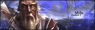
10/10
love simple sigs eh?
then take a look at this !!
love simple sigs eh?
then take a look at this !!

1 user(s) are reading this topic
0 members, 1 guests, 0 anonymous users

