7.8175638176333876237862368736873638120942738727498274981239/10 <--- lol

Rate teh Siggy!
Started By Baal-Zebub, Mar 16 2006 02:36
2198 replies to this topic
#1876
-
- Gold Member
-

- 4950 posts
Light up life.
Posted 05 June 2008 - 22:44
For there can be no death without life.
#1877
-
- Member
-

- 2696 posts
Silent Assassin
Posted 14 June 2008 - 18:35
8/10 (the big sig only)
It looks good though the name is unreadable and the white part on the left corner looks a bit weird but overally its good
It looks good though the name is unreadable and the white part on the left corner looks a bit weird but overally its good

#1878
-
- Member
-
- 37 posts
Visitor
Posted 14 June 2008 - 19:52
8/10
i dunno much about sigs so i wont make an *** of myself but i like how it looks
(i get 10/10)
reffering to his porsche having no seats...
i dunno much about sigs so i wont make an *** of myself but i like how it looks
(i get 10/10)
richard hammond said:
You cant knock any marks off, because theres nothing wrong with them if there not there
reffering to his porsche having no seats...
#1879
-
- Project Team
-

- 1909 posts
veritas vos liberabit
-
Projects: Hangar 13 Projects
Posted 14 June 2008 - 20:57
10/10, nothing to critisize because theres nothing there 
Swimmer
Swimmer
kinda, sorta alive.
#1880
-
- Gold Member
-
- 4950 posts
Light up life.
Posted 14 June 2008 - 23:07
9/10 - could I possibly take it any lower???
For there can be no death without life.
#1881
-
- Project Leader
-

- 7224 posts
YOUR WORLDS WILL BECOME OUR LABORATORIES
-
Projects: EC, CORE, ER
Posted 16 June 2008 - 01:31
8/10
Lookiiiiin guuuud
Lookiiiiin guuuud

#1882
-
- Administrator
-

- 5853 posts
Whispery Wizard
Posted 18 June 2008 - 21:45
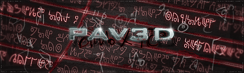
7/10 Its really cool, but its a bit too big Imo.

F O R T H E N S

#1883
-
- Gold Member
-
- 11193 posts
<Custom title available>
Posted 18 June 2008 - 21:45
9/10 THEDR could be easier to read
#1884
-
- Gold Member
-
- 4950 posts
Light up life.
Posted 18 June 2008 - 21:48
@ the Dr :8/10 I don't like the little criss-cross pattern on the right and you nicked my idea of the name on the ship (EDIT: smiley added to show good humor ) , but other than those two points it's good
@Dauth: 9/10 simple and elegant. Me likey.
) , but other than those two points it's good@Dauth: 9/10 simple and elegant. Me likey.
Edited by AjPod, 18 June 2008 - 22:05.
For there can be no death without life.
#1885
-
- Administrator
-
- 5853 posts
Whispery Wizard
Posted 18 June 2008 - 21:59
 AjPod, on 18 Jun 2008, 22:48, said:
@ the Dr :8/10 I don't like the little criss-cross pattern on the right and you nicked my idea of the name on the ship, but other than those two points it's good
@Dauth: 9/10 simple and elegant. Me likey.
@Dauth: 9/10 simple and elegant. Me likey.
I didn't nick the idea, i started on the sig before your one, it just too me a while to do.
But you ain't gonna believe that, so i don't know why i bother
Anyway, its a little to big for my taste 7/10
F O R T H E N S
#1886
-
- Gold Member
-
- 4950 posts
Light up life.
Posted 18 June 2008 - 22:01
It was a joke (should have added a smiley ) (and I really ain't bothered even if you did )
And I like my sigs a little bigger!
9/10 for re-clarified content...
(should have added a smiley ) (and I really ain't bothered even if you did )And I like my sigs a little bigger!
9/10 for re-clarified content...
Edited by AjPod, 18 June 2008 - 22:06.
For there can be no death without life.
#1887
-
- Member
-
- 1887 posts
☆I FighT For FreeDoM☆
-
Projects: C&C Renovatio
Posted 26 June 2008 - 10:59
7.18942318743516847\10 :]


Dauth edit: One on top of the other or it breaks sig rules
#1888
-
- Administrator
-
- 5853 posts
Whispery Wizard
Posted 26 June 2008 - 11:12
9/10, that font works really well with the C&C one.
F O R T H E N S
#1889
-
- Project Team
-
- 1909 posts
veritas vos liberabit
-
Projects: Hangar 13 Projects
Posted 28 June 2008 - 17:15
8/10. Nice and simple, but a little to simple IMO
kinda, sorta alive.
#1890
-
- Administrator
-
- 9337 posts
Not a Wonky Gent.
Posted 01 July 2008 - 00:40
10/10 for the top one 
8.5/10 for the second one
8.5/10 for the second one

F O R T H E N S

#1891
-
- Project Team
-
- 1909 posts
veritas vos liberabit
-
Projects: Hangar 13 Projects
Posted 01 July 2008 - 01:00
9 and 8/10, respectively
Swimmer
Swimmer
kinda, sorta alive.
#1892
-
- Project Leader
-
- 7224 posts
YOUR WORLDS WILL BECOME OUR LABORATORIES
-
Projects: EC, CORE, ER
Posted 01 July 2008 - 03:25
Its huge
first "verticle sig" ive seen on here :O
I love the bullfrog siggy, where the hell did bob manage to get that render of it? 0o
9/10
first "verticle sig" ive seen on here :O
I love the bullfrog siggy, where the hell did bob manage to get that render of it? 0o
9/10
#1893
-
- Project Team
-
- 991 posts
Duly Appointed Federal Marshal
-
Projects: The Pants Party, Irradiated Inc.
Posted 01 July 2008 - 03:30
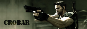
Brilliant siggy as usual, Pav3d, I have no idea how you make those things. 10/10
@ Swimmer: Idk why I noticed this, but the Samus in your picture is backwards... the cannon should be on her right arm and her left arm should be the regular one! :wow:
@ Swimmer: Idk why I noticed this, but the Samus in your picture is backwards... the cannon should be on her right arm and her left arm should be the regular one! :wow:
Edited by Ghostrider, 01 July 2008 - 03:41.

AJ is responsible for this signature masterpiece... if you see him, tell him I say thanks.

#1894
-
- Project Team
-
- 1909 posts
veritas vos liberabit
-
Projects: Hangar 13 Projects
Posted 01 July 2008 - 03:38
@Pav3d. Its my SOTW, and I thought it looked kinda cool alongside everything else like that, no? Also, the render is from the bullfrogs unit profile. On redalert3.com
@Ghost- I did that intentionally. With the flip tool. Why? Because it makes the sig flow better.
For GhostRiders sig, 10/10 xD
Swimmer
EDIT: Answered Pav3ds question
@Ghost- I did that intentionally. With the flip tool. Why? Because it makes the sig flow better.
For GhostRiders sig, 10/10 xD
Swimmer
EDIT: Answered Pav3ds question
Edited by The Swimmer, 01 July 2008 - 03:39.
kinda, sorta alive.
#1895
-
- Member
-
- 211 posts
Semi-Pro
-
Projects: Just Chilling
Posted 01 July 2008 - 14:27
9/10 I really like your work, Swimmer. GDI dude has got a good chance in SOTW so far
#1896
-
- Administrator
-
- 9337 posts
Not a Wonky Gent.
Posted 01 July 2008 - 14:38
8/10 Simple, but effective
F O R T H E N S
#1899
-
- Member
-
- 507 posts
<Custom title available>
-
Projects: Harvesting Tiberium 24/7
Posted 03 July 2008 - 13:45
9/10
the composition and the use of color is very well done
the composition and the use of color is very well done

Above sig by Vertigo
#1900
-
- Project Team
-
- 1909 posts
veritas vos liberabit
-
Projects: Hangar 13 Projects
Posted 03 July 2008 - 15:39
Its nice, but I don't love the mirror effect. High amount of technical work, though
8/10
Rebel
8/10
Rebel
kinda, sorta alive.
2 user(s) are reading this topic
0 members, 2 guests, 0 anonymous users

