7/10 it looks quite sophisticated but is let down by the cutoff along the top - the black line suddenly stopping at it reaches the edge of the car doesn't work.

Rate teh Siggy!
Started By Baal-Zebub, Mar 16 2006 02:36
2198 replies to this topic
#1976
-
- Gold Member
-

- 4950 posts
Light up life.
Posted 06 November 2008 - 23:56
For there can be no death without life.
#1977
-
- Gold Member
-
- 5114 posts
Formerly known as Scopejim
-
Projects: Life
Posted 07 November 2008 - 05:29
10/10 Frickin Awesome!

#1978
-
- Administrator
-

- 5853 posts
Whispery Wizard
Posted 07 November 2008 - 10:09
7/10
Nice sig but i don't like the font.
Nice sig but i don't like the font.

F O R T H E N S

#1979
-
- Member Test
-

- 1899 posts
Shyborg Commander
-
Projects: Frontline Chaos creator and leader, Invasion Confirmed co-leader
Posted 07 November 2008 - 13:48
10/10
It's a The Dr sig
It's a The Dr sig
#1980
-
- Member
-
- 1136 posts
Man, myth, and legend
-
Projects: diji
Posted 30 November 2008 - 03:49
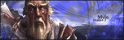
9/10 very nice looking and tells alot about him
#1981
-
- Member Test
-
- 2197 posts
Grand Poobah and Lord High Everything Else
-
Projects: Where parallels meet.
Posted 30 November 2008 - 09:28
0/0.000000000000000000000000000000000000000000000000000000000000000000000000000000
000000000000000000000000000000000000001
000000000000000000000000000000000000001
 19681107
#1982
-
- Member
-
- 55 posts
Casual
-
Projects: Dunno
Posted 30 November 2008 - 11:40
7/10
3 points down due Chevron :(
Dont like it
3 points down due Chevron :(
Dont like it

Mood Control: LMAO MOOF
#1983
-
- Project Team
-

- 4073 posts
[Pantsu-Dan]
-
Projects: Commanding the ECA 33rd Ground Assault Team.
Posted 30 November 2008 - 11:43
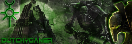
9/10 Dirty


 Black Lagoon OST
#1984
-
- Member Test
-
- 1899 posts
Shyborg Commander
-
Projects: Frontline Chaos creator and leader, Invasion Confirmed co-leader
Posted 30 November 2008 - 14:23
8/10 Looks good!
#1985
-
- Member
-
- 55 posts
Casual
-
Projects: Dunno
Posted 30 November 2008 - 14:28
9/10 ------Nod
Mood Control: LMAO MOOF
#1986
-
- Member Test
-
- 2197 posts
Grand Poobah and Lord High Everything Else
-
Projects: Where parallels meet.
Posted 01 December 2008 - 05:44
7.8/10 kinky
19681107


#1988
-
- Member
-
- 1136 posts
Man, myth, and legend
-
Projects: diji
Posted 04 December 2008 - 20:51
themed, shows whhat you do here and credits artist 10/10 verry nice
#1989
-
- Member
-
- 581 posts
Commander&Chief of the Order of the Black Knights
-
Projects: None, unfortunately
Posted 06 December 2008 - 21:45
0/0 Bland.... I wanted Motoshi.......
Edited by Zero, 08 December 2008 - 01:53.


[indent]Garrod "Newtype Killer" Ran[/indent]
#1991
-
- Member
-
- 581 posts
Commander&Chief of the Order of the Black Knights
-
Projects: None, unfortunately
Posted 08 December 2008 - 01:51
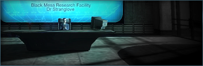
Well, that was a prototype.... Anyways: 5/10 don't like snowmen much.... But render is good
[indent]Garrod "Newtype Killer" Ran[/indent]
#1992
-
- Member Test
-
- 547 posts
Der Metzgermeister
Posted 02 January 2009 - 11:29
ิ5/10 both

my sig showroom kick!!
http://500px.com/schwarzk0pf
glouf, on 23 Jun 2006, 16:51, said:
I like to call him Dr. Spamkopf
#1993
-
- Member Test
-
- 1899 posts
Shyborg Commander
-
Projects: Frontline Chaos creator and leader, Invasion Confirmed co-leader
Posted 02 January 2009 - 11:37
7/10
Simple, but nice. Extra points for Rammstein
Simple, but nice. Extra points for Rammstein
#1994
-
- Member
-
- 1136 posts
Man, myth, and legend
-
Projects: diji
Posted 05 January 2009 - 02:14
loaded, 10/10
#1995
-
- Gold Member
-
- 5114 posts
Formerly known as Scopejim
-
Projects: Life
Posted 05 January 2009 - 09:00
3/10 Mildly interesting quote.
#1996
-
- Member
-
- 390 posts
Professional
-
Projects: Resident Knicker.
Posted 08 January 2009 - 17:45
6.5/10.
Something about the border irritates me, and it seems unfocused.
~V.
Something about the border irritates me, and it seems unfocused.
~V.

-Tha' rewf iz awn fiyah-
#1997
-
- Gold Member
-
- 5114 posts
Formerly known as Scopejim
-
Projects: Life
Posted 08 January 2009 - 23:39
Slightly bumpy but otherwise I like. The Shadow is a nice touch. 9.5/10
#1998
-
- Gold Member
-
- 4950 posts
Light up life.
Posted 09 January 2009 - 00:02
Multiple focal points don't bug me one bit, and I like the colouring, although I will agree the border comes across as slightly bland compared with the rest. 8.5/10
For there can be no death without life.
#1999
-
- Fallen Brother
-

- 3736 posts
Grand Admiral, Deimos Fleet, Red Banner
-
Projects: Rise of the Reds beta testing & publicity officer; military technology consultancy; New World Order
Posted 22 January 2009 - 00:09
8/10, very nicely accomplished, and a classic Dauth quote. Your own sig is particularly good - I like the way the top figure protrudes out of the box.
Quote
"Working together, we can build a world in which the rule of law — not the rule of force — governs relations between states. A world in which leaders respect the rights of their people, and nations seek peace, not destruction or domination. And neither we nor anyone else should live in fear ever again." - Wesley Clark


#2000
-
- Administrator
-
- 9627 posts
[...beep...]
Posted 23 January 2009 - 16:43
Deep and meaningful + bt badge is ok with me 7/10
3 user(s) are reading this topic
0 members, 3 guests, 0 anonymous users

