7/10 Nice sig, but not quite great. At the top of the things it needs is a secondary color of some sort.

Rate teh Siggy!
Started By Baal-Zebub, Mar 16 2006 02:36
2198 replies to this topic
#2177
-
- Project Team
-

- 4646 posts
IRC is just a multiplayer notepad.
Posted 29 October 2009 - 16:55
9/10
Nice texture, font, effects etc, but the right side of it feels a bit flat.
Nice texture, font, effects etc, but the right side of it feels a bit flat.

#2178
-
- Administrator
-

- 5853 posts
Whispery Wizard
Posted 06 January 2010 - 14:03
I like the BG and effects, but i don't feel it fits with the render (Maybe a lighter blue?) and the text has the standard inner glow colour for the layer style effect.
The bar under the text looks really quite good and effective and its a size sig.
7/10, The BG is sweet, but the colours seem a bit out of place.
The bar under the text looks really quite good and effective and its a size sig.
7/10, The BG is sweet, but the colours seem a bit out of place.

F O R T H E N S

#2179
-
- Project Team
-
- 3068 posts
I may or may not be iron man!
-
Projects: European Conflict
Posted 06 July 2010 - 00:54
Revival time 
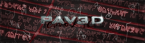
9/10 - The rain and lightning add a really nice effect to the sharper front image.
Mike
9/10 - The rain and lightning add a really nice effect to the sharper front image.
Mike
Thanks to Pav3d for the awesome sigs

#2180
-
- Member
-

- 180 posts
Regular
Posted 06 July 2010 - 09:52
8.5
Well I couldn't say anything.
Well I couldn't say anything.
OC's and stuff
DeviantArt
*RWUAAARAAUGHRWAGH!!*
--------------------------

"I am an artist of daydreams. With just a little material, be it a picture, audio or a simple thought, it could fuel a derivative masterpiece."
And I also do Walfas Comics...when I feel like it.
DeviantArt
*RWUAAARAAUGHRWAGH!!*
--------------------------
"I am an artist of daydreams. With just a little material, be it a picture, audio or a simple thought, it could fuel a derivative masterpiece."
And I also do Walfas Comics...when I feel like it.
#2181
-
- Project Team
-
- 60 posts
Casual
-
Projects: Shock Therapy
Posted 08 July 2010 - 01:59
Tank man with a Tank, Very Topical
T-7.4/10
T-7.4/10
#2182
-
- Project Leader
-

- 1170 posts
Set sails!
-
Projects: New!
Posted 08 July 2010 - 02:05
Good for a beginner 
7.5/10
7.5/10
"The entire ocean. The entire world. Wherever we want to go, we'll go. That's what a ship is, you know. It's not just a keel and a hull and a deck and sails, that's what a ship needs but what a ship is... what Tidal Wars really is... is freedom."

kudos to Pasidon for this awesome avvy and siggy!
kudos to Pasidon for this awesome avvy and siggy!
#2183
-
- Project Team
-
- 923 posts
Ecchi Toaster
-
Projects: Spam
Posted 08 July 2010 - 02:08
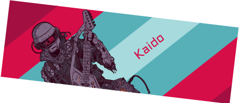
Epic necro. xD
5/10 Barss...
5/10 Barss...


Awesome radio
Quote
19:44 - Chyros: I'm very harmless
#2184
-
- Project Leader
-
- 1417 posts
Lurker
-
Projects: NProject Mod, Recolonize, Tidal Wars
Posted 08 July 2010 - 16:35
have a nice background. the pop-up also neat.
8.8/10
8.8/10

NProject Mod -- Recolonize -- Tidal Wars
#2185
-
- Administrator
-
- 5853 posts
Whispery Wizard
Posted 08 July 2010 - 20:02
I feel the background doesn't really fit with the image (could do with more colour from the image in the background). However, its still good
F O R T H E N S
#2186
-
- Member Test
-
- 898 posts
The one who screams.
-
Projects: Nothin'
Posted 08 July 2010 - 20:05
10/10
I'm lovin' it
I'm lovin' it

#2187
-
- Gold Member
-

- 4950 posts
Light up life.
Posted 13 July 2010 - 18:30
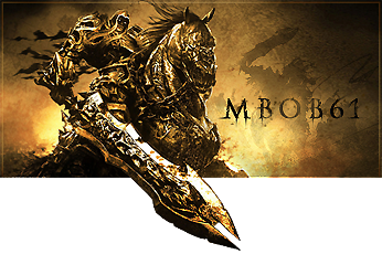
7/10, nice, but simple. Not sure the brush in the middle quite goes with the rest of it.
For there can be no death without life.
#2188
-
- Member Test
-
- 2150 posts
Rocket soldier
-
Projects: Nothing yet
Posted 13 July 2010 - 18:48
Where to start...?
Alright, so the render is very badly rendered, especially for the hair.
I don't like the font nor the color of the text.
The double light source on the character make him look weird.
And finally I don't like siggies which are too big in size D:
4/10
Alright, so the render is very badly rendered, especially for the hair.
I don't like the font nor the color of the text.
The double light source on the character make him look weird.
And finally I don't like siggies which are too big in size D:
4/10
 Chyros, on 11 November 2013 - 18:21, said:
I bet I could program an internet
#2189
-
- Gold Member
-
- 4950 posts
Light up life.
Posted 30 July 2010 - 16:10
Well I like yours but somewhere, there's something not quite right for me that I can't place a finger on. 8/10 tho 
Btw, if anybody tells me mine's upside down, I'm gonna kill someone
Btw, if anybody tells me mine's upside down, I'm gonna kill someone
For there can be no death without life.
#2190
-
- Member Test
-
- 3141 posts
Forum Nakadashi-er
Posted 30 July 2010 - 16:17
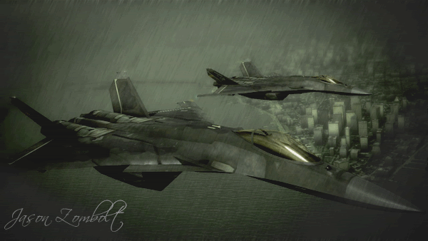
9/10
1 point gone because it's upside down.
Nah, to be honest the 'wire' thingy behind the cockpit to the rudder seems to be suffering from some...weird...'stairs effect' as seen on voxels...IDK how to phrase it...uhh...and the other wing is missing the contrail which I thing is kinda...strange.
1 point gone because it's upside down.
Nah, to be honest the 'wire' thingy behind the cockpit to the rudder seems to be suffering from some...weird...'stairs effect' as seen on voxels...IDK how to phrase it...uhh...and the other wing is missing the contrail which I thing is kinda...strange.

#2191
-
- Project Leader
-
- 7224 posts
YOUR WORLDS WILL BECOME OUR LABORATORIES
-
Projects: EC, CORE, ER
Posted 30 July 2010 - 16:20
@AJ:
7/10
I like it, (the AJPOD is a great touch) The background is really well done and looks like it has a lot going on.
But with the plane itself however I suggest turning up the brightness a bit on the plane and maybe throwing a sharpen layer on it as it looks quite dark atm.
Also try a different technique for the motion blur you have going on, it doesnt look right, looks more like a drop shadow and doesnt blend well with the background. I would also suggest adding some fake shadows and highlights to the plane itself as it looks rather flat. (and maybe make the glass look more like glass)
Edited by Pav:3d, 30 July 2010 - 16:21.

#2192
-
- Gold Member
-
- 4950 posts
Light up life.
Posted 30 July 2010 - 16:50
With a few tweaks:
Points to note - no idea wtf to do for the motion blur whatsoever, and I can't find the glass in the UVunwrap anywhere, which has irritated me greatly. Not sure on the new contrail either. And Destiny, that stairs effect is supposed to be there, it's a part of the system on it

Oh, and I guess I like you're Pav, but the text overlay on the main image is a little odd. 8/10
Points to note - no idea wtf to do for the motion blur whatsoever, and I can't find the glass in the UVunwrap anywhere, which has irritated me greatly. Not sure on the new contrail either. And Destiny, that stairs effect is supposed to be there, it's a part of the system on it
Oh, and I guess I like you're Pav, but the text overlay on the main image is a little odd. 8/10
Edited by AJ, 30 July 2010 - 16:52.
For there can be no death without life.
#2193
-
- Project Leader
-
- 7224 posts
YOUR WORLDS WILL BECOME OUR LABORATORIES
-
Projects: EC, CORE, ER
Posted 30 July 2010 - 16:53
I think it doesnt really need a motion blur, tho the propellers could do with that effect, but ill stop here. Otherwise ill end up finding millions of tweaks
UVunwrap? Where is model from? and what are you using to render it?
UVunwrap? Where is model from? and what are you using to render it?
#2194
-
- Member Test
-
- 2150 posts
Rocket soldier
-
Projects: Nothing yet
Posted 30 July 2010 - 17:59
Concerning Aj's sig (since he doesn't have a thread for that) I'd have to say that the render in that last version is badly cut, you should use a round eraser to soften the edges, as well as make the texture look a bit less sharp.
Also, the second engine trail should be rotated a bit more towards the bottom (but that's just because I'm being picky about perspective these days)
About Pav's sig, it's just perfect, although personally, I don't really like those colors.
I give it a 9.9/10
Also, the second engine trail should be rotated a bit more towards the bottom (but that's just because I'm being picky about perspective these days
)About Pav's sig, it's just perfect, although personally, I don't really like those colors.
I give it a 9.9/10
Chyros, on 11 November 2013 - 18:21, said:
I bet I could program an internet
#2195
-
- Gold Member
-
- 4950 posts
Light up life.
Posted 30 July 2010 - 22:19
Personally I'm not a huge fan of that second version - the look of a 'poor cut' comes from the lighting source used on the model (not render, model ) as well as the increasingly sharpened texture for it, which combine to give the impression of something a lot less smooth than what it actually is as seen in the first one.
Btw: (Utterly Disused) Thread
) as well as the increasingly sharpened texture for it, which combine to give the impression of something a lot less smooth than what it actually is as seen in the first one. Btw: (Utterly Disused) Thread
For there can be no death without life.
#2196
-
- Member Test
-
- 2150 posts
Rocket soldier
-
Projects: Nothing yet
Posted 30 July 2010 - 22:22
A render is an image that has been cut out from it's background and that you use to create a sig, therefore that plane is a render, not a model 
Chyros, on 11 November 2013 - 18:21, said:
I bet I could program an internet
#2197
-
- Gold Member
-
- 4950 posts
Light up life.
Posted 31 July 2010 - 06:34
CJ, on 30 Jul 2010, 23:22, said:
A render is an image that has been cut out from it's background and that you use to create a sig, therefore that plane is a render, not a model
Incorrecto my dear CJ. This is a model, it has no background, and is imported into CS5 as a .obj, and then has a texture applied to it. It never had a background, and was never a stock image. http://www.colacola....po_303.htm#octa
For there can be no death without life.
#2198
-
- Member Test
-
- 2150 posts
Rocket soldier
-
Projects: Nothing yet
Posted 31 July 2010 - 06:50
*Facepalm*
Silly people using the 3D elements of Adobe D:
Silly people using the 3D elements of Adobe D:
Chyros, on 11 November 2013 - 18:21, said:
I bet I could program an internet
#2199
-
- Gold Member
-
- 4950 posts
Light up life.
1 user(s) are reading this topic
0 members, 1 guests, 0 anonymous users

