Drag#!'z Artworkz
 Kaido
30 Mar 2008
Kaido
30 Mar 2008
Well here are my noobish sigs 
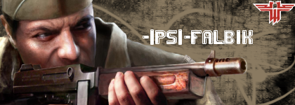
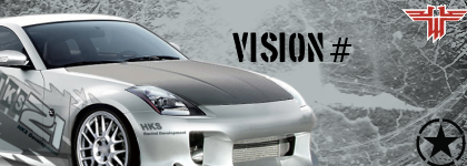
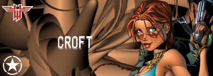
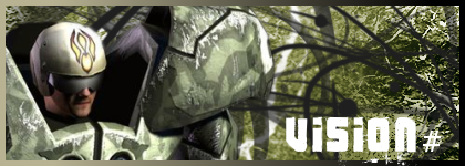
1.
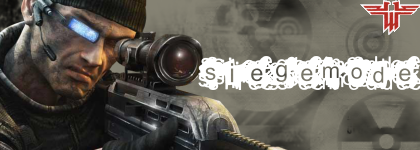
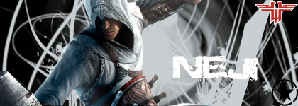
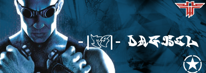
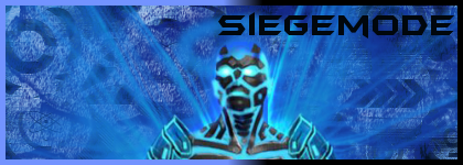
2.
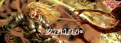
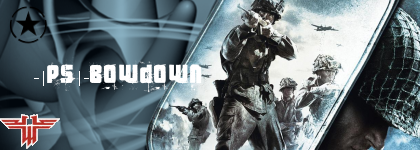
3.
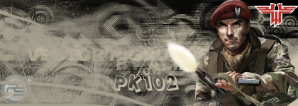
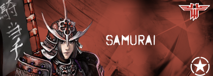
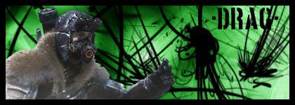
4.
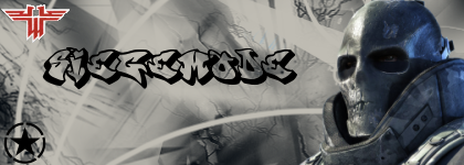
5.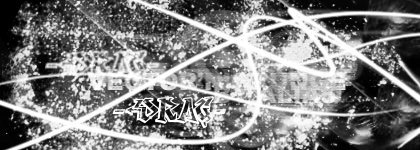
6.
Edited by Drag#!, 09 September 2009 - 14:22.
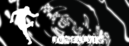
1.
2.
3.
4.
5.
6.
Edited by Drag#!, 09 September 2009 - 14:22.
Jok3r
30 Mar 2008
For the most part, pretty good. What program are you using? also- you've been abusing the Grunge brushes. If you want more commentary on any one in particular, just ask.
~Swimmer
~Swimmer
Warbz
30 Mar 2008
Yeh pretty good, but alot of areas could do with refining.
Like ^he said, just post 1 in particular if you want constructive criticism on it.
EDIT: Most notable is the lack of borders.
Edited by Warbz, 30 March 2008 - 16:20.
Like ^he said, just post 1 in particular if you want constructive criticism on it.
EDIT: Most notable is the lack of borders.
Edited by Warbz, 30 March 2008 - 16:20.
Sgt. Nuker
30 Mar 2008
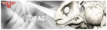
Your third signature seems to be your best, though that's only my opinion. It could have something to do with the render (or a lot depending on who you are  ) and the background. The background circles fit with the "I'm dodging you, you miserable creature from the abyss." THe only thing that I'd change is the text, but at the moment, I'm at a lack of suggestions on what it could be changed to.
Nicely done mate.
) and the background. The background circles fit with the "I'm dodging you, you miserable creature from the abyss." THe only thing that I'd change is the text, but at the moment, I'm at a lack of suggestions on what it could be changed to.Nicely done mate.
Kaido
30 Mar 2008
Well yeah... im using gimp and for 1 month trying it to make sigs 
Edit: Made 3 more with gimp
1.
2.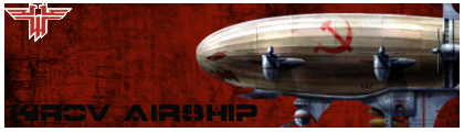
3.
Edited by -Drag-, 30 March 2008 - 17:48.
and for 1 month trying it to make sigs Edit: Made 3 more with gimp
1.
2.
3.
Edited by -Drag-, 30 March 2008 - 17:48.
Jok3r
30 Mar 2008
I use GIMP as well, so I may be able to help. I like the Kirov one. The only thing is maybe add a semi-transparent gradient on top so that you can read the text a little better (it will make one side lighter). Also, you can use a much smaller border, and something other than a white line would be nice. A little more clear brushwork might help a little with eye movement. Also, can you point me to some of those brushes? I'm always on the look out for good GIMP brushes and you seem to have a couple good sets.
~Swimmer
~Swimmer
Jok3r
30 Mar 2008
Try those edits? Also, I think "Bombardiers to your stations" would look pretty awesome on their... but that might just be because thats probably my favorite line from the whole game...
~Swimmer
~Swimmer

Wizard
01 Apr 2008
Your work isn't bad -Drag- but you have no blend in between your renders and your BGs. You need to work on that I think. There are plenty of good tutorials out there that will show you.
Warbz
04 Apr 2008
It would prob look better if you didnt keep adding both those logo's, stick to just the one if you feel the need to include it.
They just distract from the rest of the sig.
Secondly try adding a stroke border.
For photohsop it's just >
CTRL + A, EDIT > STROKE
then choose either black or white as the color and set it to 1 pixel. Maybe 2 if you want better definition of the border.
EDIT:
Also if you do a 3 or 4 pixel feather on your renders that would help blend them in much better.
Edited by Warbz, 04 April 2008 - 11:16.
Jok3r
09 Apr 2008
 -Drag-, on 1 Apr 2008, 3:47, said:
5.
This is probably my favorite of your work, however, all of them could definitely use refinements. Also, I would recomend changing your sig to one of your newer ones (preferably the one I pointed out above
), it reflects much better on you.~Swimmer
Wizard
10 Apr 2008
It doesn't work. Your render has no connection to the BG at all. Although the BG is nice.
Ellipsis
11 Apr 2008
Me likes the first and second sig, :biggrin:.
Troa Barton- Suggest some ideas on how it should look like, maybe include a render.
:drunk:,
Ellipsis
Troa Barton- Suggest some ideas on how it should look like, maybe include a render.
:drunk:,
Ellipsis
Troa Barton
11 Apr 2008
Noob Question: is a render a pic?
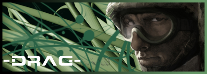
A sig that shows some of ironside units
Mammoth Tank, tank destroyer, howitzer, and some other cool units
A sig that shows some of ironside units
Mammoth Tank, tank destroyer, howitzer, and some other cool units
Troa Barton
11 Apr 2008
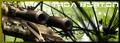
Nice!!!
One prob
The Spelling: Trowa Barton
but thats one sic tank
Second prob how do i make that my official sig.
One prob
The Spelling: Trowa Barton
but thats one sic tank
Second prob how do i make that my official sig.
Kaido
11 Apr 2008
Well Edited then
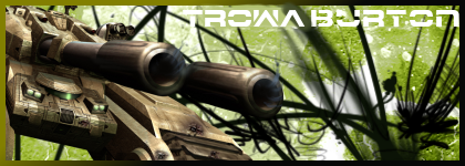
[IMG]http://i156.photobucket.com/albums/t40/kaido100/Trowa.png[/IMG]
Troa Barton
11 Apr 2008
1. :wahhhhhaa: Is that a U in Barton.
2. For my second sig can it be either Trowas gundam Heavyarms (which I can't find a pic of thats decent.) or the AFL team I support which is West Coast Eagles. I look for pics that you cana use.
2. For my second sig can it be either Trowas gundam Heavyarms (which I can't find a pic of thats decent.) or the AFL team I support which is West Coast Eagles. I look for pics that you cana use.
