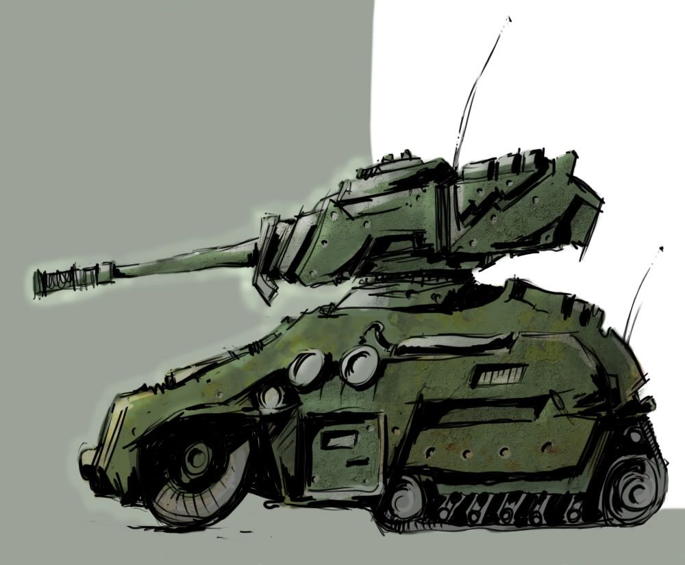
sweet tanks are sweet, 2nd one looks like its filled to the brim with sweet stuff. awesome job

Camille's drawings...
Started By Camille, Apr 17 2008 23:15
164 replies to this topic
#102
-
- Project Team
-

- 2351 posts
girl eater
Posted 21 June 2009 - 16:07
something quick, turned out that i liked the idea. not that i know what the idea is (yet) but i like it 
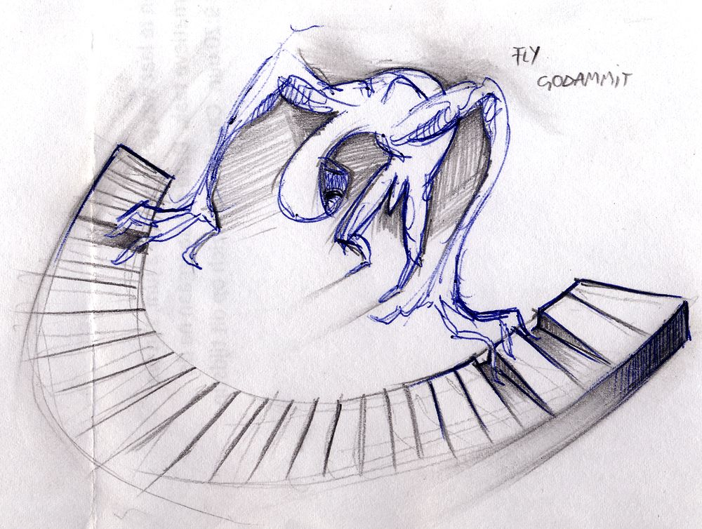
it's time to wake up
#103
-
- Gold Member
-

- 5812 posts
Mountain Maniac
-
Projects: European Conflict - Particle FX & Coder
Posted 21 June 2009 - 16:12
Looks like an alien playing the keyboard.

#104
-
- Project Team
-
- 2351 posts
girl eater
Posted 21 June 2009 - 16:21
who knows...
it's time to wake up
#105
-
- Member Test
-

- 3870 posts
Monster Hunter
Posted 21 June 2009 - 16:46
A grey which tries to take off with his UFO 
I liked the tanks by the way
I liked the tanks by the way
#106
-
- Project Team
-
- 2351 posts
girl eater
Posted 08 July 2009 - 15:35
tanks general eh turian
some new stuff.
cc plox
some new stuff.
cc plox
it's time to wake up
#107
-
- Global Moderator
-

- 13457 posts
Greenskin Inside
-
Projects: Shoot. Chop. Smash. Stomp.
Posted 08 July 2009 - 16:10
For whatever reason, the "grey" playing the keyboard reminds me of someone playing Beethoven's 5th (great, now I've got that song in my head).
The tank however, reminds me a bit of Metal Slug. The chassis of the tank looks like the Flak Track from RA2 and I do love the way it's coloured.
The tank however, reminds me a bit of Metal Slug. The chassis of the tank looks like the Flak Track from RA2 and I do love the way it's coloured.

#108
-
- Project Team
-
- 2351 posts
girl eater
Posted 08 July 2009 - 16:16
i actually thought of a piece by chopin when drawing the "grey" (though that's not what i intended it to be)
and thanks you very much for liking the tank. i am cautiously broadening my horizons when it comes to colouring so expect more of those in the future
and thanks you very much for liking the tank. i am cautiously broadening my horizons when it comes to colouring so expect more of those in the future
it's time to wake up
#109
-
- Project Team
-
- 2351 posts
girl eater
Posted 25 August 2009 - 15:35
a front page cover for a friends' thesis, he liked it
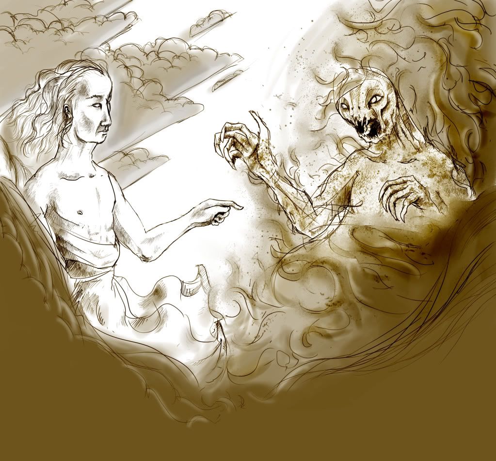
comments & critique welcome, even though it's an old piece...
comments & critique welcome, even though it's an old piece...
it's time to wake up
#110
-
- Member Test
-
- 3870 posts
Monster Hunter
Posted 25 August 2009 - 16:39
Creature's anatomy is almost in good shape but the man's need more work, I personally can't draw with completely correct anatomy aswell,I think we both need to learn that But ' story ' looks interesting, what does this mean, fall of the Satan ?
But ' story ' looks interesting, what does this mean, fall of the Satan ?
#111
-
- Global Moderator
-
- 13457 posts
Greenskin Inside
-
Projects: Shoot. Chop. Smash. Stomp.
Posted 25 August 2009 - 16:43
A sort of "heaven meets hell", or at least that's what it seems to be to me. Also reminds me of Michelangelo's "Creation of Adam" because of the two figures facing each other and the outstretched hands towards one another. There isn't much colour, but then again, there doesn't really need to be, as too much colour would ruin this piece. Half of the piece is peaceful, almost silk-like and smooth, the other is chaotic, noisy, and rough. The facial expression of the figure on the left is almost one of curiosity rather than one of greeting, while that of the figure on the right seems to be one of taunt, as if to say "don't touch me".
#112
-
- Project Team
-
- 2351 posts
girl eater
Posted 25 August 2009 - 23:50
you're all too right gabriel, i/we both still need to work on anatomy. glad you appreciate it and no, it's not exactly that. the piece was meant to be a depiction of a classic good vs evil confrontation, with both sides having their associated position and props. no one is "winning" yet they are in a state of struggle, barely touching each other.
yes nooka, you're good with words also your knowledge of classic art surprises me, it is exactly that piece i used as a mental reference for mine. your description of the picture is also very accurate. the picture has a lot of depth and feeling put into it so it's nice when someone recognises that
and no, it's not exactly that. the piece was meant to be a depiction of a classic good vs evil confrontation, with both sides having their associated position and props. no one is "winning" yet they are in a state of struggle, barely touching each other.yes nooka, you're good with words
also your knowledge of classic art surprises me, it is exactly that piece i used as a mental reference for mine. your description of the picture is also very accurate. the picture has a lot of depth and feeling put into it so it's nice when someone recognises that
it's time to wake up
#113
-
- Project Leader
-

- 7224 posts
YOUR WORLDS WILL BECOME OUR LABORATORIES
-
Projects: EC, CORE, ER
Posted 26 August 2009 - 00:23
Great stuff man, I really like ur style

#114
-
- Project Team
-
- 2351 posts
girl eater
Posted 11 November 2009 - 23:02
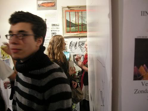
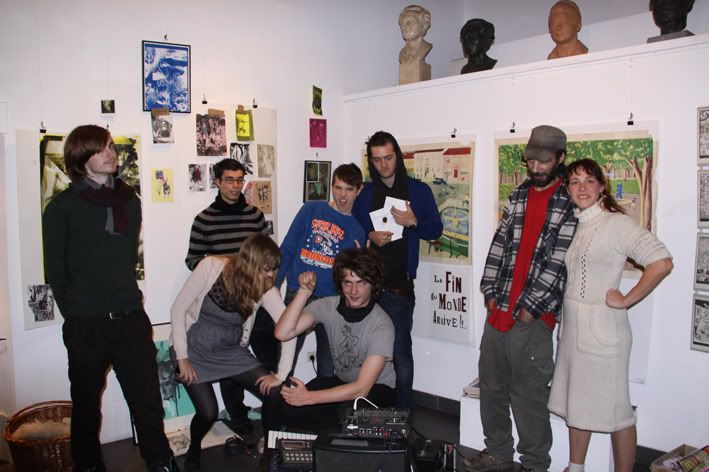
pictures from an exposition called "Undesirable Effect (2nd edition)" me and some friends held in Antwerp, where i live it was a relatively large success and there was never a moment when the room was empty. apart from loads of displayed work there was also one of the participators who played crazy electronic beats in the evening. there where artists from different countries like France and Holland and even a girl from Chicago nine people in total participated.
me, moving away from the camera.
my most commented upon work, the strip was five pages long.
group picture, about 2 of the nine artists missing. i'm the stripes guy
i'll post some of my work that was displayed there when my mate who organized the event gives me back my work
it was a relatively large success and there was never a moment when the room was empty. apart from loads of displayed work there was also one of the participators who played crazy electronic beats in the evening. there where artists from different countries like France and Holland and even a girl from Chicago nine people in total participated. me, moving away from the camera.
my most commented upon work, the strip was five pages long.
group picture, about 2 of the nine artists missing. i'm the stripes guy
i'll post some of my work that was displayed there when my mate who organized the event gives me back my work
it's time to wake up
#115
-
- Project Team
-
- 3068 posts
I may or may not be iron man!
-
Projects: European Conflict
Posted 12 November 2009 - 14:19
Congratulations 
The strip looks pretty sweet from what i can see of it
Glad it went well for you.
Mike
The strip looks pretty sweet from what i can see of it
Glad it went well for you.
Mike
Thanks to Pav3d for the awesome sigs

#116
-
- Project Team
-
- 2351 posts
girl eater
Posted 25 November 2009 - 03:03
thanks mate
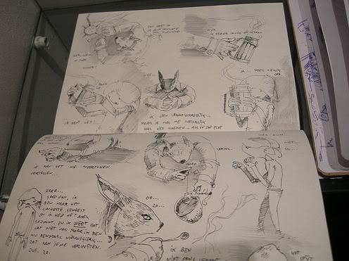
and as promised, here is some of the works i displayed at the expo. i kept them large to prevent detail loss.
note: i know most of you guys and gals are more interested in seeing buff guys with huge guns or demonic mutants from saturn (sorry gab), and i also know very well that it is something i deliberately avoid myself. however, this is no reason to just entirely ignore posting anything. just a simple sign of approval/dismay/critique is always welcome and is in fact the sole purpose i post in this thread long story short, i'd appreciate it if i got some more feedback.
and as promised, here is some of the works i displayed at the expo. i kept them large to prevent detail loss.
note: i know most of you guys and gals are more interested in seeing buff guys with huge guns or demonic mutants from saturn (sorry gab
), and i also know very well that it is something i deliberately avoid myself. however, this is no reason to just entirely ignore posting anything. just a simple sign of approval/dismay/critique is always welcome and is in fact the sole purpose i post in this thread long story short, i'd appreciate it if i got some more feedback.
it's time to wake up
#117
-
- Global Moderator
-
- 13457 posts
Greenskin Inside
-
Projects: Shoot. Chop. Smash. Stomp.
Posted 25 November 2009 - 05:23
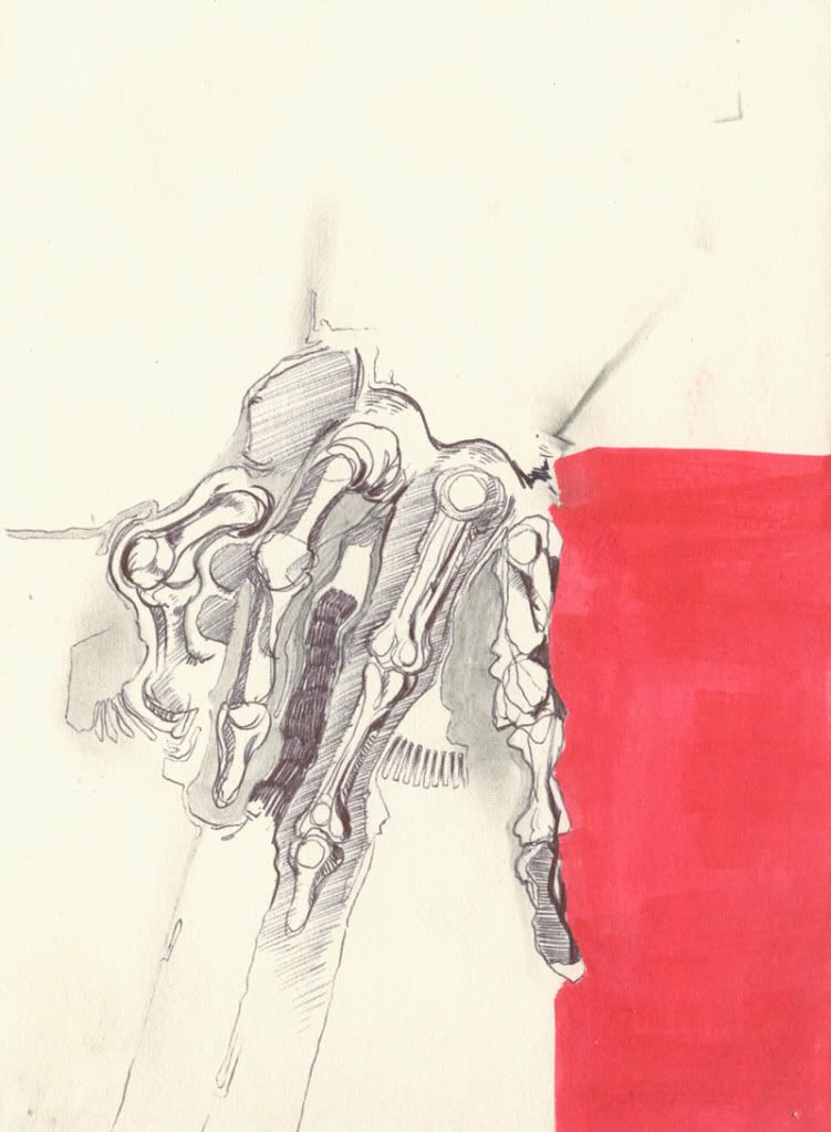
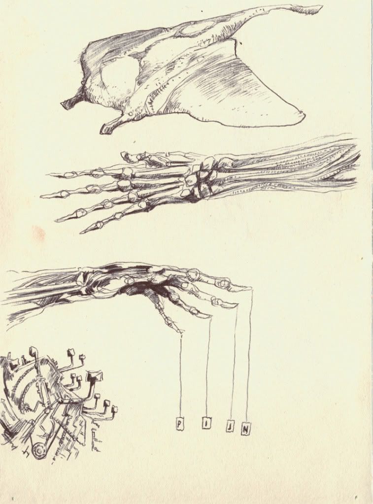
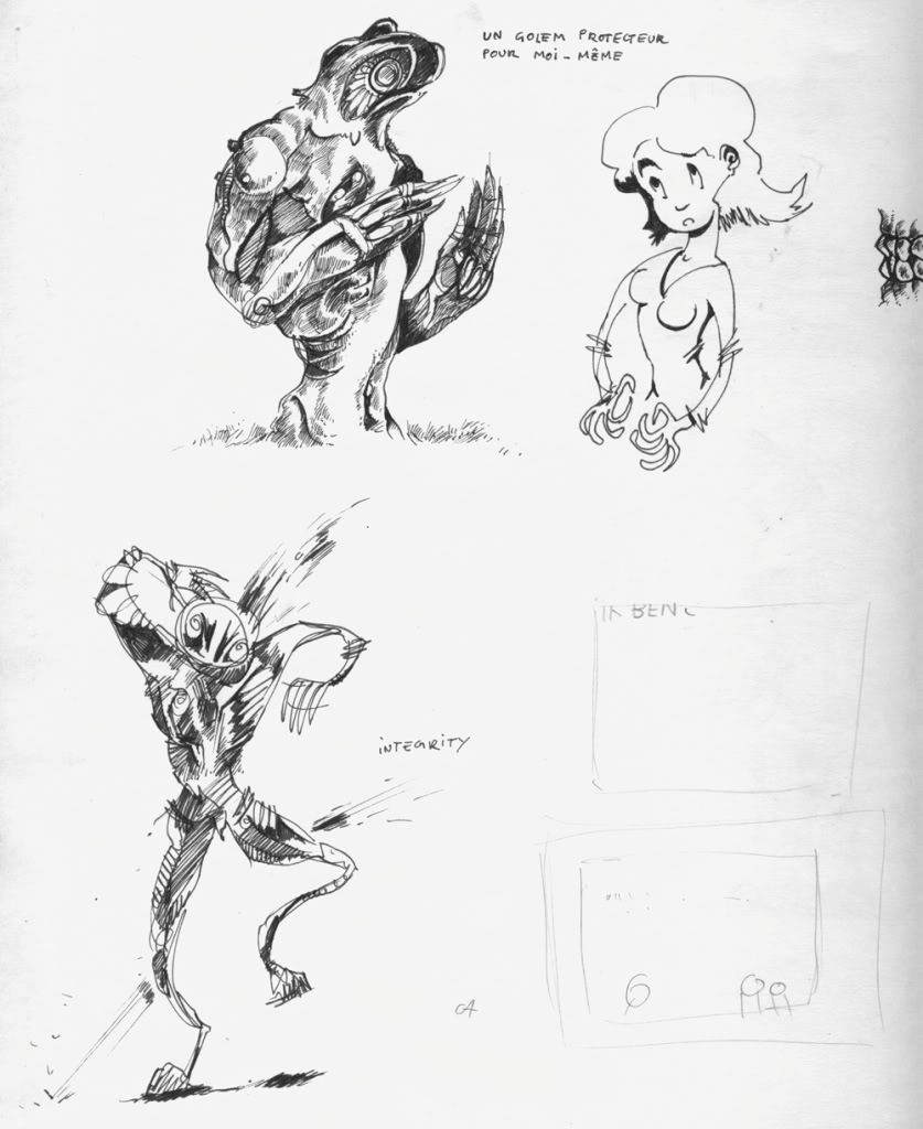
You have a style all your own, which is rather obvious, but needs to be said, considering that you're the only one that posts sketches and drawings of this nature. I am a particular fan of the Golem Protecteur in the last collection of sketches shown, and feel that you have a sort of Da Vinci approach to your skeletal sketchings. I hope you continue to post your works mate.
#118
-
- Project Team
-
- 3068 posts
I may or may not be iron man!
-
Projects: European Conflict
Posted 25 November 2009 - 11:12
Some excellent stuff in there
I really like the 4th one down with the hands.
Could you possibly post that strip? That looked pretty cool from the image you showed earlier
Please keep posting your work.
Mike
I really like the 4th one down with the hands.
Could you possibly post that strip? That looked pretty cool from the image you showed earlier
Please keep posting your work.
Mike
Thanks to Pav3d for the awesome sigs
#119
-
- Project Team
-
- 2351 posts
girl eater
Posted 25 November 2009 - 11:27
thank nooka and mike and yeah nooka, needless to say, i'm a big da vinci admirer
sure mike, i'll scan it somewhere tonight.
and yeah nooka, needless to say, i'm a big da vinci admirer sure mike, i'll scan it somewhere tonight.
it's time to wake up
#120
-
- Project Leader
-
- 7224 posts
YOUR WORLDS WILL BECOME OUR LABORATORIES
-
Projects: EC, CORE, ER
Posted 25 November 2009 - 11:55
Just awesome, your art is so organic, it just looks like its about to move off the page. Cant really explain it
The hand especially.
The hand especially.
#121
-
- Gold Member
-
- 5114 posts
Formerly known as Scopejim
-
Projects: Life
Posted 25 November 2009 - 20:20
I didn't really comment on the expo pics because the artwork wasn't clearly visible. Anyway, I really like your latest work. It is very different but very well drawn as well. Some seem quite expressive of moods.

#122
-
- Project Team
-
- 649 posts
Eisenhower Commander
-
Projects: Shockwave, Rotr
Posted 26 November 2009 - 22:36
you've got some nice ones there
my favorite is the last paper, the dynamic is great
my favorite is the last paper, the dynamic is great
My Showroom
-{Aston Martin 4ever}-

"the earth does not deserve to touch my feet"
-{Aston Martin 4ever}-
"the earth does not deserve to touch my feet"
...:rofl:...:rofl:...:lol:...:rofl:...:rofl:...:lol:...
......... -.___.--"------ ................./ /
........ / ]: [][ I ]..........=======/
....... (-,____==o___.´ ..............` --
--`-------`---..........
......... -.___.--"------ ................./ /
........ / ]: [][ I ]..........=======/
....... (-,____==o___.´ ..............` --
--`-------`---..........
#123
-
- Project Team
-
- 2351 posts
girl eater
Posted 07 December 2009 - 12:13
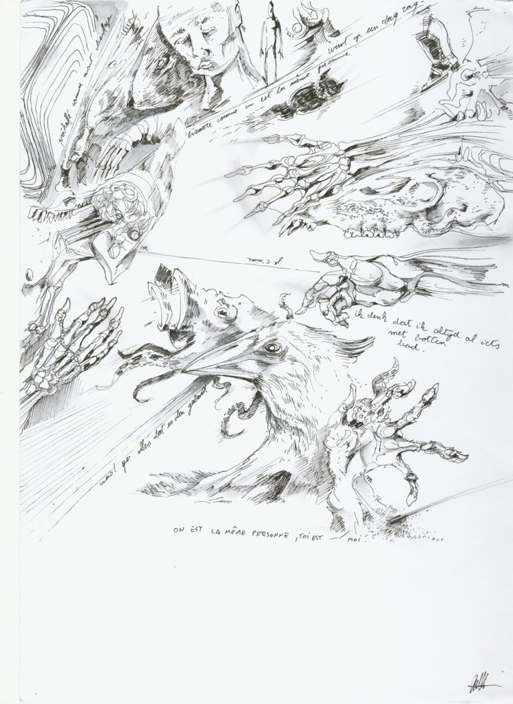
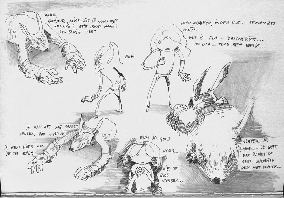
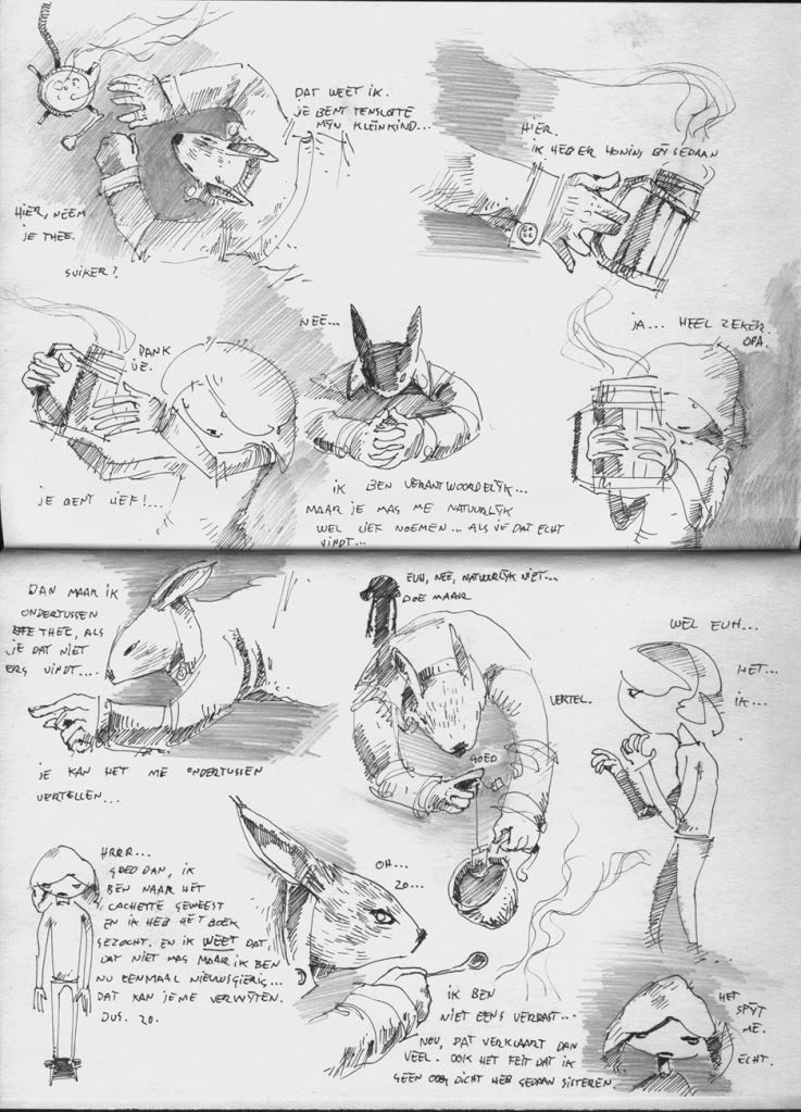
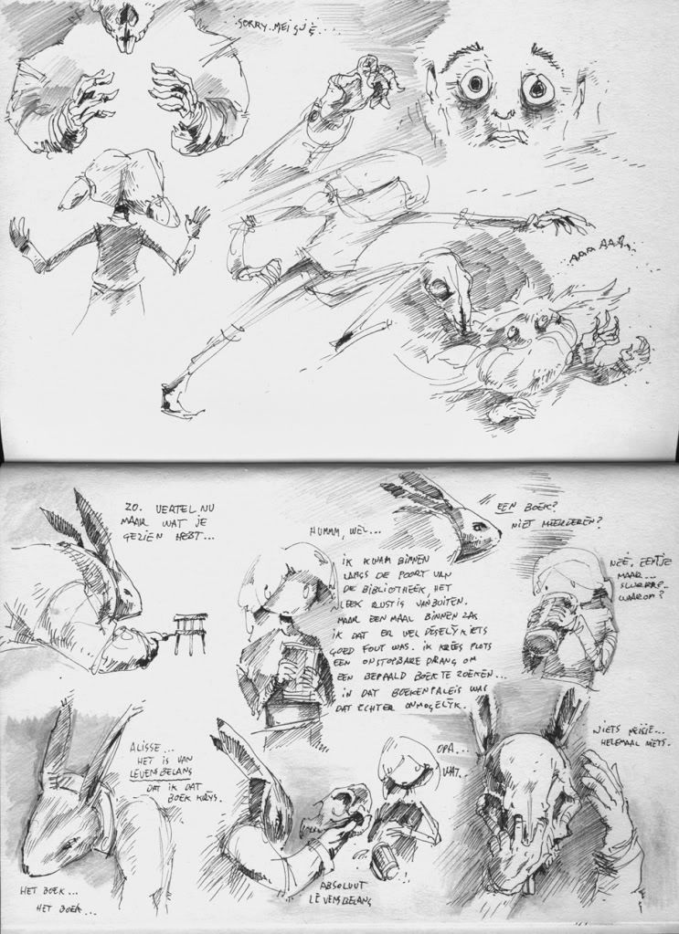
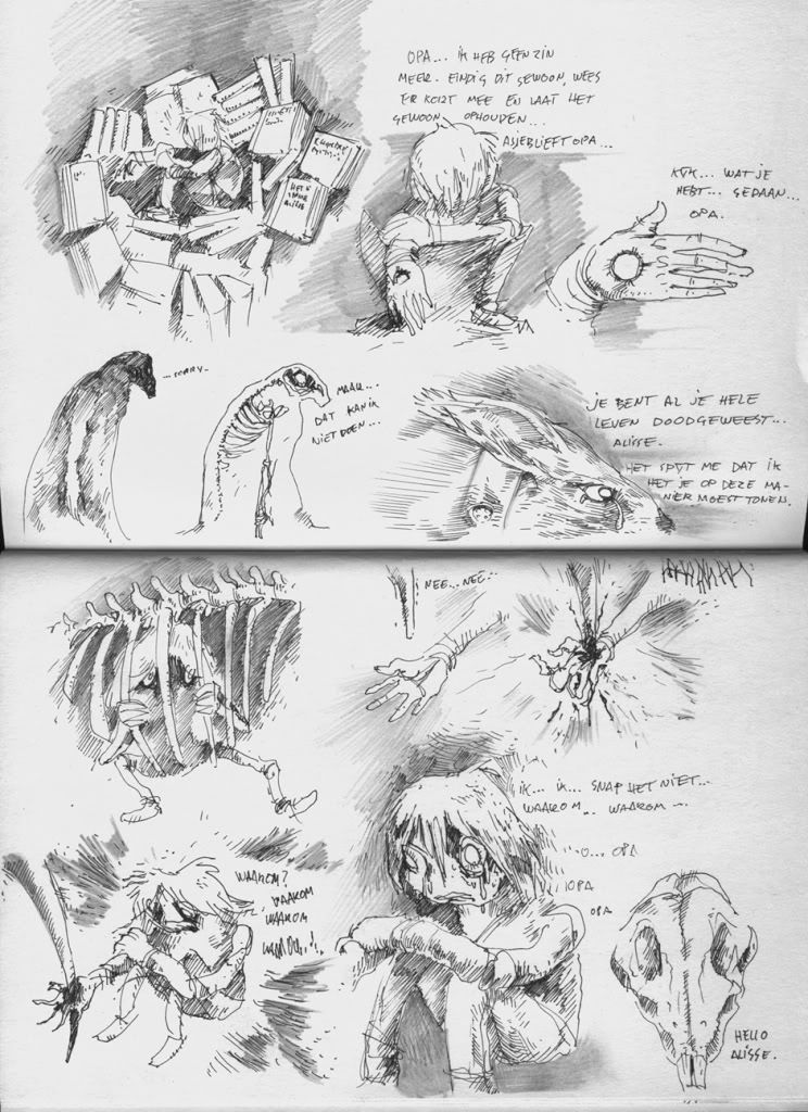
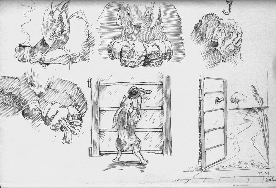
the strip i promised, these are all separate pages that i made in bed while trying to fall asleep so some of them might be considered a bit weird.
oh yeah, language is Dutch, sorry.
oh yeah, language is Dutch, sorry.
Edited by Camille, 07 December 2009 - 12:14.
it's time to wake up
#124
-
- Member Test
-
- 3141 posts
Forum Nakadashi-er
Posted 07 December 2009 - 18:34
That rabbit-thingy is scary You draw quite well, though. Very nice 
You draw quite well, though. Very nice
#125
-
- Member
-
- 571 posts
<Custom title available>
Posted 07 December 2009 - 22:10
You should make a portrait of yourself using that lovely art style you have.

[ER-Dev] Kalo Shin [USA]: The only thing I could do in safe mode
[ER-Dev] Kalo Shin [USA]: Is browse my porn photos
[ER-Dev] Kalo Shin [USA]: GUESS WHAT I'VE BEEN DOING ALL DAY
[ER-Dev] Kalo Shin [USA]: GIGGITY.
1 user(s) are reading this topic
0 members, 1 guests, 0 anonymous users

