Crobar's Rusty Old Art Shack
 Crobar
30 May 2008
Welcome to my rusty old art shack, brave traveller (mind the flowers on your way in - they're new  )
)
I recently aquired Adobe Photoshop, and have just discovered how therapeutic and addictive the pastime of making sigs really is. My Photoshop skills are currently close to abysmal, but I enjoy making new sigs and I think/hope that I am getting slightly better with each new sig I make. I hope with a little bit of critism and guidance from you guys; the true sig masters, I should be be able to hone my skills, sooner rather than later. I thank you for your time
This is the first ever sig I made. I based it on the figure of Nu Wa from the new Warriors Orochi Game. I'm really ashamed with the way this sig turned out (no background, no real colours, just a render plonked on a nasty white background with some lurid purple text added on top) and I think this is one sig better left forgotten in my opinion:

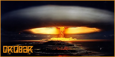
My next sig was my 'explosion' sig entered for my very first SOTW - Sig Of The Week #57 - This sig gained second place Its a very simple sig consisting of a stock image, slightly modified (by means of contrast and scaling), a border and some text. The image is of the French Nuclear Test of 1968. Not the best sig ever, by all means, but i'm quite happy with the way this one turned out :
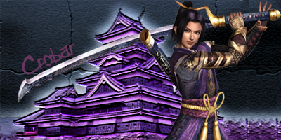
My next sig is a sig of the male samurai Ranmaru Mori from the game 'Samurai Warriors 2' This is the most intricate sig i've attempted so far, and i'm pretty pleased with the way it turned out. To make the sig, I found an image of a Japanese Castle, changed the colours a little (or a lot actually) to match the render, which I then added to the picture. To liven the background up a little, I added a crumbling, mosaic-like effect. I then added the text. I personally think a border might have given this sig the extra impact it needs:
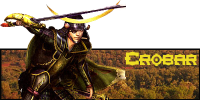
Next, I attempted a pop-up sig. This was a bit of a mistake I feel and I think I was trying to walk before I could crawl. The render is of the Samurai Warriors Character Masamune Date and has been cut out from its background abysmally by me. (If there's one thing I struggle with more than anything, its cutting out renders from their original backgrounds) As a result of this weakness, the sig looks nowhere near as good as I feel it could. Expect to see a replacement sig here fairly soon:
Anyway, that's all the sigs I have attempted at this time of writing. I hope to be adding to my collection with some better sigs soon
Edited by Crobar, 14 January 2009 - 23:11.

I recently aquired Adobe Photoshop, and have just discovered how therapeutic and addictive the pastime of making sigs really is. My Photoshop skills are currently close to abysmal, but I enjoy making new sigs and I think/hope that I am getting slightly better with each new sig I make. I hope with a little bit of critism and guidance from you guys; the true sig masters, I should be be able to hone my skills, sooner rather than later. I thank you for your time
This is the first ever sig I made. I based it on the figure of Nu Wa from the new Warriors Orochi Game. I'm really ashamed with the way this sig turned out (no background, no real colours, just a render plonked on a nasty white background with some lurid purple text added on top) and I think this is one sig better left forgotten in my opinion:

My next sig was my 'explosion' sig entered for my very first SOTW - Sig Of The Week #57 - This sig gained second place


My next sig is a sig of the male samurai Ranmaru Mori from the game 'Samurai Warriors 2' This is the most intricate sig i've attempted so far, and i'm pretty pleased with the way it turned out. To make the sig, I found an image of a Japanese Castle, changed the colours a little (or a lot actually) to match the render, which I then added to the picture. To liven the background up a little, I added a crumbling, mosaic-like effect. I then added the text. I personally think a border might have given this sig the extra impact it needs:

Next, I attempted a pop-up sig. This was a bit of a mistake I feel and I think I was trying to walk before I could crawl. The render is of the Samurai Warriors Character Masamune Date and has been cut out from its background abysmally by me. (If there's one thing I struggle with more than anything, its cutting out renders from their original backgrounds) As a result of this weakness, the sig looks nowhere near as good as I feel it could. Expect to see a replacement sig here fairly soon:

Anyway, that's all the sigs I have attempted at this time of writing. I hope to be adding to my collection with some better sigs soon
Edited by Crobar, 14 January 2009 - 23:11.
 Dauth
30 May 2008
You improved quickly, however the butchering of the render of the end of the sword & cape does cast a poor shadow on the rest of the sig. Keep practising and you'll get customers.
 Crobar
30 May 2008
Thanks  I agree I desperately need to touch up my rendering skills. Perhaps that's something I need to improve before I attempt any more sigs.
 TheDR
30 May 2008
 Crobar, on 30 May 2008, 18:27, said:
Thanks  I agree I desperately need to touch up my rendering skills. Perhaps that's something I need to improve before I attempt any more sigs.
Making Sigs improves your skill, Keep trying and people will be begging for your art
 Kichō
30 May 2008
I like how you did Nu Wa's and Ranmaru Mori's ones. 
Looks good.
Fun fact: Ranmaru Mori is a male.
EDIT:Actually according to Japanese history hes a homo. :wow:
Edited by Zhen Ji, 30 May 2008 - 18:03.
Looks good.
Fun fact: Ranmaru Mori is a male.
EDIT:Actually according to Japanese history hes a homo. :wow:
Edited by Zhen Ji, 30 May 2008 - 18:03.
 Wizard
30 May 2008
 Crobar, on 30 May 2008, 17:56, said:
My next sig is a sig of the male samurai Ranmaru Mori from the game 'Samurai Warriors 2' This is the most intricate sig i've attempted so far, and i'm pretty pleased with the way it turned out. To make the sig, I found an image of a Japanese Castle, changed the colours a little (or a lot actually) to match the render, which I then added to the picture. To liven the background up a little, I added a crumbling, mosaic-like effect. I then added the text. I personally think a border might have given this sig the extra impact it needs:


This one shows some promise for the future of skills. Whilst in itself it isn't particularly special there are elements in the composition that indicates you could have a future. I would've lowered the opacity on the building (pagoda?) as it does stand out far to much behind the render. It also has more colour depth than the render which doesn't work. However on a ver positive note I am impressed by you BG as it is very good.
Keep up the work Crobar and let's see more.
 Crobar
01 Jun 2008
My latest sig. I'm really quite happy with the way this turned out, but i'm still not too sure about the font. I might change that some time:


 Jok3r
02 Jun 2008
Ok, before anything else, I like this one. Now, crit. time.
-I'm not huge on the pop-up text. It just feels a little awkward to me.
-I'm not huge on the BG. Its acceptable, but perhaps with a more cartoony BG or a modified c4d, you could get something better.
-Not loving the pop-up avvy. If I were you, I would either kill the whole BG, or none of it. Cutting it off like that looks odd.
All in all tho, great work, especially for a PS newb .
.
-Swimmer
-I'm not huge on the pop-up text. It just feels a little awkward to me.
-I'm not huge on the BG. Its acceptable, but perhaps with a more cartoony BG or a modified c4d, you could get something better.
-Not loving the pop-up avvy. If I were you, I would either kill the whole BG, or none of it. Cutting it off like that looks odd.
All in all tho, great work, especially for a PS newb
-Swimmer
 Alias
02 Jun 2008
-Add a centred drop shadow on the text (render is fine).
-For the avatar, instead of the popup effect I suggest you just fade it in (feather/edge blur, whichever you prefer)
Otherwise, pretty nice.
Edited by Alias, 02 June 2008 - 11:37.
-For the avatar, instead of the popup effect I suggest you just fade it in (feather/edge blur, whichever you prefer)
Otherwise, pretty nice.
Edited by Alias, 02 June 2008 - 11:37.
 Wizard
02 Jun 2008
Always good to try new things, but there are a few issues here. The Render and BG don't blend. You have an anime render and a cgi background. Almost impossible to mix well as the lighting is different. As Swimmer said the text shouldn't be pop up, it's worth trying as sometimes it can work, this one hasn't quite.
However the avy works better as there is less BG to show.
Keeping plugign away chap.
However the avy works better as there is less BG to show.
Keeping plugign away chap.
 Slightly Wonky Robob
03 Jun 2008
Not bad, but like others have said the background/anime don't really fit (although I have seen much worse matches) and the text doesn't really work.
There are a couple of things you could do (well things I might do); 1. add some lighting to the anime section, to make it more "realistic" or 2. create a cartoony look version of the background and have it "glow" from the character.
I can't really give much advice on the text, because quite frankly that's my weakest area in sig making =0
 TheDR
03 Jun 2008
Crobar, ask me on msn and i will give you some text tips, tis one of my strong points.
 Crobar
19 Jun 2008
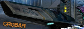
My SOTW #60 Entry. A little basic it may be, but i'm pretty happy with the way this one turned out:

 Libains
19 Jun 2008
It's basic, but it's also nice - the only thing I will say is that that image has cropped up a few times in this SOTW (cropped up - geddit? No?......aww) and it wasn't exactly the last one in google image search! But I like it nonetheless - sometimes the simplest sigs are the most elegant!
 Crobar
19 Jun 2008
Thanks  There's some really tough competition this week I feel - Some really slick sigs, yours included
 Libains
20 Jun 2008
Merci! Thanks - took me a fair while to get the text to look like it was actually stamped on the ship... was fun tho. And indeed, this SOTW is very very competitive and good - helped greatly by the topic (which allows for motion blur etc.) but also because of lack of real renders, which means people have to think outside the box. 
 Crobar
23 Jun 2008
Ok, I think I'm just about confident now to start taking requests. I don't expect many, if any, but i'm always here if anyone ever needs a mediocre sig
 Libains
24 Jun 2008
Luls.... Requests are fun as they make you think outside of the box. At that, I need to go and do my first one for the Wandering Jew...
 Crobar
25 Jun 2008
My SOTW #61 entry - A tribute to two things I love: The metal band Anthrax and Judge Dredd.  For some reason I really like this one:

Edited by Crobar, 25 June 2008 - 20:58.

Edited by Crobar, 25 June 2008 - 20:58.
 retry_1
25 Jun 2008
I like your latest one, while simple it is attractive and unique. Keep it up.
 Libains
25 Jun 2008
It is a very nice sig - my only thing about it being that the perspectives of the two 'sections' look a little off. By that, I mean that the writing looks a bit like it is slanting away from where you are relative to the screen, while the bit with the Judge looks flatter against the screen. If I were you I'd cut a small section off the sides of the Judge section to make it look slanted like the rest, or push the top edges of the 'anthrax' text only out a little bit, so as to prevent the slant. That's my opinion anyhows - the actual composition is great though!
Edited by AjPod, 25 June 2008 - 22:16.
Edited by AjPod, 25 June 2008 - 22:16.
 Crobar
02 Jul 2008
My latest SOTW entry. My first real exploration of gradient maps (ooooo...):


