Jump to content


Kyuubi's Lair


76 replies to this topic

#1 Reaper94

    rawr!!

  • Member
  • 1178 posts
  • Projects: Being more loved and less loathed by community

Posted 08 July 2008 - 21:26

Here i'll post my renders and sigs and other gfx related stuff. Please comment or ill never get better. (They will be posted in order i make them)


Posted Image < Test

Posted Image < Test

Posted Image < Test

Posted Image < Test

Posted Image < Use

Posted Image < Test

Posted Image <Mate

Posted Image < Mate

Posted Image < Test, Use


Edited by Rage of Kyuubi, 03 April 2009 - 18:06.


 RaiDK, on 3 Jun 2009, 10:09, said:

MY BEAK IS ONE WHICH WILL PIERCE THE HEAVENS.

Posted Image

#2 Libains

    Light up life.

  • Gold Member
  • 4950 posts

Posted 08 July 2008 - 23:51

Ok - some friendly comments on your work - I may be no expert but I'm getting better at what I do....

The first one - the initial rendering on the image is quite good. However, the C4D behind it is very bland - it looks very much like a copy-paste job and throw the image in front of it - the image has no blend with the render at all - and lacks a sense of 'movement' in my books at least. The text is also not great - there's no need to go and stamp a sign like that on it - a nice simple font other than a basic one that came with the computer would be better, saying just Kiba, and preferably located elsewhere other than the place it is currently - the right would be best to draw the eye around the image more - the focal point is also not great in that respect. However, compared with other things like others have done for their first try (myself included) - it's not bad at all.

Second one - the render here has been butchered several times that I can see... firstly there is an artifact leftover on the right of the image that could very easily be erased. Secondly - the pop-out feature of it doesn't work at all in this case - it works with legs/ hands/protruding items - but not the end of a torso. The protruding gun on the other hand, would have worked well, had it not been for the end of the barell being cut off. from the render I see - I would have left it so that it is as it were currently, and cut everything below the arm or the gun to make it look like the guy were resting his arm on the edge of the rectangle. The background also isn't really a great one once again - try some blurring and adding in some C4d's with different opacities and blending options. Also, the right hand side again looks very vacant and needs something, preferably just above the guy's shoulder and to the right slightly - so that again the whole canvas is used - I would again recommend you name in a different font, and preferably a slightly blocky military looking one.....

Now look what you made me do - I have hand cramp!! :/ - hope I was of some help though!
For there can be no death without life.

#3 Reaper94

    rawr!!

  • Member
  • 1178 posts
  • Projects: Being more loved and less loathed by community

Posted 09 July 2008 - 06:39

whatsa c4d?
]
and this was the render

Posted Image

didnt look right with 2 people in

damnit... when i copy/pasted it it came out white on gimp.

and yes... i downloaded some fonts, next one up wll be an Alien v Predator one but its being a whore to render.

Edited by Kiba, 09 July 2008 - 06:41.


 RaiDK, on 3 Jun 2009, 10:09, said:

MY BEAK IS ONE WHICH WILL PIERCE THE HEAVENS.

Posted Image

#4 Libains

    Light up life.

  • Gold Member
  • 4950 posts

Posted 09 July 2008 - 13:51

Hmmm - that's not a great render to be honest - especially with the gun cut-off on the right hand edge - if it'd been me i'd have used a render that only contined one person - they're quite easy to find btw! http://www.planetrenders.net is by far the best place to get renders - and that makes it far easier to get renders, rather than making them yourself - they're not easy to do at all...

Anyways, a good render would be one such as this:

Posted Image

and as for the gun, I would have reduced the size of the image generally and had the gun hitting the right-hand edge of the sig so that it didn't appear too botched, possibly by rotating the whole image slightly anti-clockwise. As for cutting the bottom off of the guy, I would not have gone further than the initial background - pop-out sigs often work as such that less is more - less pop-out is more effective.

A C4D is a nickname given to background renders, or fractals, as are seen used by the vast majority of sigs here - a good example of one of these is say, for example, in my sig, or Bob's. In mine - the red wavey shifty-effect has come from a C4D that comes as a PNG and cut-out and ready to go - these are then transplanted on top of another background of single colour, and then blending options are played with until it looks good.

Another thing that always helps a good sig is a border of some sort, whether it be a very simple one such as the black one on mine, or a more stylish one such as on someone's like Bob's again - it is very hard to get a good sig with no border unless you're rather too good at making them eg. Wizard.... :P
For there can be no death without life.

#5 Reaper94

    rawr!!

  • Member
  • 1178 posts
  • Projects: Being more loved and less loathed by community

Posted 11 July 2008 - 18:35

Posted Image

next attempt at popout

plz comment, i wont get better without comments

 RaiDK, on 3 Jun 2009, 10:09, said:

MY BEAK IS ONE WHICH WILL PIERCE THE HEAVENS.

Posted Image

#6 Wizard

    [...beep...]

  • Administrator
  • 9627 posts

Posted 11 July 2008 - 18:38

1. Don't use 3 focal points (renders)
2. If you make a cut out sig make sure there aren't any square edges on the render
3. You can't see the BG because of the 2 extra renders.
4. Render has a lot of white around it. Try cutting it down some more.
5. Font colour doesn't fit the sig.

#7 Libains

    Light up life.

  • Gold Member
  • 4950 posts

Posted 11 July 2008 - 19:18

What Wizard has added is all very appropriate - you might also want to avoid putting a render in that expands beyond both the top and bottom of the background, as it look like your background is more of a wall in the distance than an actual background. The two renders on either side really don't help this thing, both in the ways that Wizard pointed out, and also in that the small ones are layered in front of the big one, which makes the perspective look really out. If you do duplicate renders make sure that it's there for a reason - look at my current sig - it has a copy of the small figure blown up behind it as an illusion of the blast ripping fragments of the body out - almost like a soul. Unless you are an exceptional artist you will almost never be able to get away with three renders in a sig, even if they are all the same, due to the focal points as Wizard pointed out.
For there can be no death without life.

#8 Reaper94

    rawr!!

  • Member
  • 1178 posts
  • Projects: Being more loved and less loathed by community

Posted 11 July 2008 - 20:54

yep

Posted Image

is my new one :D (ignore that i smudged my name over)

 RaiDK, on 3 Jun 2009, 10:09, said:

MY BEAK IS ONE WHICH WILL PIERCE THE HEAVENS.

Posted Image

#9 Libains

    Light up life.

  • Gold Member
  • 4950 posts

Posted 11 July 2008 - 21:03

Well I'll add some quick and easy comments as it were.

Firstly, as you pointed out, you've smudged the name over - layers help to prevent things like this......
Secondly, the font is currently too small, enlarge it a little bit.
Thirdly, the images comprising the background are quite obviously cut-offs of the render - it would be worth smudging them a bit more/changing their opacity/having at them with a grunge brush.
Fourthly, the sig is currently a bit too wide - generally the forum goes for 500x200pixels max and you've hit 535pixels wide - not a huge issue but I would maybe cut a bit off of the right-hand side of the sig.
Fifthly, there's a little bit of white still visible on the left hand side of the render - take it in by just one or two pixels there and you should be good to go.

Hope that helps!
For there can be no death without life.

#10 Reaper94

    rawr!!

  • Member
  • 1178 posts
  • Projects: Being more loved and less loathed by community

Posted 11 July 2008 - 21:11

i have no idea how to "take it in" i thought i smudged over that part

i did have the name layed but i merged them all...

Any idea's for next sig?

 RaiDK, on 3 Jun 2009, 10:09, said:

MY BEAK IS ONE WHICH WILL PIERCE THE HEAVENS.

Posted Image

#11 Libains

    Light up life.

  • Gold Member
  • 4950 posts

Posted 11 July 2008 - 21:16

To take it in (via photoshop) hold ctrl and click on the image of the render in the layer palette/list. Then go to select on the menu, and find contract (down the bottom in the a secondary menu), and contract the selection by 2pixels. Once you've done that, click inverse, then delete the section outside of the render which you should have selected now. Hence, you will have removed 2pixels from every edge of the render. As for ideas - for sigs you need to come up with your own, if not browse planetrenders for a nice render, or enter something like SOTW to get some. Good luck!
For there can be no death without life.

#12 Reaper94

    rawr!!

  • Member
  • 1178 posts
  • Projects: Being more loved and less loathed by community

Posted 11 July 2008 - 21:18

i use gimp... not every teen has 690 quid for photoshop

 RaiDK, on 3 Jun 2009, 10:09, said:

MY BEAK IS ONE WHICH WILL PIERCE THE HEAVENS.

Posted Image

#13 Libains

    Light up life.

  • Gold Member
  • 4950 posts

Posted 11 July 2008 - 21:22

Lol - neither do I - got it off my Dad's company about two years ago and installed it - or else I'd be seriously out of pocket..... I'd guess that it is something similar in GIMP, under the selection menu.

Edited by AjPod, 11 July 2008 - 21:23.

For there can be no death without life.

#14 Reaper94

    rawr!!

  • Member
  • 1178 posts
  • Projects: Being more loved and less loathed by community

Posted 11 July 2008 - 21:58

Posted Image

selling it for ForumGold on another forum (hence the antirip)

Edited by Kiba, 11 July 2008 - 21:59.


 RaiDK, on 3 Jun 2009, 10:09, said:

MY BEAK IS ONE WHICH WILL PIERCE THE HEAVENS.

Posted Image

#15 Warbz

    IRC is just a multiplayer notepad.

  • Project Team
  • 4646 posts

Posted 12 July 2008 - 09:01

I don't think the font works very well again, also try adding a border.

Posted Image

#16 Reaper94

    rawr!!

  • Member
  • 1178 posts
  • Projects: Being more loved and less loathed by community

Posted 12 July 2008 - 09:40

dunno how to add a border...

which is best?

Posted Image

Posted Image

i spent a lot of time/effort on these 2 as well

Edited by Kiba, 12 July 2008 - 09:40.


 RaiDK, on 3 Jun 2009, 10:09, said:

MY BEAK IS ONE WHICH WILL PIERCE THE HEAVENS.

Posted Image

#17 Crobar

    Semi-Pro

  • Member
  • 211 posts
  • Projects: Just Chilling

Posted 12 July 2008 - 09:49

I personally think the top one is better. The bottom is a little too 'swirly' for my liking
Posted Image

#18 Reaper94

    rawr!!

  • Member
  • 1178 posts
  • Projects: Being more loved and less loathed by community

Posted 12 July 2008 - 10:10

theyre both the same but the top one has a larger render pasted over and another one layerd behind with the opacity turned down slightly...

any tips to become better?

 RaiDK, on 3 Jun 2009, 10:09, said:

MY BEAK IS ONE WHICH WILL PIERCE THE HEAVENS.

Posted Image

#19 Crobar

    Semi-Pro

  • Member
  • 211 posts
  • Projects: Just Chilling

Posted 12 July 2008 - 10:27

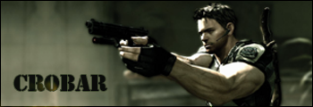
I definately think that you're slowly improving. I think that you do need to add borders to your work (not quite sure how to do that on GIMP, but if you're really desperate, you could draw a straight line around the edge of the sig with the desired colour pencil. I'm sure GIMP has a tool that allows for quick border placement). On your Houndoom sig I personally feel the background is very bland and this blandness has been covered up badly with those swirls. I advise perhaps that you place the render on a more exiting background, even if it is a stock image which has been cropped to fit your needs. I also suggest that you vastly reduce the amout of swirls in the sig, as I personally think that they divert the viewer's eyes away from the main focal point of the sig, which primarily should be the render. Now all the criticals are out of the way, i'll move on to the things I like about your sig. I like the size, I personally feel that anything around 350 x 135 is a good size for a sig - concise and effective, without being big and bulky. I also merit you on the text. Be it bland and basic, you have at least used a colour scheme that matches the rest of the sig. Perhaps if you downloaded some 'extravagant' fonts from a website like www.dafont.com or www.deviantart.com, you could give the text that little extra dynamic edge.

I hope that helps (it probably doesn't, there's a hell of a lot better sig makers out there who can give you much better advice than me :rolleyes:) but I think if you keep working at it, you'll eventually crack it :P
Posted Image

#20 Reaper94

    rawr!!

  • Member
  • 1178 posts
  • Projects: Being more loved and less loathed by community

Posted 12 July 2008 - 10:37

 Crobar, on 12 Jul 2008, 11:27, said:

I definately think that you're slowly improving. I think that you do need to add borders to your work (not quite sure how to do that on GIMP, but if you're really desperate, you could draw a straight line around the edge of the sig with the desired colour pencil. I'm sure GIMP has a tool that allows for quick border placement). On your Houndoom sig I personally feel the background is very bland and this blandness has been covered up badly with those swirls. I advise perhaps that you place the render on a more exiting background, even if it is a stock image which has been cropped to fit your needs. I also suggest that you vastly reduce the amout of swirls in the sig, as I personally think that they divert the viewer's eyes away from the main focal point of the sig, which primarily should be the render. Now all the criticals are out of the way, i'll move on to the things I like about your sig. I like the size, I personally feel that anything around 350 x 135 is a good size for a sig - concise and effective, without being big and bulky. I also merit you on the text. Be it bland and basic, you have at least used a colour scheme that matches the rest of the sig. Perhaps if you downloaded some 'extravagant' fonts from a website like www.dafont.com or www.deviantart.com, you could give the text that little extra dynamic edge.

I hope that helps (it probably doesn't, there's a hell of a lot better sig makers out there who can give you much better advice than me :rolleyes:) but I think if you keep working at it, you'll eventually crack it :P


It didnt look bland when i dounloaded from Dafont... (Resident Evil font)

any tips on what to do now?


ehmm:

it was attempt to copy this http://www.gimp-tutorials.com/tutorial/Gim...torial-383.html
but half of what he said after stage 9 i had fuck all clue what he was on about O.O

Edited by Kiba, 12 July 2008 - 10:39.


 RaiDK, on 3 Jun 2009, 10:09, said:

MY BEAK IS ONE WHICH WILL PIERCE THE HEAVENS.

Posted Image

#21 TheDR

    Whispery Wizard

  • Administrator
  • 5846 posts

Posted 12 July 2008 - 10:44

I know what troubles you are going though, Gimp Imo is much harder to use than photoshop.

I suggest using Paint.Net to make simple signatures and practising with layers before you start making complex sigs because you will just be overwhelmed with the amount of complexity of the gimp program.

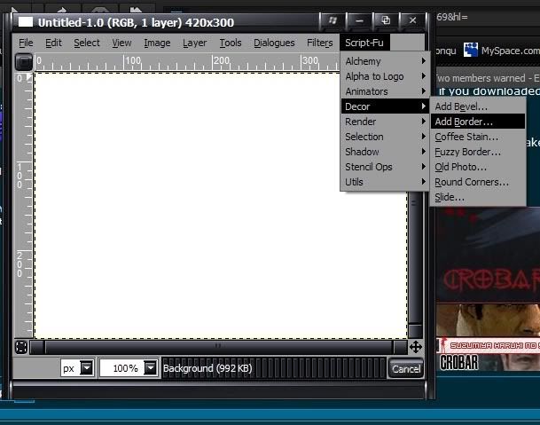
And gimp has a easy way of adding borders.

First find Script Fu which is shown in the picture:
Posted Image

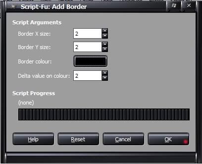
Then use these options to make a basic 2 pixel border.
Posted Image

Borders can make a sig 10x better in a matter of seconds.

-TheDR
Posted Image
F O R T H E N S
Posted Image

#22 Reaper94

    rawr!!

  • Member
  • 1178 posts
  • Projects: Being more loved and less loathed by community

Posted 12 July 2008 - 11:23

no border:

Posted Image

with border:

Posted Image

i see what you meran about the boarders Dr

Edited by Kiba, 12 July 2008 - 11:26.


 RaiDK, on 3 Jun 2009, 10:09, said:

MY BEAK IS ONE WHICH WILL PIERCE THE HEAVENS.

Posted Image

#23 Crobar

    Semi-Pro

  • Member
  • 211 posts
  • Projects: Just Chilling

Posted 12 July 2008 - 11:27

Looks much better :rolleyes: Perhaps reduce the thickness of the border a little, but it really does make the sig much more effective :P
Posted Image

#24 TheDR

    Whispery Wizard

  • Administrator
  • 5846 posts

Posted 12 July 2008 - 11:30

The Border makes it look much better.

Maybe reduce the size of the border, its a bit big at the moment.
Posted Image
F O R T H E N S
Posted Image

#25 Reaper94

    rawr!!

  • Member
  • 1178 posts
  • Projects: Being more loved and less loathed by community

Posted 12 July 2008 - 11:38

like this?:

Posted Image

 RaiDK, on 3 Jun 2009, 10:09, said:

MY BEAK IS ONE WHICH WILL PIERCE THE HEAVENS.

Posted Image


2 user(s) are reading this topic

0 members, 2 guests, 0 anonymous users