Posted 22 November 2008 - 08:47
The Dr,
Bob,
Swimmer.
Thought I'd do a little feedback because,well, just because.
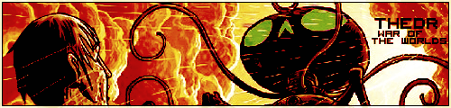
The Dr - did some good work with the render, with it appearing to flow even though the left hand side of the image has been spliced up somewhat - the intensity of the colours compared with the original is also a nice touch, and the text is leggible and well placed as always.
Bob - Very good cut from the render used - nice clean edges help the pop out become more effective - and the distortion effect is unique - my only thought to it would be to add a little ripple effect around where the distortion occurs - and the text is a little small and requires you to look for it instead of seeing it obviously.
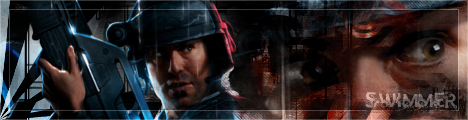
Swimmer - As usual the vector work is top class, and I spy that same old brush in there again - however the dual focals of the image mean that your eye more often than not gets drawn to the large eye on the right hand side, when your eye should really be drawn to the left hand side main image, imo, as that is the one without vector overlays - just blurring that eye out a bit would have a made a huge difference I think. Oh, and the text is quite indistinct - not the best font you've ever used.
Chronosheep - The sheep had me laughing, for sure. The main render itself is also a good cut, but is let down by lighting differences betwen it and the sheep - meaning that there appear to be multiple artificial light sources in a woodland area - doesn't quite fit. The text is legible tho, and the deep, rusty look is a nice choice. Finally, the border gets cut off at the bottom - whether intentional or not I would rather have seen is extend the whole way around.
Sgt Rho - not bad, but lacking in some respects - firstly, there is no clarity to the image at all, and compared to the render there is not much difference beyond the blocky painting effect that has been created. The large background text also takes time to fully comprehend, and detracts from the overall image from my viewpoint. The lack of border also means the edges merge into the forum's skin - which doesn't often work. Finally the name in the text looks a little small, and indistinct.
My thoughts - hope they're useful somehow.
For there can be no death without life.


 This topic is locked


