Kick me in the bollocks! I actually didn't see this thread until now. Good to have you back, mate. I sent you a PM just moments ago. Sorry I
couldn't talk to you earlier this week. I guess my sleeping habits are a little obstructive at times. Looking forward to talking to you soon!
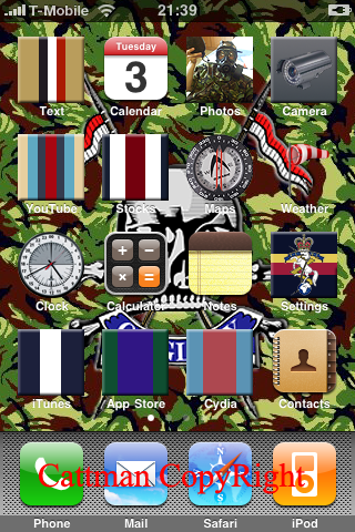
As for your iPhone theme, I do like what I see. Granted, I never understood the craze about all the i-stuff but it's a cool idea.
Little suggestion: As it has been said already, the weather icon is a little hard to see. I suggest either making the part with the actual windsock a little bigger by shortening the pole or adding a background to the image. That way, it also fits the other icons.

Just a little visualisation to make it clearer.
Edited by Rayburn, 06 February 2009 - 11:54.